This article brings you a detailed explanation of css3 radial gradient, accurately defining the shape and size of the gradient, and adding multiple termination colors. It has certain reference value. Friends in need can refer to it. I hope it will be helpful to you.
Clearly defined shape and size
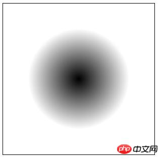
In the previous article [Detailed explanation of how css3 radial gradient defines the center and In "Size and Shape" we introduce the method of defining the gradient center and using keywords to define the gradient shape and size. You can refer to it. However, sometimes we need to define the size and shape of a radial gradient more precisely, which requires using length values or percentage values. As shown below:
.demo {
    /* Safari 5.1 - 6.0 */
    background-image: -webkit-radial-gradient(center center, 100px 100px, black, white);

    /* 标准的语法 */
    background-image: radial-gradient(center center, 100px 100px, black, white);
}Rendering:

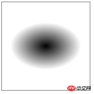
This defines a perfect circle with a diameter of 100px. We can also define an ellipse:
.demo {
    /* Safari 5.1 - 6.0 */
    background-image: -webkit-radial-gradient(center center, 120px 80px, black, white);

    /* 标准的语法 */
    background-image: radial-gradient(center center, 120px 80px, black, white);
}Rendering:

Description:
1. Unable to combine explicit size values with any size and shape keywords in together; you can only use one method.
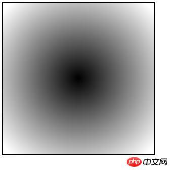
2. Explicit values define the length on the horizontal and vertical axes of the radial shape. So if we double the value from the first example (using 200px 200px), the new gradient will look like this:

End Color And the placement of colors
The last few parameters in the radial-gradient() function are to define which colors the gradient starts and ends with, as well as any intermediate transition colors.
Of course, the color value can be any valid value in CSS colors, and we can also choose the added position for each color.
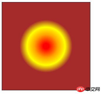
Here is an example of using percentages to place four colors at specific intervals:
.demo {
    /* Safari 5.1 - 6.0 */
    background-image: -webkit-radial-gradient(center center, 100px 100px, red 10%, orange 40%, yellow 65%, brown 90%);

    /* 标准的语法 */
    background-image: radial-gradient(center center, 100px 100px, red 10%, orange 40%, yellow 65%, brown 90%);
}Rendering:

Here are the colors in question Notes on values:
1. You can choose to omit the position of any color, which will cause the browser to calculate the position by itself;
2. You can use negative values, which will cause the color to be Invisible at first, but you will still see the result (a gradual change from one color to the next), depending on the value;
3. The position where the colors stop defines where each corresponding color is The position of the full state; everything in between is where gradual changes (i.e. gradients) occur;
4. Since we are dealing with radial gradients, the color termination will naturally define the boundaries and colors of the nested ellipses .
The above is the detailed content of Detailed explanation of css3 radial gradient: accurately define the shape and size of the gradient and add multiple termination colors. For more information, please follow other related articles on the PHP Chinese website!