How to layout using float? This article will introduce to you how to use float to layout content. It has certain reference value. Friends in need can refer to it. I hope it will be helpful to you.
In the previous article [What is float? Detailed explanation of float attribute ] introduces what the float attribute is, why we need to know about floating, etc. If you are interested, you can refer to it. Let's take a look at how float layouts content through an example of floating layout.
1. Use float to wrap content
html code:
<div class="demo">
	<h1>浮动--文字环绕</h1>
	<div class="box_left">向左浮动</div>
	<p>此文本位于浮动盒子(.box_left)之后的正常段落中。该段可以看作是浅绿色的盒子。请注意,此轮廓延伸 到浮动div的 后面。这很重要,因为这意味着段落的左侧实际上位于页面的左侧。只是该段落的内容已经向右移动,以“绕过”浮动的DIV。如果你试图操纵与浮点相邻的段落一侧的边距或 填充,则会产生影响。</p>
	<div class="box_right">向右浮动</div>
	<p>现在我们添加第二段并用内容充实它。你应该看到,一旦覆盖了div的高度,此段落文本将环绕它,以便文本不再缩进。类似的效果可在html通过设置来实现。</p>
	<p>float属性的一个复杂因素是Internet Explorer将在浮动的div盒子和后面的文本之间添加一些填充像素。这在标准中没有位置,只是他们“弱化”CSS和HTML的方式。在其他浏览器中,段落文本将与浮动的DIV对接。如果要在所有浏览器中填充,则需要为浮动元素指定边距。</p>
</div>
css code:
.demo {
	width: 520px;
	overflow: hidden;
	border: 2px solid paleturquoise;
	padding: 10px;
	margin: 100px auto;
}

.box_left {
	float: left;
	margin-right: 15px;
	width: 150px;
	height: 100px;
	border-radius: 5px;
	background-color: rgb(207, 232, 220);
	padding: 1em;
}

.box_right {
	float: right;
	margin-left: 15px;
	width: 150px;
	height: 100px;
	border-radius: 5px;
	background-color: rgb(207, 232, 220);
	padding: 1em;
}Rendering:
2. Use 'clear' to force the content to float
Common mistakes when using float to layout content I forgot to add the clear. This is an instruction to the element after the floated content to move it down far enough so that it is not affected by the floated content in front of it.
The problem of elements moving up occurs when the "normal" content behind a float element is not enough to clear it.
In this case, you may see subsequent section titles taking effect, or even content overflowing the "Content" section of the page. This is because the floated content is "taken out of the document flow" and therefore does not force any containing boxes to expand downwards on the page.
The best way to force the container to expand around the floated content when no other elements are present is to insert an empty div with clear set to 'both', like this:
<div style="max-width:90%"></div>
Let’s modify the above example:
<div class="demo">
	<h1>浮动--文字环绕</h1>
	<div class="box_left">向左浮动</div>
	<p>此文本位于浮动盒子(.box_left)之后的正常段落中。该段可以看作是浅绿色的盒子。请注意,此轮廓延伸 到浮动div的 后面。这很重要,因为这意味着段落的左侧实际上位于页面的左侧。只是该段落的内容已经向右移动,以“绕过”浮动的DIV。如果你试图操纵与浮点相邻的段落一侧的边距或 填充,则会产生影响。</p>
	<div class="box_right">向右浮动</div>
	<p>现在我们添加第二段并用内容充实它。你应该看到,一旦覆盖了div的高度,此段落文本将环绕它,以便文本不再缩进。类似的效果可在html通过设置来实现。</p>
	<div style="clear: both;"></div>
	<p>float属性的一个复杂因素是Internet Explorer将在浮动的div盒子和后面的文本之间添加一些填充像素。这在标准中没有位置,只是他们“弱化”CSS和HTML的方式。在其他浏览器中,段落文本将与浮动的DIV对接。如果要在所有浏览器中填充,则需要为浮动元素指定边距。</p>
</div>
Rendering:
3. Use floats to divide the content into columns
html code:
<div class="demo">
	<div class="box_1">
		<p>第一列</p>
		<p>float的一个稍微不常见属性但有非常强大的用途,可以将内容分组为列。这可以通过将div向左浮动以形成左侧列,然后添加第二个div来完成,同时向左浮动以位于其旁边。每个DIV必须具有宽度,你可以向第一个DIV添加右边距以分隔列。在许多情况下,这使得TABLE元素的使用变得不必要。</p>
	</div>

	<div class="box_2">
		<p>第一列</p>
		<div style="width: 100px;height: 50px;border: 1px solid #000;"></div>
		<p>你可以看到此框中的内容与第一个段落相邻,并且与第一个示例不同,一旦清除了第一个浮点的高度,它就不会回绕。</p>
	</div>
	<div>使用这种布局,你必须记住在最后一个DIV之后添加一个清除,否则后续内容可以出现在两列中和周围。</div>
</div>
css code:
.demo {
	width: 800px;
	overflow: hidden;
	border: 2px solid paleturquoise;
	padding: 10px;
	margin: 100px auto;
}

.box_1 {
	float: left;
	margin-right: 15px;
	width: 200px;
	height: 310px;
	border-radius: 5px;
	background-color: rgb(207, 232, 220);
	padding: 1em;
}

.box_2 {
	float: left;
	margin-left: 15px;
	width: 200px;
	height: 310px;
	border-radius: 5px;
	background-color: rgb(207, 232, 220);
	padding: 1em;
}Rendering:
You can also not be limited to setting up two column floats, and could easily have three or four on the page. There are other options. For a three-column layout, you can float the divs left and right and display "normal" content in between.
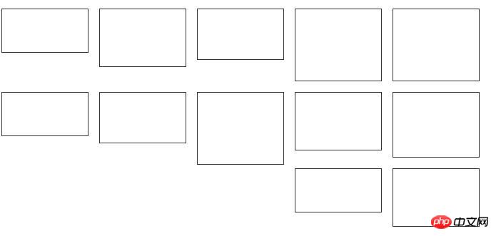
4. Using floating “tile” images and text
Now let’s look at something that should be simple but is actually very complex. If you have a lot of small DIVs - for example photos in a photo gallery - you can create a simple page by just floating them all to one side.
This works great when the items to be floated all have the same height:
But it causes a lot of problems when the heights are different, because " Higher" items will block those that subsequently float to the left:
NOTE: Reload this page to see other configurations.

#If this is the case, then the safest option is to use a table for layout. In some cases you can avoid this by inserting clear="left" to every nth element, but this may be difficult to maintain when items are added or removed.
Summary: The above is the entire content of this article, I hope it will be helpful to everyone's study.
The above is the detailed content of How to layout using float? Example of floating layout. For more information, please follow other related articles on the PHP Chinese website!
 How to use the atom editor
 resample function usage
 How to use the choose function
 How to create virtual wifi in win7
 How to solve the problem that the device manager cannot be opened
 How to use the length function in Matlab
 What does frame rate mean?
 The difference between console cable and network cable