


The content of this article is to introduce how to implement 2D conversion in CSS3? Implementation of 2D transformation (code example). It has certain reference value. Friends in need can refer to it. I hope it will be helpful to you.
transform
Reference W3 Manual
The transform attribute applies a transformation from 2D or 3D to an element. This property allows us to rotate, scale, move or tilt the element.
1. Format:
transform: none|transform-functions;
1. Common values:
1), rotaterotate
transform: rotate(45deg);/*其中deg是单位, 代表多少度*/
translate
transform: translate(100px, 0px); /*第一个参数:水平方向第二个参数:垂直方向*/
scale
transform: scale(1.5);
/*transform: scale(0.5, 0.5);*/

/*
第一个参数:水平方向
第二个参数:垂直方向
注意点:
如果取值是1, 代表不变
如果取值大于1, 代表需要放大
如果取值小于1, 代表需要缩小
如果水平和垂直缩放都一样, 那么可以简写为一个参数
*/
transform: rotate(45deg) translate(100px, 0px) scale(1.5, 1.5);
/*
注意点:
1.如果需要进行多个转换, 那么用空格隔开
2.2D的转换模块会修改元素的坐标系, 所以旋转之后再平移就不是水平平移的
*/
transform: rotateZ(45deg);

transform: rotateX(45deg);

transform: rotateY(45deg);
transform-origin
transform-origin attribute is used to change the position of the transformed element2D transformation Elements can change the element's X and Y axes. The 3D conversion element can also change its Z axistransform-origin: left top;
/*具体像素*/
transform-origin: 200px 0px;
/*百分比*/
transform-origin: 50% 50%;
/*特殊关键字*/
transform-origin: left top;
perspective
perspective attribute defines the distance of the 3D element from the view, in pixels. This attribute allows changing the view of the 3D element to view the 3D element When the perspective attribute is defined for an element, its child elements get the perspective effect, not the element itselfperspective: number|none; /* number 元素距离视图的距离,以像素计 none 默认值。与0相同。不设置透视 */
Comprehensive example one
2D Module conversion poker practice
<!DOCTYPE html><html lang="zh-CN"><head>
    <meta charset="UTF-8">
    <title>2D模块转换扑克练习</title>
    <style>
        *{
            margin: 0;
            padding: 0;
        }
        p{
            width: 310px;
            height: 418px;
            border: 1px solid gold;
            margin: 100px auto;
            background-color: #afcced;
            perspective: 400px;
        }
        p img{
            transition: transform 1.2s;
            transform-origin: center bottom;
        }
        p:hover img{
            transform: rotateX(80deg);
        }
    </style></head><body><p>
    <img src="img/pk.png" alt=""></p></body></html>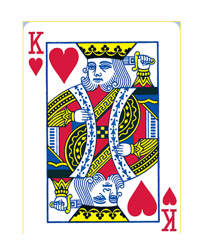
Comprehensive example two (photo wall)
2D conversion module-photo wall
<!DOCTYPE html><html lang="zh-CN"><head>
    <meta charset="UTF-8">
    <title>2D转换模块-照片墙</title>
    <style>
        *{
            margin: 0;
            padding: 0;
        }
        ul{
            height: 400px;
            margin: 100px auto;
            background-color: cornflowerblue;
            text-align: center;
            border: 1px solid #000;
        }
        ul li{
            list-style: none;
            margin-top: 100px;
            height: 200px;
            width: 150px;
            display: inline-block;
            background-color: red;
            border: 5px solid white;
            transition: transform 1s;
            box-shadow: 2px 2px 2px;
            position: relative;
        }
        ul li:nth-child(1){
            transform: rotate(30deg);
        }
        ul li:nth-child(2){
            transform: rotate(-40deg);
        }
        ul li:nth-child(3){
            transform: rotate(15deg);
        }
        ul li:nth-child(4){
            transform: rotate(60deg);
        }
        ul li:nth-child(5){
            transform: rotate(-25deg);
        }
        ul li:nth-child(6){
            transform: rotate(10deg);
        }
        ul li img{
            width: 150px;
            height: 200px;
        }
        ul li:hover {
            transform: scale(1.6);
            z-index: 999;
        }
    </style></head><body><ul>
    <li><img src="img/1.jpg" alt=""></li>
    <li><img src="img/2.jpg" alt=""></li>
    <li><img src="img/3.jpg" alt=""></li>
    <li><img src="img/4.jpg" alt=""></li>
    <li><img src="img/5.jpg" alt=""></li>
    <li><img src="img/6.jpg" alt=""></li></ul></body></html>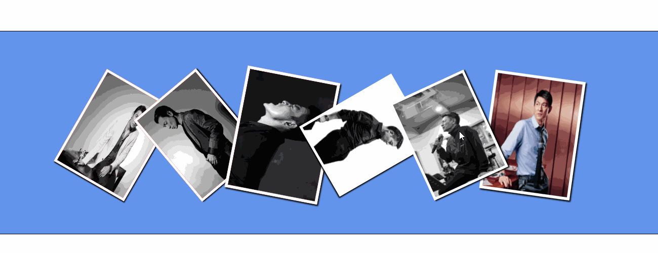
The above is the detailed content of How does CSS3 implement 2D conversion? Implementation of 2D transformation (code example). For more information, please follow other related articles on the PHP Chinese website!
 css3 tutorial
 What are the css3 gradient properties?
 Dogecoin trading platform
 java configure jdk environment variables
 Which is more worth learning, c language or python?
 What are the main characteristics of computers?
 The difference between scratch and python
 Introduction to the relationship between php and front-end


![[Web front-end] Node.js quick start](https://img.php.cn/upload/course/000/000/067/662b5d34ba7c0227.png)


