This article will bring you an introduction to common components of BootStrap based on BootStrap study notes. It has certain reference value. Friends in need can refer to it. I hope it will be helpful to you. If you want to learn and get more bootstrap related video tutorials, you can also visit: bootstrap tutorial!
    <h3>图标</h3>
    <span></span>
    <span></span>
    <span></span>
    <span></span>
    <span></span>
    <span></span>
    <span></span>
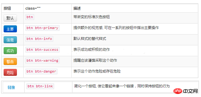
    <h3>按钮</h3>
    <button>按钮</button>
    <button>primary</button>
    <button>success</button>
    <button>info</button>
    <button>warning</button>
    <button>danger</button>

    <h3>按钮尺寸</h3>
    <button>按钮</button>
    <button>primary</button>
    <button>success</button>
    <button>info</button>
    <h3>把图标显示在按钮里</h3>
    <button><span></span>  按钮</button>
<p>
        <button>
            <span>菜单一</span>
            <span></span>
        </button>
        </p>
Interaction: monitor the click event of each menu, and display the current menu in the title after clicking it
        $('.dropdown-item').click(function () {
            $('#dropdown-title').text($(this).text());
});<h3>输入框</h3> <p> <span></span> <input> </p> <p> <span></span> <input> </p>
    <h3>导航栏</h3>
    <nav>
        <p>
          </p>
<ul>
            <li><a>Home</a></li>
            <li><a>About</a></li>
            <li><a>Contact</a></li>
            <li>
              <a>Dropdown <span></span></a>
              <ul>
                <li><a>Action</a></li>
                <li><a>Another action</a></li>
                <li>
                <li>Nav header</li>
                <li><a>Separated link</a></li>
              </ul>
            </li>
          </ul>
        <!--/.nav-collapse -->

    </nav>
<h3>表单</h3>
    <h3>警告框</h3>
    <p>
       <button><span>×</span></button>
       <strong>Warning!</strong> Better check yourself, you're not looking too good.
    </p>
    <p>
        <a>success!</a>
    </p>
    <p>
        <a>info!</a>
    </p>
    <p>
        <a>warning!</a>
    </p>
    <p>
        <a>danger!</a>
    </p>
    <h3>进度条</h3>
    <p>
      </p><p>
        70%
      </p>
Generally we use float:right to realize the function of floating to the right, but the right involves clearing the float, adjusting the margin on the right, the margin up and down, etc. Of course, in bootstrap To use his method, just add a class: pull-right to solve the problem:
<span>item1</span>
<p>item2</p>
The first line must be on a horizontal line with the second line, so the first line cannot use
Tab can easily switch the displayed content in a page. The use of bootstrap tabs is very simple:
这是tab1
这是tab2
这是tab3
can be easily captured in js Switch tabs and make corresponding changes. For example, when the second page is loading some data, then I wait until I switch to the second page and then load it:
        $('a[data-toggle="tab"]').on('shown.bs.tab',function (e) {
            var activeTab = $(e.target).text();
            alert(activeTab);
});A plug-in that can request json data and generate tables through ajax
Project address:
https://github.com/wenzhixin/bootstrap-table
https://github.com/CodeSeven/toastr
http://www.ithao123.cn/content-2414918.html
Find the build folder in the downloaded file and introduce toastr inside .min.js and toastr.css
This prompt message is displayed in the upper right corner of the browser by default. We can change it to be displayed in the top center during initialization:
toastr.options.positionClass = 'toast-top-center';//显示位置
The location display setting has the following options:
toast-top-right
toast-botton-right
toash-bottom-left
toast-top-left
toast-top-full-width 这个是在网页顶端,宽度铺满整个屏幕
toast-bottom-full-width
toast-top-center顶端中间
toast-bottom-center
Then when we need to display it, just call it like this:
toastr.success('提交数据成功');
toastr.error('Error');
toastr.warning('只能选择一行进行编辑');
toastr.info('info');Button:
                <button>
                    换个密码
                </button>
js:
    $('.btn').on('click',function () {
        $.post('xxx')
            .done(function (result) {
                var json = ajaxResultShow(result);
                if (json.result_code == 0)
                    $('#pwdId').text(json.data1);
            })
            .fail(function () {
            })
            .always(function () {
            });
});(1) This component does not belong to bootstrap, it needs to be imported separately into bootstrap-switch.min. js and bootstrap-switch.min.css;
(2) Download address: http://www.bootcss.com/p/bootstrap-switch/
(3) Usage:
Add framework:
<link>
<link>
<script></script>
<script></script>
Add component in html:
<input>
Initialize in js:
$("[name='my-checkbox']").bootstrapSwitch();The status can be set directly during initialization:
$("#isOpenCheckbox").bootstrapSwitch('state',false);Switching status:
$('#isOpenCheckbox').bootstrapSwitch('toggleState');Listening to switching events:
   $('#isOpenCheckbox').on('switchChange.bootstrapSwitch', function (event,state) {
            alert(state);// true || false
});Summary: The above is the entire content of this article. I hope it will be helpful to everyone's study.
The above is the detailed content of BootStrap study notes: Introduction to common components of BootStrap. For more information, please follow other related articles on the PHP Chinese website!