This article introduces to you what the transform-origin attribute does in CSS? The role of the transform-origin attribute has a certain reference value. Friends in need can refer to it. I hope it will be helpful to you.
A firework animation I made recently is the animation of the fireworks spreading out. In the animation During the implementation process, I got stuck mainly during the rotation of the fireworks. Later I found that I didn’t have a deep understanding of the transform-origin attribute, so I found an example to practice and deepened my understanding of the attribute.
transform-originFunctionThis attribute is used to change the origin of element deformation. It is generally used in conjunction with rotation. The number of received parameters can be one, two, or three. When there are two values, they represent the distance to the left side of the box model, such as transform-origin: 50px 50px;, which means that the rotation center of the container becomes the upper left corner of the box model as the origin, X and Y The axis distance is 50px as the origin for rotation.

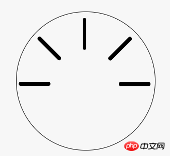
The vertical bar in the middle is our initial setting, and the rest are rotated based on this

  <p>
    </p><p></p>
    <p></p>
    <p></p>
    <p></p>
    <p></p>
As can be seen from the CSS code below, we set the rotation center to (3,105)px of the first vertical line as the origin for rotation , the distance here is the value on the left side of the distance box model. Understanding this, you can write other hour hands, and then rotate them separately to get the hour hands. Because I didn't understand which position the value here was calculated relative to, I ran into a lot of pitfalls.
CSS
.hour {
  position: absolute;
  left: 105px;
  width: 6px;
  height: 50px;
  background-color: #000;
  border-radius:6px;
  -webkit-transform-origin:3px 105px;
          transform-origin:3px 105px;
}
.hour:nth-child(2) {
  transform:rotate(45deg);
}
.hour:nth-child(3) {
  transform:rotate(90deg);
}
.hour:nth-child(4) {
  transform:rotate(-45deg);
}
.hour:nth-child(5) {
  transform:rotate(-90deg);
}Related recommendations:
Usage of border-sizing attribute in css
What is CSS? Introduction to css cascading style (code)The above is the detailed content of What does the transform-origin property in CSS do? The role of transform-origin attribute. For more information, please follow other related articles on the PHP Chinese website!


