The following article brings you an in-depth understanding of the impact of css attribute selection on animation performance. The content is quite good. I would like to share it with you now and give it as a reference.
Nowadays, the proportion of mobile phones is getting higher and higher, and all kinds of cool pages are emerging one after another. These special effects are inseparable from CSS animation. When it comes to CSS animation, the mainstream situations are nothing more than these two categories: displacement and deformation. When we write an animation special effect, how can we improve its performance? Of course, first we need to understand the basic concepts, such as the working principle of browser rendering, etc. I have a certain understanding of these after reading relevant articles written by several experts. I will not go into details here. Interested students can go find out. To put it simply and crudely, the purpose of this article is actually what CSS properties we should use to draw animations, which can effectively improve the performance of the browser in the rendering and drawing process.
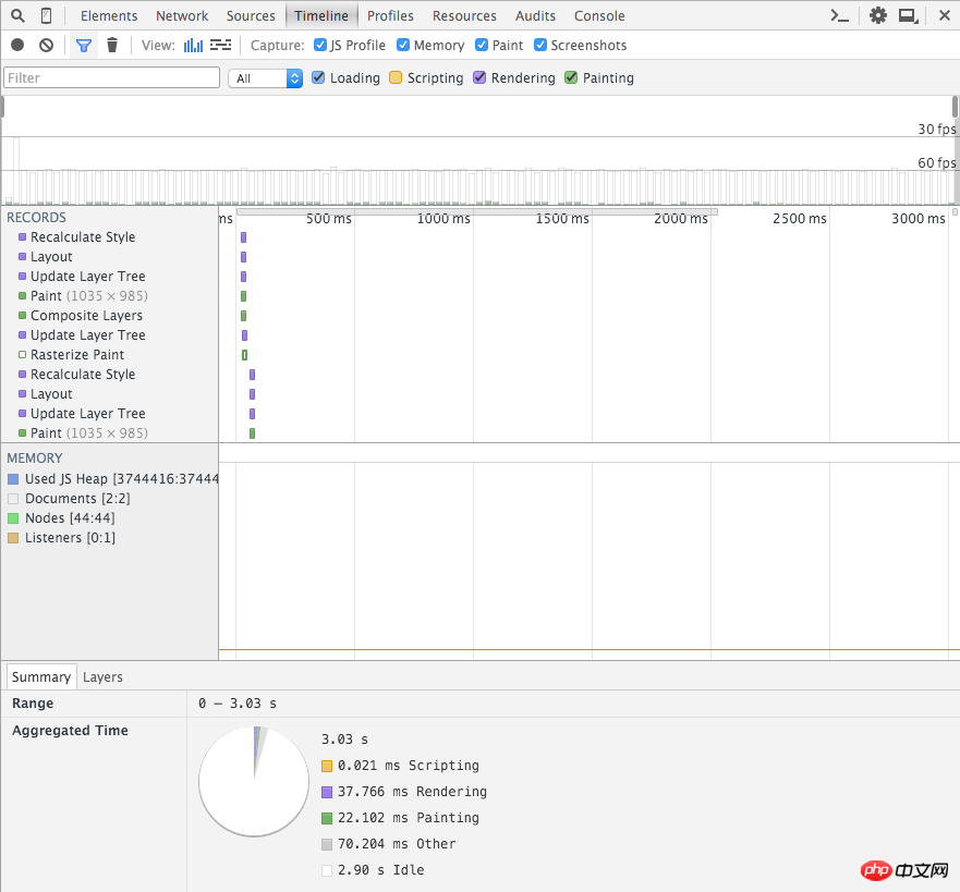
Used left and transform respectively to translate 500px to the right in 2 seconds. The code is as follows:
<style>
.box-ps,.box-tf{position:absolute;top:0;left:0;width:100px;height:100px;background-color:red;}
.box-ps{-webkit-animation:box-ps 2s linear;}
.box-tf{-webkit-animation:box-tf 2s linear;}
@-webkit-keyframes box-ps{
0%{
left:0;
}100%{
left:500px;
}
}
@-webkit-keyframes box-tf{
0%{
-webkit-transform:translate(0,0);
}100%{
-webkit-transform:translate(500px,0);
}
}
</style>
<body>
<p class="box-ps"></p>
<p class="box-tf"></p>
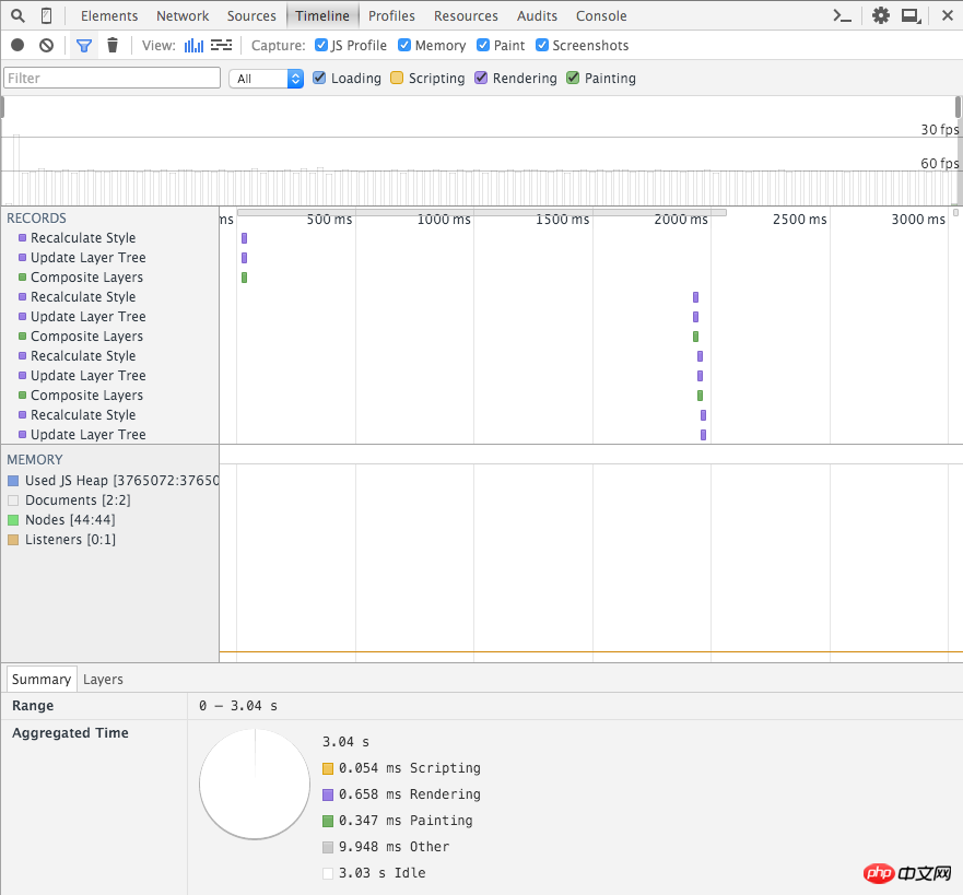
</body>Then I got the following results under chrome. The first one is a screenshot using left, and the second one is a screenshot using transform:

Transform screenshot

Let's use chrome's show paint rectangles to observe the difference between the rendering and drawing areas during the animation process. The first one is a screenshot using left, and the second one is a screenshot using transform:

Screenshot of transform

The properties that will not be re-layout include: transform (translate, rotate, scale among them), color, background, etc.
Instructions on the use of css3 animation effect animate and introduction to browser compatibility
About css Use of the background-attachment attribute
The above is the detailed content of About the impact of css attribute selection on animation performance. For more information, please follow other related articles on the PHP Chinese website!


