


This article mainly introduces the usage instructions and browser compatibility of CSS3 animation effect animate. It has a certain reference value. Now I share it with you. Friends in need can refer to it
Yesterday Suddenly I saw jing.fm (this music website is very good, I like many of the effects. If you are interested, you can check it out). When the music is played, the album rotation effect is very good, so I am going to write it down myself. Reserve for later use. As a result, I encountered a cheating thing when I used animate for the first time. I am complaining that I haven’t updated my blog for a long time. It has been exactly a month since I last posted (November 8th), and during this period, there were many things on the project. I felt that time was tight and I didn't have time to update. This week has finally come to an end, and I will add a few technical articles. Well, the first article is about the use of css3 animation.
Yesterday I suddenly saw jing.fm (this music website is very good, I like many of the effects. If you are interested, you can check it out). When playing music, the album rotation effect is very good, so I am ready to do it myself. Write it down for later use. As a result, I encountered a cheating thing the first time I used animate, so I complained about it.
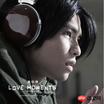
1. The final effect
As shown in the picture above, the ultimate goal is to make the album picture rotate to simulate the effect of record playback (you can go to jing Check out the real effect on .fm, it’s great, now many music websites have added this effect). 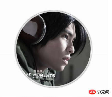
2. Structural code
<!DOCTYPE html> <html> <head> <meta charset='utf-8'> <title>音乐专辑播放模拟</title> <link rel="stylesheet" type="text/css" href="css/style.css"> </head> <body> <p id="bd"> <p id="musicBox"> <p class="cover rotateCD"></p> <p class="mask"></p> </p> </p> </body> </html>
 3. css3 style sheet rotateCD This part of the code is compatible with a variety of advanced browsers (of course it supports css3 ), set the animation execution time and some other settings, you can query animate for more knowledge to learn more.
 @charset utf-8;
/* common: rotateCD */
@-webkit-keyframes myrotate{
0%{
-webkit-transform : rotate(0deg);
}
100%{
-webkit-transform : rotate(360deg);
}
}
@-moz-keyframes myrotate{
0%{
-moz-transform : rotate(0deg);
}
100%{
-moz-transform : rotate(360deg);
}
}
@-ms-keyframes myrotate{
0%{
-ms-transform : rotate(0deg);
}
100%{
-ms-transform : rotate(360deg);
}
}
@-o-keyframes myrotate{
0%{
-o-transform : rotate(0deg);
}
100%{
-o-transform : rotate(360deg);
}
}
@keyframes myrotate{
0%{
transform : rotate(0deg);
}
100%{
transform : rotate(360deg);
}
}
.rotateCD{
-webkit-animation: myrotate 9.5s infinite linear;
-moz-animation: myrotate 9.5s infinite linear;
-ms-animation: myrotate 9.5s infinite linear;
-o-animation: myrotate 9.5s infinite linear;
animation: myrotate 9.5s infinite linear;
-webkit-animation-play-state: running;
-moz-animation-play-state: running;
-ms-animation-play-state: running;
-o-animation-play-state: running;
animation-play-state: running;
}
/* module: bd */
#bd{width: 960px;margin: 200px auto 0;}
/* module: musicBox */
#musicBox{position: relative;width: 430px;height: 430px;margin: 0 auto;overflow: hidden;}
#musicBox .cover{width: 300px;height: 300px;margin: 65px;background: url(../img/music1.jpg) 0 0 no-repeat;}
#musicBox .mask{position: absolute;top: 0;left: 0;width: 100%;height: 100%;background: url(../img/playerMask.png) 0 0 no-repeat;}Copy after login
@-webkit-keyframes myrotate{
0%{
-webkit-transform : rotate(0deg);
-moz-transform : rotate(0deg);
-ms-transform : rotate(0deg);
-o-transform : rotate(0deg);
transform : rotate(0deg);
}
....@-webkit-keyframes myrotate{
0%{
-webkit-transform : rotate(0deg);
}
...
@-moz-keyframes myrotate{
0%{
-moz-transform : rotate(0deg);
}
...
@-ms-keyframes myrotate{
0%{
-ms-transform : rotate(0deg);
}
...
@-o-keyframes myrotate{
0%{
-o-transform : rotate(0deg);
}
...
@keyframes myrotate{
0%{
transform : rotate(0deg);
}
...4. Summary
css3 looks very good, but there are still many uncertainties in actual use. If you can't see the implemented code template, it's difficult to be sure that your code format is correct. So you can go to some good websites to observe various animation effects, choose the animation you like and generate code, download it and then write the animation code according to your own needs. This will make your animation effects more efficient and effective (don’t worry if it doesn’t meet your requirements, there are many effects above, you can combine them yourself, as long as your imagination is rich enough). Okay, this article ends here.
PS
: The browsers used in this article are chrome (21.0.1180.15), safari5.1.7 (7534.57.2), opera (12.11), FF (17.0.1) and IE10 (10.0. 9200.16438). The above is the entire content of this article. I hope it will be helpful to everyone's study. For more related content, please pay attention to the PHP Chinese website!
Related recommendations:
How to use Flexbox to achieve the centering effect in CSSHow to use css3 to achieve the color gradient glow effect of the input input box
The above is the detailed content of Instructions for using css3 animation effect animate and introduction to browser compatibility. For more information, please follow other related articles on the PHP Chinese website!


![[Web front-end] Node.js quick start](https://img.php.cn/upload/course/000/000/067/662b5d34ba7c0227.png)


