


This article mainly introduces the basic multi-column layout of CSS, which has certain reference value. Now I share it with everyone. Friends in need can refer to it
The basic layout is mainly displayed on the mobile terminal, and is also applicable to the PC terminal. Divided into one column, two columns, three columns, and four columns.
Two methods are used here.
First set the basic style:
/*==================common css start================*/
    ul{
        list-style: none;
        background: #f0f1f1;
        padding: 30px 15px;
    }
    li{
        background: #fff;
        text-align: center;
        border: 1px solid #5d2a22;
        padding: 15px;
        box-sizing: border-box;
    }
    .clearfix::after{
        content:"";
        display: block;
        clear: both;
    }
/*==================common css end================*/
/*==================html start================*/    <!--一列-->
    <ul class="one clearfix">
        <li>入选CCTV中国年度品牌</li>
        <li>获得Hair代理权</li>
        <li>签署5G筛查合作协议</li>
        <li>全国开设近20家分院</li>
    </ul>

    <!--两列-->
    <ul class="two clearfix">
        <li>入选CCTV中国年度品牌</li>
        <li>获得Hair代理权</li>
        <li>签署5G筛查合作协议</li>
        <li>全国开设近20家分院</li>
    </ul>

    <!--三列-->
    <ul class="three clearfix">
        <li>入选CCTV中国</li>
        <li>获得Hair代理权</li>
        <li>签署5G筛查合作协议</li>
        <li>全国开设近20家</li>
        <li>了解植发需求</li>
        <li> 推荐专业医师</li>
    </ul>

    <!--四列-->
    <ul class="four clearfix">
        <li>咨询</li>
        <li>定位</li>
        <li>检测</li>
        <li>定制</li>
        <li>辅助</li>
        <li>养护</li>
        <li>咨询</li>
        <li>定制</li>
</ul>/*==================html end================*/Traditional calculation method: precise calculation of floating width
    /*==============传统(浮动+清浮动+宽度精确计算) start=================*/
        /*.one li:nth-child(n+2){
            margin-top: 15px;
        }
        .two li{
            float: left;
            width: 48%;
        }
        .two li:nth-child(even){
            margin-left: 4%;
        }
        .two li:nth-child(n+3){
            margin-top: 15px;
        }
        .three li{
            float: left;
            width: 32%;
            margin-left:2%
        }
        .three li:nth-child(3n-2){
            margin-left:0%
        }
        .three li:nth-child(n+4){
            margin-top: 15px;
        }
        .four li{
            float: left;
            width: 22%;
            margin-left:4%
        }
        .four li:nth-child(4n-3){
            margin-left: 0;
        }
        .four li:nth-child(n+5){
            margin-top: 15px;
        }*/
/*==============传统(浮动+清浮动+宽度精确计算) end=================*/flex calculation method: flex
        /*================flex(按照需求设置宽度) start=================*/
        /*为方便查看,这里不单独去掉clearfix类名了*/
        .clearfix::after{            content: none;        }
        ul{            display: flex;            flex-wrap: wrap;            justify-content: space-between;        }
        .one li{            width: 100%;        }
        .one li:nth-child(n+2){            margin-top: 15px;        }
        .two li{            width: 48%;        }
        .two li:nth-child(n+3){            margin-top: 15px;        }
        .three li{            width: 32%;        }
        .three li:nth-child(n+4){            margin-top: 15px;        }
        .four li{            width: 23%;        }
        .four li:nth-child(n+5){            margin-top: 15px;        }
/*================flex(按照需求设置宽度) end=================*/The two methods achieve the same effect, as shown below: 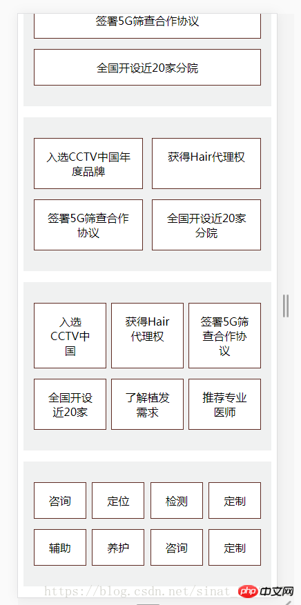
Usage method two, you only need to consider the width of the element, and use justify-content: space-between; to achieve the effect of dispersed centering.
If you want to know more about flex layout, please refer to the master's documentation
Flex Layout Tutorial: Grammar http://www.ruanyifeng.com/blog/2015/07/flex-grammar.html
Flex Layout example
http://static.vgee.cn/static/index.html
CSS Basic Syntax: Three Introductions of CSS
The above is the detailed content of css basic multi-column layout. For more information, please follow other related articles on the PHP Chinese website!


![[Web front-end] Node.js quick start](https://img.php.cn/upload/course/000/000/067/662b5d34ba7c0227.png)


