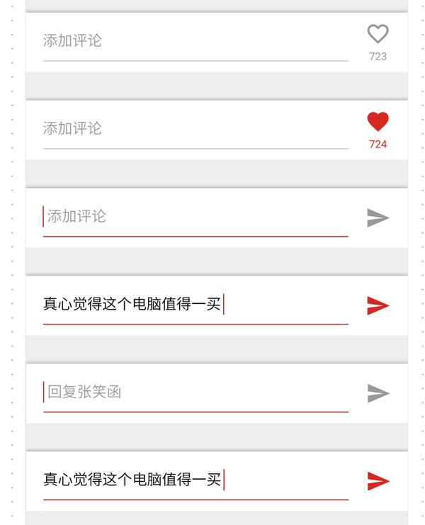
A few days ago, I encountered a page requirement like this:

A comment box. The button behind it has two states: like or send comment. The send button is divided into clickable and comment based on whether there are words in the input box. Both states are unclickable.
Requirements:
No text, no focus - like
No text, focus - send in gray
With text - send in red
If implemented with JS, you need to monitor the change and focus events of the input box, which is more troublesome. But similar effects can be achieved using pseudo-classes in CSS.
<input type="text" class="input" required>
<div class="like">点赞</div>
<div class="send">发送</div>
.send {
  display: none;
}

.input:focus ~ .send {
  display: block;
}

.input:valid ~ .send {
  display: block;
  color: red;
}


.input:focus ~ .like, .input:valid ~ .like {
  display: none;
}(If the comment box is implemented with a div element with the contenteditable attribute, you can use the :empty pseudo-class instead of :valid.)
So there are many pseudo-classes and pseudo-elements in CSS3, and some of them, if used cleverly, can achieve a lot Effects that originally required JS to be achieved.
Placeholder of div with contenteditable attribute
For some reasons, we sometimes use div with contenteditable attribute instead of input or textarea as input box. For example, divs can automatically adjust their height based on their content. But the div element does not support the placeholder attribute. How to display a default text when the div content is empty? You can use the :empty pseudo-class.
<div class="input" contenteditable placeholder="请输入文字"></div>
Draw a grid
This is what I saw on Meituan’s mobile page:

We need to draw a grid in this area of the city list. Of course, our first thought is to use the border attribute, but the designer has a requirement that if there is only one or two cities in the last row, there must be a blank grid behind it for the sake of beauty. Like this:

How to draw the vertical lines of the grid on Meituan’s page? It is drawn using ::after and ::before elements.
.input:empty::before {
  content: attr(placeholder);
}Created two pseudo-elements with a height of 100%, using their borders as vertical lines of the table. This solution can meet the designer's requirements without adding blank page elements and destroying semantics. But the limitation is that only four vertical lines can be drawn at most, which means that the table can have up to 5 columns.
Tab switching
It is also possible to implement tab switching using pure CSS. It mainly uses the :checked pseudo-class and adjacent selector of the radio button element. Because it is a radio button, it is guaranteed that only one tab is active at the same time. If you do not require more complex effects, the tab switching effect achieved by pure CSS is much simpler and more reliable than JS.
.table:before {
  content: '';
  position: absolute;
  width: 25%;
  left: 25%;
  height: 100%;
  border-left: 1px solid #ddd8ce;
  border-right: 1px solid #ddd8ce;
}

.table:after {
  content: '';
  position: absolute;
  width: 10%;
  left: 75%;
  height: 100%;
  border-left: 1px solid #ddd8ce;
  border-right: none;
}<input id="tab1" type="radio" name="tabs" checked> <label for="tab1">TAB1</label> <input id="tab2" type="radio" name="tabs"> <label for="tab2">TAB2</label> <div id="content1" class="tab-content">CONTENT1<div> <div id="content2" class="tab-content">CONTENT2</div>
In addition, using pseudo-classes of form elements, label elements can be used to replace form elements such as radio buttons and check boxes themselves, because it is very difficult to define styles for the form elements themselves.
Perception of the number of child elements
This is one of the most complex techniques I have ever seen. It comes from this article. It does not rely on JS to apply different styles according to the number of child elements.
For example, this CSS:
  input, .tab-content{
    display: none;
  }
  #tab1:checked ~ #content1,
  #tab2:checked ~ #content2 {
    display: block;
}can achieve this effect: if the number of li elements in the .list is greater than or equal to 4, it will be displayed in red.
How is this achieved?
:nth-last-child(n+4) This selector means the fourth to last and previous elements, with ~ li added after it, which means the li element after the element that meets the previous conditions.
If the total number of elements is less than 4, there will be no element that conforms to :nth-last-child(n+4) (there are not four in total, so there will be no fourth-to-last child), then li:nth-last-child (n+4) ~ li will not select any elements.
But if you only use ~ li, the first li will not be matched, so li:nth-last-child(n+4):first-child is added.
This also enables the application of different styles based on the number of elements.


