orange tries to share with you how to fill the pitfalls in actual projects. Of course, it is just to provide ideas. There are many methods and welcome discussion. Also, it is not particularly friendly to newcomers who have just started with the front end. It doesn’t matter. I will guide you accordingly when it comes to basic knowledge. , give a link or give a hint, you can Google (Baidu) by yourself.
When it comes to inline alignment, you may think of articles similar to horizontal alignment and vertical alignment. Since we call it "black magic", it will not be a basic alignment tutorial. There are many articles on basic tutorials, and everyone must know a variety of them. Method to achieve alignment
Project background
It is still a mobile project of the company where Orange works. The case

is too much. Let’s only look at the first line of text. It is the title of every day. Someone Said: Fuck are you kidding me? If there is anything to say about this, anyone can write it!
Don’t get excited, of course I am not explaining how to implement this layout. A simple example is easier to explain the problem. Continue to look at the preliminary implementation code.
<div class="date-wrap">
  <span class="date">14 OCT</span>
  <span class="multiple">x</span>
  <span class="desc">今日瞎选6篇</span>
</div>

<style type="text/css">
  .date-wrap {
    width: 100%;
    height: 60px;
    position: relative;

    text-align: center;
    line-height: 60px;

    font-size: 18px;
    font-weight: 600;
  }

  .multiple {
    color: #f8ac08;
  }
</style>The screenshot is as follows

A careful friend can see the problem. , it doesn’t matter if you can’t see it, let’s add two auxiliary lines!
<div class="date-wrap">
  <span class="date">14 OCT</span>
  <span class="multiple">x</span>
  <span class="desc">今日瞎选6篇</span>
  <div class="line-top"></div>
  <div class="line-bottom"></div>
</div>

<style type="text/css">
  /* 这里是前面的样式,不重复给出 */
  .line-top {
    width: 100%;
    height: 1px;
    position: absolute;
    left: 0;
    top: 21px;

    background-color: #000;
  }

  .line-bottom {
    width: 100%;
    height: 1px;
    position: absolute;
    left: 0;
    bottom: 21px;

    background-color: #000;
  }
</style>The effect is as follows

Okay, I believe everyone can now see the problem at a glance, that is, the previous date is not vertically centered, and the reason is! It’s easy to explain
You only need to modify one line of code here to answer everyone’s questions
<span class="date">14 OCT orange</span>
After modifying the corresponding html above, you will get a screenshot

This reminds me of the four-line grid in primary school English homework books , Haha, the uppercase letters are indeed in the two boxes above, and there are examples of lowercase letters in the upper, middle and lower case. Looking at g alone, it is easy to explain the above display.
The seemingly simple case is still so special. It happens to be all numbers and capital letters. If you are careful, you will find that there is also a problem with the 6 at the end. If you are not careful and it is not centered, the design will come to you and you will be confused. It says that I wrote it in the middle, but it can’t be solved?
No, we will solve this problem next. Real projects are more complicated. Experienced front-ends know the differences between fonts. The difference between individual fonts is very different.
The fonts before and after here are different, but Fortunately, the difference in the vertical direction is not very big. Here I introduced the original font of the project. The x in the middle is actually an SVG. I won’t go into details here. Because if you understand your thoughts, you can easily solve a hundred misalignments.
Enter the real world of magic. Two ideas are given for this case. You can choose by yourself
inline-block magic
I will not explain it step by step, but directly use the code that has solved the problem
<div class="date-wrap">
<div class="date">14 OCT</div>
<div class="multiple">x</div>
<div class="desc">今日瞎选6篇</div>
<div class="line-top"></div>
<div class="line-bottom"></div>
</div>
<style type="text/css">
@font-face {
font-family: century-gothic-bold;
src: url('century-gothic-bold.ttf');
}
@font-face {
font-family: FZYouH_512B;
src: url('FZYouH_512B.ttf');
}
.date-wrap {
width: 100%;
height: 60px;
display: flex;
position: relative;
flex-direction: row;
align-items: center;
justify-content: center;
text-align: center;
line-height: 60px;
font-size: 18px;
font-weight: 600;
}
.date {
font-family: century-gothic-bold;
}
.multiple {
margin: 0 10px;
color: #f8ac08;
}
.desc {
font-size: 16px;
font-family: FZYouH_512B;
}
.line-top {
width: 100%;
height: 1px;
position: absolute;
left: 0;
top: 22px;
background-color: #000;
}
.line-bottom {
width: 100%;
height: 1px;
position: absolute;
left: 0;
bottom: 22px;
background-color: #000;
}
</style>The effect is as follows

Good Great, I only changed the font-size of the text at the back: 16px; The problem was solved. I happily showed it to the designer and compared it and reworked it.
what the fuck? What the hell? Ten thousand grass-mud horses (mythical beasts) are galloping past in my heart, look carefully! Eyes widened. . . . That's right
Our auxiliary lines appear above the character. The designer will also take a screenshot of the mobile phone and compare the auxiliary lines with the original manuscript~
The solution is quite simple, just
.desc {
  margin-top: 1px;  /* add */

  font-size: 16px;
  font-family: FZYouH_512B;
}just add one line, dangdang Dangdang~

嗑嗑,凑合这样吧,为什么?明明对齐了啊!再仔细看,我是认真的,没玩大家,发现我们的 date 低了不到一个像素(使用 Retina 屏幕的朋友看的明显些),有人问一像素以内可以调整嘛?明确告诉大家可以,之后的文章准备做解释,这里不展开
第一种方案到这为止,上手试验的朋友虽然没有我的字体,你不必去下载,浏览器默认字体一样的,我们讲的是原理,没必要还原我的 demo,关键就是 block 元素的上下 margin 调整。
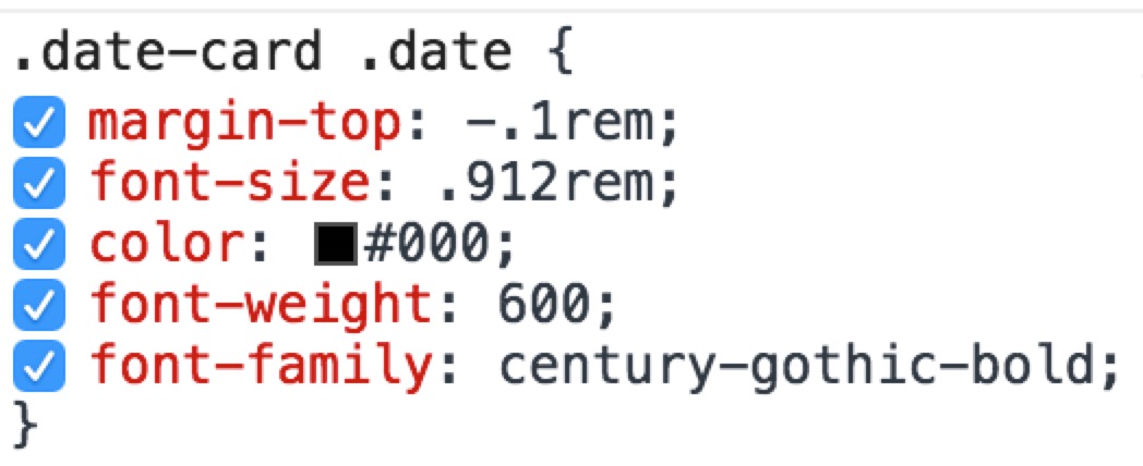
提醒:这里的 margin 可以设置负值,如果负值无用自己去探索原因吧,给大家线上项目的控制台

我这里给的就是负值,是有作用的哦,可以去 敢玩移动端主页,记得在模拟器里查看(不然会乱成一锅粥),控制台一看便知,不过多解释啦。
vertical-align 魔法
完整代码如下
<div class="date-wrap">
<span class="date">14 OCT</span>
<span class="multiple">x</span>
<span class="desc">今日瞎选6篇</span>
<div class="line-top"></div>
<div class="line-bottom"></div>
</div>
<style type="text/css">
@font-face {
font-family: century-gothic-bold;
src: url('century-gothic-bold.ttf');
}
@font-face {
font-family: FZYouH_512B;
src: url('FZYouH_512B.ttf');
}
.date-wrap {
width: 100%;
height: 60px;
position: relative;
text-align: center;
line-height: 60px;
font-size: 18px;
font-weight: 600;
}
.date {
font-family: century-gothic-bold;
}
.multiple {
color: #f8ac08;
}
.desc {
vertical-align: 1px;
font-size: 16px;
font-family: FZYouH_512B;
}
.line-top {
width: 100%;
height: 1px;
position: absolute;
left: 0;
top: 22px;
background-color: #000;
}
.line-bottom {
width: 100%;
height: 1px;
position: absolute;
left: 0;
bottom: 22px;
background-color: #000;
}
</style>以上代码运行效果和之前一摸一样这里就不一一截图费大家流量啦(良心前端。。。。)
和上一个方法区别在于我们行内元素还用之前的 span 标签。然后通过 vertical-align: 1px; 来调节垂直方向上下的位置。对这个属性不熟悉的朋友可以去看MDN的文档:https://developer.mozilla.org...
几种语法如下
/* keyword values */
vertical-align: baseline;
vertical-align: sub;
vertical-align: super;
vertical-align: text-top;
vertical-align: text-bottom;
vertical-align: middle;
vertical-align: top;
vertical-align: bottom;

/* <length> values */
vertical-align: 10em;
vertical-align: 4px;

/* <percentage> values */
vertical-align: 20%;

/* Global values */
vertical-align: inherit;
vertical-align: initial;
vertical-align: unset;
我们用的这个
总结
两种方案都可行,有时候不要因为一像素绞尽脑汁,找到突破口,以后谁还会怕行内对齐了呢?


