


This article will share with you advanced CSS skills and introduce how to use CSS to achieve the wavy progress bar effect. I hope it will be helpful to everyone!
This article is the third article in the CSS Painting API series of CSS Houdini.
In the last two articles, we introduced in detail how the CSS Painting API can implement custom patterns and even animation effects step by step!
In this article, we will continue to explore and try to use the CSS Painting API to achieve some effects that were not possible with pure CSS in the past. [Recommended learning:css video tutorial]
Let’s take a quick look at what is CSS Painting API.
The CSS Painting API is part of CSS Houdini. Houdini, on the other hand, is a set of low-level APIs that expose parts of the CSS engine, allowing developers to extend CSS by joining the styling and layout process of the browser rendering engine. Houdini is a set of APIs that give developers direct access to theCSS Object Model(CSSOM), allowing developers to write code that browsers can parse into CSS, thereby creating new CSS functionality without having to wait. They are implemented natively in the browser.
The current version of CSS Paint API isCSS Painting API Level 1. It is also known as CSS Custom Paint or Houdini's Paint Worklet.
We can understand it as JS In CSS, using the powerful capabilities of JavaScript Canvas to achieve functions that were not possible with CSS in the past.
CSS Implementing wave effect has always been one of the difficulties in CSS. In the past, although we have many ways to use Hack to create some wave effects, I have repeatedly mentioned it in many previous articles:
Yes, most of the time, we use some tricks to achieve the wave effect, like this:
Now, with the CSS Painting API, we can already draw real wave effects. Take a look at the code:
div { position: relative; width: 300px; height: 300px; background: paint(waveDraw); border-radius: 50%; border: 2px solid rgba(255, 0, 0, 0.5); }
We have defined awaveDrawmethod. Next, just use registerPaint to implement this method.
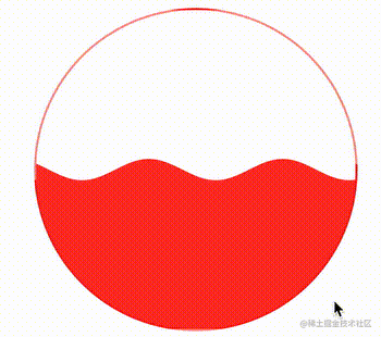
// 文件名为 CSSHoudini.js registerPaint( "waveDraw", class { static get inputProperties() { return []; } paint(ctx, size, properties) { const { width, height } = size; const initY = height * 0.5; ctx.beginPath(); for (let i = 0; i <= width; i++) { ctx.lineTo(i, initY + Math.sin((i) / 20) * 10); } ctx.lineTo(width, height); ctx.lineTo(0, height); ctx.lineTo(0, initY); ctx.closePath(); ctx.fillStyle = 'rgba(255, 0, 0, 0.9)'; ctx.fill(); } } );
In this way, we get such a wave effect:
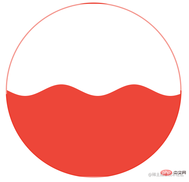
The above code is actually easy to understand. Let’s explain briefly. Our core is to use paths. Drawing, based on theMath.sin()trigonometric function, draws a graph of the sin(x) trigonometric function.
The entire graph starts fromctx.beginPath(), the first point isctx.lineTo(0, initY Math.sin((i) / 20) * 10), butMath.sin(0) = 0, so it is equal toctx.lineTo(0, initY)
initYThe function here is to control the height from which to start drawing the wave graphics. Our value here isinitY = height * 0.5, which is defined as a graphic. centre position
利用for (let i = 0; i <= width; i++)循环,配合ctx.lineTo(i, initY + Math.sin((i) / 20) * 10),也就是在每一个 x 轴上的点,都绘制一个点
随后三个在循环体外的ctx.lineTo的作用是让整个图形形成一个闭环
最后ctx.closePath()完成整个路径,ctx.fill()进行上色
如果不ctx.fill()上色,利用ctx.stroke()绘制边框,也是可以的,其实我们得到是这样一个图形:
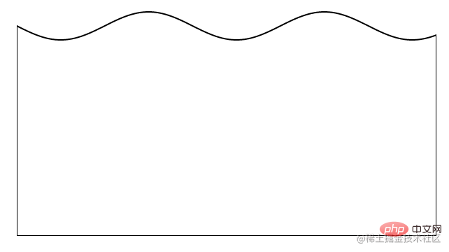
上图是同时去掉了 CSS 代码里面的border-radius: 50%,方便大家理解。
当然,上面的图形,有个很大的问题,没法动起来,所以,我们需要借助一个 CSS @Property 自定义变量,让它拥有一些动画效果。
我们需要改造一下代码,首先,添加一个 CSS @Property 自定义变量:
@property --animation-tick { syntax: ''; inherits: false; initial-value: 1000; } div { // ... 代码与上述保持一致 animation: move 20s infinite linear; --animation-tick: 1000; } @keyframes move { 100% { --animation-tick: 0; } }
我们添加了一个--animation-tick变量,并且利用 CSS 动画,让它从 1000 减至 0。
下一步,利用这个不断在变化的 CSS 自定义变量,我们在waveDraw方法中,把它利用上:
// 文件名为 CSSHoudini.js registerPaint( "waveDraw", class { static get inputProperties() { return ["--animation-tick"]; } paint(ctx, size, properties) { let tick = Number(properties.get("--animation-tick")); const { width, height } = size; const initY = height * 0.5; ctx.beginPath(); for (let i = 0; i <= width; i++) { ctx.lineTo(i, initY + Math.sin((i + tick) / 20) * 10); } ctx.lineTo(width, height); ctx.lineTo(0, height); ctx.lineTo(0, initY); ctx.closePath(); ctx.fillStyle = 'rgba(255, 0, 0, 0.9)'; ctx.fill(); } } );
仔细看,和上述的代码变化不大,核心在于,利用三角函数绘制图形的时候,我们把这个变量加入进去。
从原来的ctx.lineTo(i, initY + Math.sin((i) / 20) * 10),变成了ctx.lineTo(i, initY + Math.sin((i + tick) / 20) * 10)。
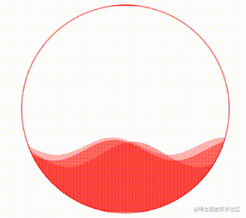
这样,在这个不断变化的变量的作用下,我们的波浪图形就能运动起来了:
CodePen Demo -- CSS Houdini Wave
虽然能动了,但是总是感觉还少了些什么。如果我们把这个波浪效果应用与进度条之类的效果上,我们可以需要可以快速定义波浪的振幅、每个波峰之间的间距、效果的颜色、百分比等等。
因此,我们需要再通过一个 CSS 变量,让它成为一个实际可用的封装良好的波浪进度条。我们再简单改造一下:
@property --animation-tick { syntax: ''; inherits: false; initial-value: 1000; } @property --height { syntax: ''; inherits: false; initial-value: .7; } div { position: relative; width: 300px; height: 300px; background: paint(waveDraw); animation: move 20s infinite linear; border-radius: 50%; border: 2px solid var(--color1); --amplitude: 15; --gap: 28; --animation-tick: 700; --height: 0.7; --color1: rgba(255, 0, 0, 0.5); --color2: rgba(255, 0, 0, 0.4); --color3: rgba(255, 0, 0, 0.3); transition: --height 8s; }
可以看到,我们定义了非常多个 CSS 变量,每次,它们都是有意义的:
--animation-tick表示波浪运动的速率--amplitude波浪的振幅--gap波峰间距--initHeight初始高度--color1、--color2、--color3我们会叠加 3 层波浪效果,显得更真实一点,这里 3 个颜色表示 3 层波浪的颜色定义好这些 CSS 变量后,我们就可以把它们运用在实际的waveDraw方法中。看看代码:
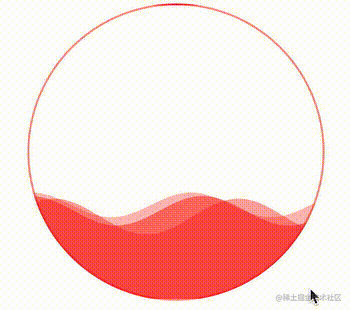
registerPaint( "waveDraw", class { static get inputProperties() { return [ "--animation-tick", "--height", "--gap", "--amplitude", "--color1", "--color2", "--color3" ]; } paint(ctx, size, properties) { let tick = Number(properties.get("--animation-tick")); let initHeight = Number(properties.get("--height")); let gap = Number(properties.get("--gap")); let amplitude = Number(properties.get("--amplitude")); let color1 = properties.get("--color1"); let color2 = properties.get("--color2"); let color3 = properties.get("--color3"); this.drawWave(ctx, size, tick, amplitude, gap, initHeight, color1); this.drawWave(ctx, size, tick * 1.21, amplitude / 0.82, gap + 2, initHeight + 0.02, color2); this.drawWave(ctx, size, tick * 0.79, amplitude / 1.19, gap - 2, initHeight - 0.02, color3); } /** * ctx * size * tick 速率 * amplitude 振幅 * gap 波峰间距 * initHeight 初始高度 * color 颜色 */ drawWave(ctx, size, tick, amplitude, gap, initHeight, color) { const { width, height } = size; const initY = height * initHeight; tick = tick * 2; ctx.beginPath(); for (let i = 0; i <= width; i++) { ctx.lineTo(i, initY + Math.sin((i + tick) / gap) * amplitude); } ctx.lineTo(width, height); ctx.lineTo(0, height); ctx.lineTo(0, initY); ctx.closePath(); ctx.fillStyle = color; ctx.fill(); } } );
可以看到,我们在paint()方法中,调用了this.drawWave()。每次调用this.drawWave()都会生成一个波浪图形,通过 3 层的叠加效果,生成 3 层波浪。并且,把我们在 CSS 中定义的变量全部的应用了起来,分别控制波浪效果的不同参数。
这样,我们就得到了这样一个波浪效果:
通过控制 CSS 中的--height变量,还可以实现高度的变化,从而完成真实的百分比,实现一种进度条效果。
div:hover { --height: 0; }
效果如下:
很好,非常不错的效果。有了上述一些 CSS 自定义变量的帮助,我们就可以通过封装好的waveDraw方法,实现不同颜色,不同大小,不同速率的波浪进度条效果了。
我们只需要简单的改变一下传入的 CSS 变量参数即可:
div { position: relative; width: 300px; height: 300px; background: paint(waveDraw); animation: move 20s infinite linear; border-radius: 50%; border: 2px solid var(--color1); --amplitude: 15; --gap: 28; --animation-tick: 700; --height: 0.7; --color1: rgba(255, 0, 0, 0.5); --color2: rgba(255, 0, 0, 0.4); --color3: rgba(255, 0, 0, 0.3); transition: --height 8s; } div:nth-child(2) { --amplitude: 6; --gap: 25; --animation-tick: 300; --height: 0.5; --color1: rgba(28, 90, 199, 0.5); --color2: rgba(28, 90, 199, 0.4); --color3: rgba(28, 90, 199, 0.3); } div:nth-child(3) { --amplitude: 3; --gap: 30; --animation-tick: 1200; --height: 0.3; --color1: rgba(178, 120, 33, 0.5); --color2: rgba(178, 120, 33, 0.4); --color3: rgba(178, 120, 33, 0.3); }
看看效果如何:
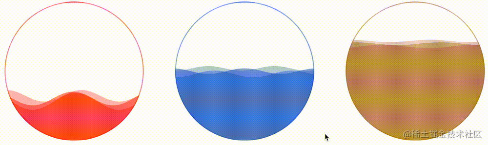
CodePen Demo -- CSS Hudini Custom Wave Effects !
In this way, with the help of CSS Painting API, we have perfectly realized the wave graphics, and with the help of it, we have realized the wave progress bar effect. By passing in different CSS variables, we have the ability to quickly batch generate different effects. It makes up for the shortcomings of previous CSS in wave effects!
Of course, based on the above code, there is still some room for optimization:
In the above CSS code, you can see that we are passing in There are 3 CSS variables about color,--color1,--color2,--color3. Normally, 1 color is passed in here, that is Yes, by converting to HSL color representation, replacing the L color value, and obtaining the other two approximate color values. Of course, doing this will add a lot of JavaScript code. Therefore, in order to facilitate everyone's understanding, this article lazily directly passes in 3 CSS color variable values;
The entire wave effect is a single round I set the animation duration to 20s, but in this article, I did not adapt the hand-to-tail connection of the animation, which means that every 20s, the wave effect may have an obvious beating feeling. To solve this problem, there are two ideas
--animation- Set the value of tickto a very large value, and then set the corresponding single-round animation time to be very long. In this way, you will basically not feel the frame skipping of the animationThe third problem may becompatibility
Well, in fact, the previous article also talked about the compatibility issue, because there may be many students who saw this article and did not read the first two articles. So, how compatible is the CSS Painting API?
CanIUse - registerPaintThe data is as follows (as of 2022-11-23):
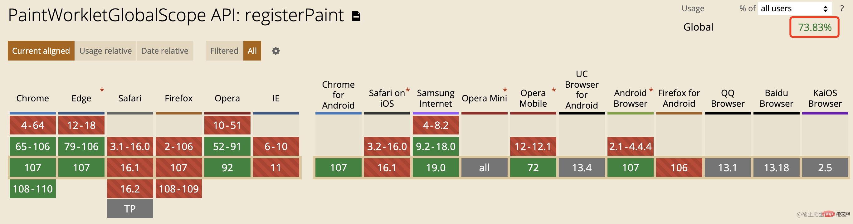
Chrome and Edge are based onChromiumKernel browsers have supported it for a long time, but among mainstream browsers, Firefox and Safari do not yet support it.
Although CSS Houdini is powerful, it currently seems that it will still take some time to be put into production environments on a large scale. Let's give it some time!
Original address: https://juejin.cn/post/7170868201645932551
Author: ChokCoco
(Learning video sharing:web front end)
The above is the detailed content of Let's talk about how to use CSS to achieve the wavy progress bar effect. For more information, please follow other related articles on the PHP Chinese website!


![The front-end course that understands you best: HTML5/CSS3/ES6/NPM/Vue/...[Original]](https://img.php.cn/upload/course/000/000/068/632ae26b9b376240.png)


![[Web front-end] Node.js quick start](https://img.php.cn/upload/course/000/000/067/662b5d34ba7c0227.png)


