


This article will share with you advanced techniques for irregular graphic background layout and introduce how to use CSS to realize a cool hexagonal grid background image. I hope it will be helpful to everyone!
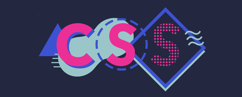
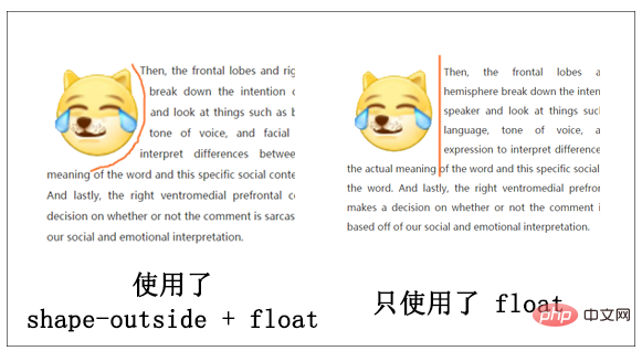
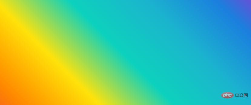
Today, I received a very interesting question, how to achieve a background effect similar to the following:
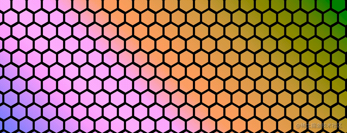
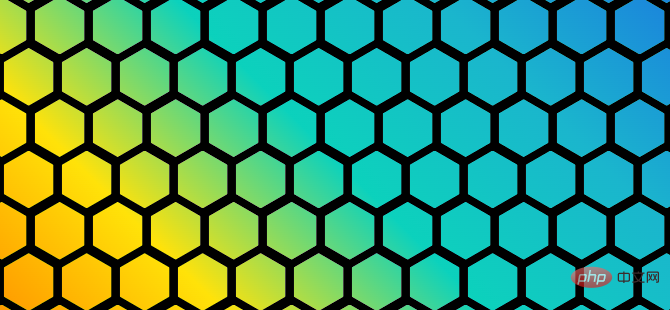
Hmm ? The core body is formed by superimposing multiple hexagonal grids.
So how do we achieve it? Is this possible using pure CSS?
Of course, below we will try how to use CSS to achieve such a background effect. [Recommended learning:css video tutorial]
First of all, when you see such a graphic, if you want to use a label to complete the entire background, the first thing that comes to mind is definitely to use the background implementation, but unfortunately, although the background in CSS is very Powerful, but no particularly good way to make it good enough to batch generate repeating hexagonal backgrounds.
So, in this requirement, we may have to settle for the next best thing and implement a hexagon using a label.
So, taking 1 DIV as an example, how many ways do we have to implement a hexagon? Here are 2 ways to briefly introduce:
First, use border to implement hexagon. The core here is that the upper and lower triangles overlap a rectangle in the middle. Here, two pseudo-elements of the element are used to implement the upper and lower triangles, so that the element looks like a hexagon.
The idea is relatively simple, just go to the code:
.hexagon { position: relative; width: 200px; height: 100px; background-color: red; } .hexagon:before, .hexagon:after { content: ""; position: absolute; width: 0; height: 0; border-left: 100px solid transparent; border-right: 100px solid transparent; } .hexagon:before { bottom: 100%; border-bottom: 50px solid red; } .hexagon:after { top: 100%; border-top: 50px solid red; }
The above code will create a hexagon with a width of 200 pixels and a height of 100 pixels, which is composed of two triangles and a rectangle . The advantage of using pseudo elements is that you can easily control the size, color and other styles of the hexagon.
Of course, the above code is not a regular hexagon. This is because in a regular hexagon, the height of theelement is 1.1547 times the width of the element.
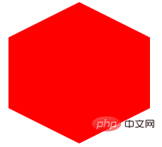
Moreover, the above method is a little more complicated. Therefore, today, we recommend using theclip-pathmethod to implement a hexagon:
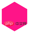
.clippath { --w: 100px; width: var(--w); height: calc(var(--w) * 1.1547); clip-path: polygon(0% 25%, 0% 75%, 50% 100%, 100% 75%, 100% 25%, 50% 0%); background: deeppink; margin: auto; }
In this way, based onclip-path, you can also quickly get a hexagonal graphic:
CodePen Demo -- Two ways to achieve a hexagon
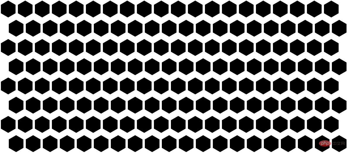
Okay, after laying the foundation for the previous step, what we have to do next is to draw Multiple hexagons form the background.
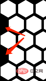
But if we look closely at the background composed of multiple hexagons, we will find that the hexagons in each even-numbered row need to have an obvious indentation to the right, with a width of about a single hexagon. Half the width of the shape:
This is actually a very tricky question. First of all, we will think of such a solution:
Each line is a group, set a parent div container, fill it with hexagonal elements, and set the elements not to wrap
Set a fixedmargin-left for even-numbered lines
// ... 填满六边形// ... 填满六边形// ... 填满六边形// ... 填满六边形
margin-leftto the even-numbered lines.
因此,这种方式存在非常大的弊端,我们希望能有一整布局方式,能够满足我们如下两个诉求:
所有六边形代码写在一个父容器下
这个弹性布局中,第二行的元素最左边,能够实现固定一个缩进
仔细思考一下,CSS 中有能够实现类似布局的方法么?
有的!在 CSS 中,有一个神奇的元素能够让元素以非直线形式排布。它就是shape-outside!
如果你对
shape-outside不太了解,也可以先看看我的这篇文章 --奇妙的 CSS shapes
shape-outside是 CSS 中的一个属性,用于控制元素的浮动方式。它允许你定义一个元素浮动时周围元素的形状。例如,你可以使用shape-outside属性来定义一个元素浮动时周围元素的形状为圆形、六边形等。
它和clip-path的语法非常类似,很容易触类旁通。看看实例,更易理解:
假设我们有下面这样的结构存在:
xxxxxxxxxxx,文字描述,xxxxxxxxx
定义如下 CSS:
.shape-outside { width: 160px; height: 160px; shape-outside: circle(80px at 80px 80px); float: left; }
注意,上面.shape-outside使用了浮动,并且定义了shape-outside: circle(80px at 80px 80px),表示在元素的 (80px, 80px) 坐标处,生成一个 80px 半径的圆。
如此,将会产生一种图文混排的效果:
CodePen Demo -- 图文混排 shape-outside
总得来说,shape-outside有两个核心特点:
shape-outside属性仅在元素定义了float属性且不为none时才会生效
它能够实现了文字根据图形的轮廓,在其周围排列
shape-outside的本质划重点,划重点,划重点。
所以,shape-outside的本质其实是生成几何图形,并且裁剪掉其几何图形之外周围的区域,让内容能排列在这些被裁剪区域之内。
所以,了解了这个本质之后,我们再将他运用在上面的六边形布局之中。
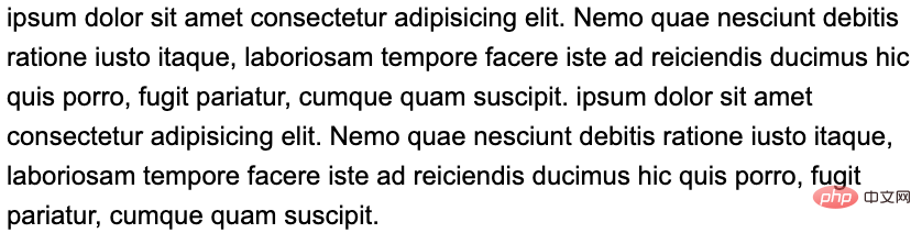
为了方便理解,我们首先使用文字代替上面的六边形,假设我们有这样一段文本内容:
Lorem ipsum dolor sit amet conse...
p { line-height: 36px; font-size: 24px; }
非常平平无奇的一段代码,效果如下:
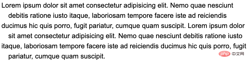
现在,我们想利用shape-outside,让文本内容的偶数行,向内缩进24px,怎么实现呢?非常简单:
p { position: relative; line-height: 36px; font-size: 24px; &::before { content: ""; height: 100%; width: 24px; shape-outside: repeating-linear-gradient( transparent 0, transparent 36px, #000 36px, #000 72px ); float: left; } }
这样,我们就实现了文字隔行缩进24px的效果:
一定有小伙伴会很好奇,为什么呢?核心在于我们利用元素的伪元素实现了一个shape-outside图形,如果我们把这个图形用background绘制出来,其实它长这样:
p { position: relative; line-height: 36px; font-size: 24px; &::before { content: ""; height: 100%; width: 24px; shape-outside: repeating-linear-gradient( transparent 0, transparent 36px, #000 36px, #000 72px ); float: left; background: repeating-linear-gradient( transparent 0, transparent 36px, #f00 36px, #f00 72px ); } }
效果如下:
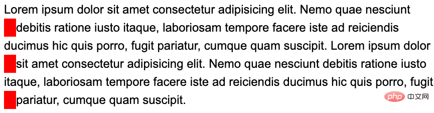
因为文本的行高是36px,这样我们以 72 为一段,每 36px 绘制一段透明,另外 36px 绘制一段宽为 24px 的内容,这样,结合shape-outside的特性,我们就实现了隔行将内容向里面挤24px的效果!
非常的 Amazing 的技巧!完整的代码你可以戳这里:
CodePen Demo -- Shape-outside achieves even line indentation
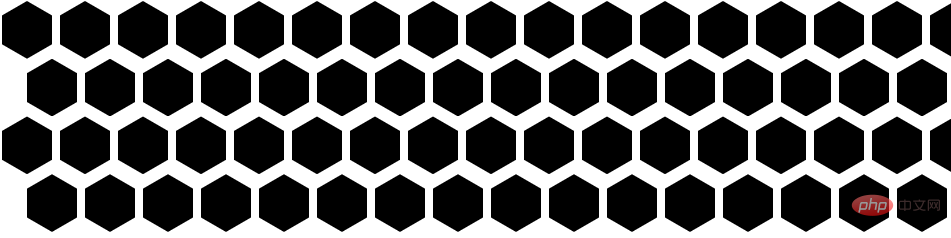
基于这个技巧,我们就可以实现上述我们想要的效果了。我们回到正题,重新实现一个充满六边形的背景:
:root { --s: 50px; /* size */ --m: 4px; /* margin */ --perHeight: calc(calc(var(--s) * 2 * 1.1547) + calc(var(--m) * 4) - 0.4px) } .wrap { position: relative; height: 100%; font-size: 0; &::before { content: ""; height: 100%; width: 27px; shape-outside: repeating-linear-gradient( transparent 0, transparent 70px, #000 70px, #000 var(--perHeight) ); float: left; } } li { width: var(--s); height: calc(var(--s) * 1.1547); background: #000; clip-path: polygon(0% 25%, 0% 75%, 50% 100%, 100% 75%, 100% 25%, 50% 0%); margin: var(--m); display: inline-block; }
借助shape-outside,我们就实现了隔行让我们的六边形向内缩进的诉求!效果如下:
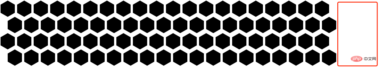
当然,有一些优化点:
为了让两边不那么空,我们可以让整个容器更宽一点,譬如宽度为父元素的120%,然后水平居中,这样,两侧的留白就解决了
让两行直接贴紧,可以设置一个margin-bottom
做完这两点优化之后,效果如下:
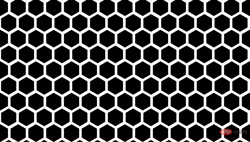
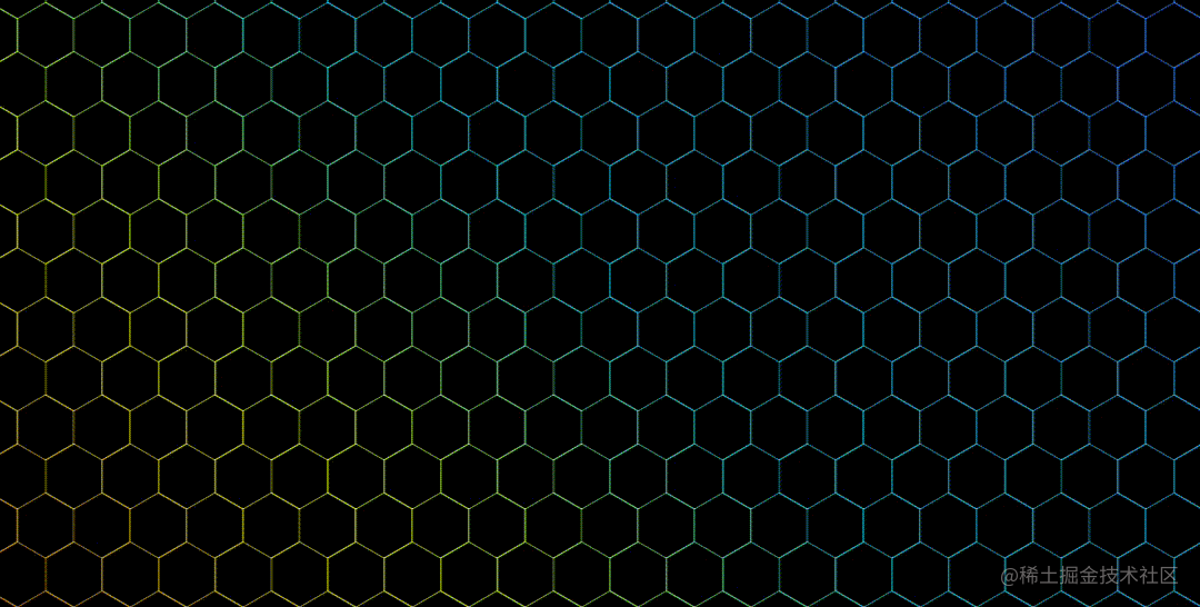
可以做到任意屏幕宽度下的六边形完美平铺布局:
完整的代码你可以戳这里:CodePen Demo -- Hexagon Layout
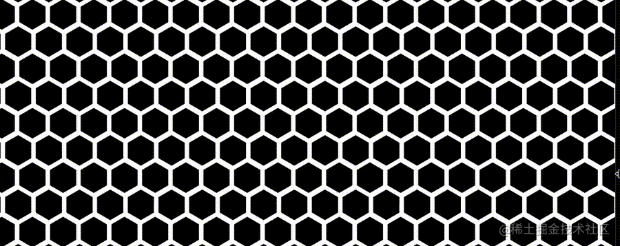
有了上述的铺垫后,要实现文章一开头的效果就不难了。
是的,我们要实现这样一个效果:

如何让它们动态的实现颜色变换呢?是给每一个六边形一个单独的颜色,然后进行动画吗?不,借助混合模式,我们可以非常快速的实现不同的颜色值。
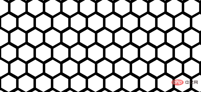
首先,我们将上述效果,改成白底黑色六边形色块:
然后,利用父容器剩余的一个伪元素,我们叠加一层渐变层上去:
.wrap { position: relative; // 代码与上述保持一致 &::before { content: ""; // ... 实现 shape-outside 功能,代码与上述保持一致 } &::after { content: ""; position: absolute; inset: 0; background: linear-gradient(45deg, #f44336, #ff9800, #ffe607, #09d7c4, #1cbed3, #1d8ae2, #bc24d6); } }
这样,我们就叠加了一层渐变色彩层在原本的六边形背景之上:
接着,只需要一个混合模式mix-blend-mode: darken,就能实现六边形色块与上层渐变颜色的融合效果:
.wrap { position: relative; // 代码与上述保持一致 &::before { content: ""; // ... 实现 shape-outside 功能,代码与上述保持一致 } &::after { content: ""; position: absolute; inset: 0; background: linear-gradient(45deg, #f44336, #ff9800, #ffe607, #09d7c4, #1cbed3, #1d8ae2, #bc24d6); z-index: 1; + mix-blend-mode: darken; } }
效果如下:
好, 我们再给上层的渐变色块,添加一个filter: hue-rotate()动画,实现色彩的渐变动画:
.wrap { position: relative; // 代码与上述保持一致 &::before { content: ""; // ... 实现 shape-outside 功能,代码与上述保持一致 } &::after { content: ""; position: absolute; inset: 0; background: linear-gradient(45deg, #f44336, #ff9800, #ffe607, #09d7c4, #1cbed3, #1d8ae2, #bc24d6); z-index: 1; mix-blend-mode: darken; + animation: change 10s infinite linear; } } @keyframes change { 100% { filter: hue-rotate(360deg); } }
这样,我们就完美的实现了我们想要的效果:

完整的代码,你可以戳这里:CodePen Demo -- Hexagon Gradient Layout
当然,有了这个基础图形之后,其实我们可以基于这个图形,去做非常多有意思的效果。
下面我是尝试的一些效果示意,譬如,我们可以将颜色放置在六边形背景的下方,制作这样一种效果:
CodePen Demo -- Hexagon Gradient Layout
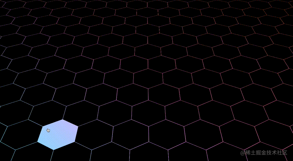
配合 mask 的蒙版效果及鼠标定位,我们还能实现这样一种有趣的交互效果:
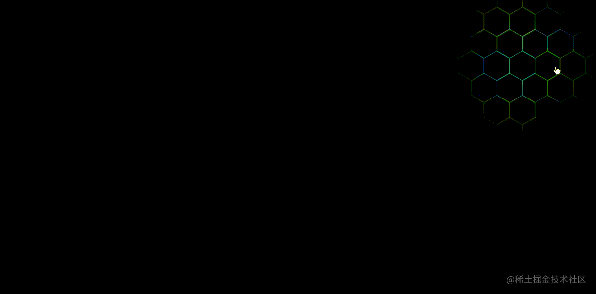
CodePen Demo -- Hexagon Gradient & MASK Layout
当然,3D 效果也不在话下:
CodePen Demo -- 3D Hexagon Gradient Layout
原文地址:https://www.cnblogs.com/coco1s/p/17005071.html
作者:ChokCoco
(学习视频分享:web前端)
The above is the detailed content of Teach you step by step how to use CSS to realize a cool hexagonal grid background image. For more information, please follow other related articles on the PHP Chinese website!


![[Web front-end] Node.js quick start](https://img.php.cn/upload/course/000/000/067/662b5d34ba7c0227.png)


