


Writing: "box-shadow: h-shadow v-shadow blur spread color inset"; h-shadow is the horizontal position, v-shado is the vertical position, spread is the shadow size, and inset changes the outer shadow to Inner shadow (can be omitted).
The operating environment of this tutorial: Windows 7 system, CSS3&&HTML5 version, Dell G3 computer.
In CSS, you can use the box-shadow attribute to achieve the border shadow effect. The box-shadow attribute can set one or more drop-down shadow boxes.
Syntax
box-shadow: h-shadow v-shadow blur spread color inset;
Possible values:
| Values | Description |
|---|---|
| h-shadow | Required. The position of the horizontal shadow. Negative values allowed |
| v-shadow | Required. The position of the vertical shadow. Negative values allowed |
| blur | Optional. Fuzzy distance |
| #spread | Optional. The size of the shadow |
| #color | is optional. The color of the shadow. |
| inset | Optional. Change shadow to inner shadow from outer shadow (at start) |
注意:boxShadow 属性把一个或多个下拉阴影添加到框上。该属性是一个用逗号分隔阴影的列表,每个阴影由 2-4 个长度值、一个可选的颜色值和一个可选的 inset 关键字来规定。省略长度的值是 0。
box-shadow属性的使用
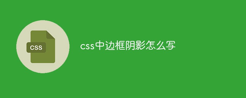
1、水平垂直偏移为0也可以有阴影
如果offset-x或offset-y值为0,则阴影在元素背后,此时给blur-radius值或spread值可以产生阴影效果。
例子:
第一个div通过设置blur-radius产生阴影效果。
第二个div通过设置spread正值产生阴影效果。
第三个div通过设置spread负值产生阴影效果。
但是有一点要注意:扩展阴影必须和阴影模糊半径配合使用。
我个人觉得应该是没有配合使用这一说,但不可能只设置扩展阴影,因为扩展阴影和阴影模糊的取值都可以为正。如果只有扩展阴影的话,会被浏览器当做模糊阴影来解析,所以也可以简单理解为“扩展阴影必须和阴影模糊半径配合使用”,如果只用扩展阴影,可以写成:box-shadow:0 0 0 1px;。
2、设置水平垂直偏移得到阴影效果
outset情况:水平垂直偏移为0,但是不设置blur和spread,看不到阴影,因为此时box-shadow的周长和border-box一样,所以可以通过设置偏移让阴影显示出来。
inset情况:水平垂直偏移为0,不设置blur和spread,同样看不到阴影,因为此时box-shadow的周长和padding-box一样,同样可通过设置偏移让阴影显示出来。
例子:
3、投影方式
投影方式默认是outset,即外部投影,可设置inset让向内投影。
例子:第一个div默认outset,第二个设置inset,第三个同时设置两个阴影可以更好的看到outset和inset的关系,第四个div可以看出inset阴影在背景之上,内容之下。
inset阴影在背景之上,内容之下

4、如果元素同时指定border-radius属性,则阴影呈现相同的圆角。

5、经典例子
w3c中的一个例子。http://www.w3.org/TR/css3-background/#the-box-shadow
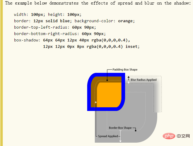
可见:
6、多重阴影
这个效果在上面就看到了,现在再补充一些内容。
语法:可以设置任意多个阴影,用逗号隔开。
一个box有多重阴影时,需要注意顺序:多个阴影从上往下分布,第一个阴影在最顶层。
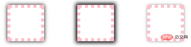
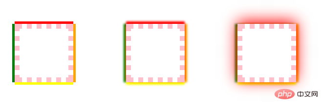
举例:单边阴影效果
先解释一下:可单独设置左边框的阴影,右边框的阴影,上边框的阴影,下边框的阴影,其实这样说也对,因为效果看起来就是这样,但根本原因是阴影在盒子后面,只是让阴影的位置发生了变化,其他3 个边的阴影还是存在的,只是被覆盖住了而已,所以,设置某个边的阴影是个很虚的东东了,哎,网上这种说法初看还让我略感困惑,所以我这里说是单边阴影效果,告诉大家只是一种效果,本质还是个box。
例子解释:给第一个div的上右下左border分别设置红橙黄绿,四种颜色,则red-shadow在最顶层,green-shadow在最底层,如下图左。
给其加上blur模糊半径,效果更明显,如下图中,可见red-shadow的模糊半径不受干扰,因为在最顶层;接下来orange-shadow次之,被red-shadow的radius干扰;yellow-shadow被orange-shadow和red-shadow的radius干扰;同理green-shadow被它上面的所有shadow的radius干扰。
如果还是不太理解,那给red-shadow设置一个很大的radius,比如50,就可以看到非常明显的效果了,见下图右。
7、阴影和布局
阴影不影响布局, 但是可能会覆盖其他box或者其他box的阴影。
阴影不触发滚动条,也不增加滚动区域的大小。
所以布局时可忽略阴影。
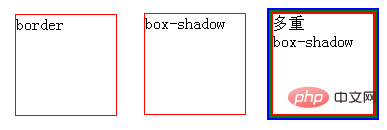
8、spread妙用
用spread模拟实现border
borderbox-shadow多重
box-shadow
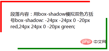
用spread实现双色方括号
段落内容:用box-shadow模拟双色方括号box-shadow: -24px -24px 0 -20px red,24px 24px 0 -20px green;
(学习视频分享:css视频教程)
The above is the detailed content of How to write border shadow in css. For more information, please follow other related articles on the PHP Chinese website!


![[Web front-end] Node.js quick start](https://img.php.cn/upload/course/000/000/067/662b5d34ba7c0227.png)


