This article will give you a detailed introduction to the method of realizing colorful and intelligent shadows using pure CSS. It has certain reference value. Friends in need can refer to it. I hope it will be helpful to everyone.

#Ever wondered how to create a drop shadow effect that inherits certain colors from a foreground element? Read this article and find out how!
I passed by Home Depot (Home Depot, American Home Depot Company, the world's leading retailer of home building materials and supplies) a few days ago. They were displaying and selling smart lights on a large scale, one of which is a series of light bulbs located behind the television that cast a light similar to the color displayed on the foreground screen of the television, similar to the one pictured below.
Pay attention to what's going on behind the TV. The colors displayed in the foreground of the television screen are projected by the lamp into a colored shadow background. As the colors on the screen change, the background projection color also changes. Really cool, right?
After seeing this, my first natural thought was, could I usewebdevelopment techniques to create a colorful shadow that was smart enough to simulate the foreground color? Facts have proved that this effect can be achieved using onlyCSS. In this article, we'll look at how. [Learning video sharing:css video tutorial]
Let’s get started!
As you will discover in the following paragraphs, creating smart colored shadows using onlyCSSmay seem at first glance It is a difficult task, but when we take it step by step and break the difficult parts into smaller parts, you will find that everything becomes easier to understand and digest. In the following chapters, we will create an example that looks like this:
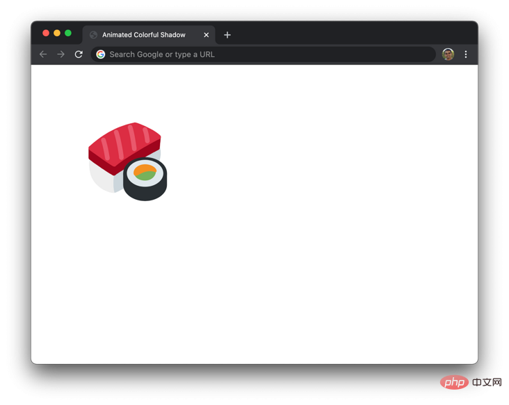
#What you see is a picture of sushi with a background color corresponding to the foreground color shadow. To emphasize that what we're doing is dynamic, add a pulsating animation effect to the shadow. With this working example, let’s dive into how to make everything come alive using onlyHTMLandCSS.
TheHTMLused to display sushi looks like this and there is nothing special:
We have a parentdivElement.parent, which contains a child element.suchifor display. We instantiate it by using a background image. The specific style rules of the.sushielement are as follows:
.sushi { margin: 100px; width: 150px; height: 150px; background-image: url("https://www.kirupa.com/icon/1f363.svg"); background-repeat: no-repeat; background-size: contain; }
In the above style rules, we willdivSet to150 * 150width and height pixels, and setbackground-imageand related attributes. If we show the results we have achieved now, you can see the content as shown below .

Now that we have our sushi image displayed, the more interesting part is defining the shadow. We will define the shadow by specifying a child pseudo-element::after, which will do3things:
Behind the div;drop-shadowshadow effects through filters.The above 3 functions are implemented by the following 2 style rules:
.colorfulShadow { position: relative; } .colorfulShadow::after { content: ""; width: 100%; height: 100%; position: absolute; background: inherit; background-position: center center; filter: drop-shadow(0px 0px 10px rgba(0, 0, 0, 0.50)) blur(20px); z-index: -1; }
Take a moment to browse the implementation here and pay close attention to each attribute and corresponding value. The most notable are thebackgroundattribute and thefilterattribute. The value ofbackgroundisinherit, which means it will inherit the background value of the parent element:
background: inherit;
filterThe attribute defines two Filter values:drop-shadowandblur
filter: drop-shadow(0px 0px 10px rgba(0, 0, 0, 0.50)) blur(20px);
Ourdrop-shadowfilter is set to a50%Transparency black shadow.blurThe filter sets a blur effect of20pxfor the element. The combination of these two filters can ultimately create colorful shadows. When these two style rules are in effect, we can see the colorful shadows appearing behind the sushi image as shown below:
To this point, we have achieved a lot. For the sake of completeness, if you want colorful shadows with a zoom-in and zoom-out animation, the following additionalCSScan help you achieve that:
.colorfulShadow { position: relative; } .colorfulShadow::after { content: ""; width: 100%; height: 100%; position: absolute; background: inherit; background-position: center center; filter: drop-shadow(0px 0px 10px rgba(0, 0, 0, 0.50)) blur(20px); z-index: -1; /* animation time! */ animation: oscillate 1s cubic-bezier(.17, .67, .45, 1.32) infinite alternate; } @keyframes oscillate { from { transform: scale(1, 1); } to { transform: scale(1.3, 1.3); } }
如果你想在不使用循环动画效果的情况下增强交互性,也可以使用CSS transition来改变阴影的行为,如在hover操作情况下。需要强调的难点是对待伪元素只需要像对待用HTML创建的或JavaScript动态创建的元素一样,唯一的不同是这个元素完全是仅使用CSS创建的!
伪元素允许我们使用CSS来创建通常在HTML和JavaScript领域内完成的元素创建任务。对于我们多彩的智能阴影来说,我们依赖于父元素有一个背景图像集,这使得我们定义一个既可以继承父级背景细节又可以设置模糊效果和投影效果的子元素变得容易。虽然这一切都很好,减少了我们大量的复制粘贴工作,但是这种方法也不是很灵活。
如果我想将这样的阴影应用到一个不只是带有背景图像的空元素上,该怎么办呢?如果我有一个HTML元素如一个按钮或组合框,我想应用这种阴影效果呢?一种解决方案是依靠JavaScript复制DOM中的相应元素,将其放置在前台元素底层,应用过滤器,这样也是一种方法。虽然这可以实现效果,但我想到这个有点重复DOM元素的沉重过程就不寒而栗。更糟糕的是,JavaScript没有将你想提供的任意视觉意向转换为渲染目标位图的能力!
更多编程相关知识,请访问:编程视频!!
The above is the detailed content of Detailed explanation of how to achieve colorful and intelligent shadows using pure CSS. For more information, please follow other related articles on the PHP Chinese website!