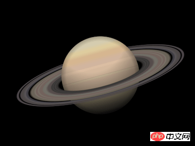
This article introduces you to the article about how to use pure CSS to achieve the effect of a Saturn. It has a good reference value and I hope it can help friends in need.

Define dom, the container itself represents the planet Saturn, and the ring Element represents the rings of Saturn:
<p>
        <span></span>
    </p>
Centered display:
body {
    margin: 0;
    height: 100vh;
    display: flex;
    align-items: center;
    justify-content: center;
    background-color: black;
}Define container size:
.saturn {
    width: 20em;
    height: 20em;
    font-size: 20px;
}Draw the planet Saturn (this is a draft, it will be refined later) :
.saturn {
    position: relative;
}

.saturn::before,
.saturn::after {
    content: '';
    position: absolute;
    width: 9em;
    height: 9em;
    background: linear-gradient(
        palegoldenrod 0%,
        tan 10%,
        burlywood 30%,
        palegoldenrod 60%,
        darkgray 100%
    );
    border-radius: 50%;
    left: calc((20em - 9em) / 2);
    top: calc((20em - 9em) / 2);
}Draw the rings of Saturn (this is a draft and will be refined later):
.rings {
    position: absolute;
    width: inherit;
    height: inherit;
    background: radial-gradient(
        transparent 35%,
        dimgray 40%,
        slategray 50%,
        transparent 60%,
        dimgray 60%,
        slategray 70%,
        transparent 70%
    );
}Change the perspective of observing the rings of Saturn:
.rings {
    transform: rotateX(75deg);
}In order to make Saturn appear as it is The effect of the rings of Saturn is to divide Saturn into upper and lower halves, so that the layer order of them and the rings of Saturn is from bottom to top: the lower half of the planet, the rings of Saturn, the upper half of the planet:
.saturn::before {
    clip-path: inset(50% 0 0 0);
}

.saturn::after {
    clip-path: inset(0 0 50% 0);
}At this point, the overall structure of Saturn has been drawn, and then the details are refined.
Paint the rings of Saturn with rich gradient colors:
.rings {
    background: radial-gradient(
        rgba(24,19,25,0) 0%,
        rgba(53,52,51,0) 34%,
        rgba(55,54,52,1) 36%,
        rgba(56,55,53,1) 37%,
        rgba(68,67,66,1) 38%,
        rgba(56,55,53,1) 39%,
        rgba(68,67,66,1) 40%,
        rgba(56,55,53,1) 41%,
        rgba(87,77,76,1) 42%,
        rgba(87,77,76,1) 44%,
        rgba(113,110,103,1) 46%,
        rgba(113,110,103,1) 48%,
        rgba(113,98,93,1) 49%,
        rgba(113,98,93,1) 51%,
        rgba(122,115,105,1) 52%,
        rgba(113,98,93,1) 53%,
        rgba(113,98,93,1) 54%,
        rgba(122,115,105,1) 55%,
        rgba(106,99,89,1) 56%,
        rgba(106,99,89,1) 58%,
        rgba(79,76,76,0) 60%,
        rgba(65,64,70,1) 61%,
        rgba(65,64,70,1) 62%,
        rgba(90,85,89,1) 63%,
        rgba(78,74,73,1) 65%,
        rgba(78,73,74,1) 67%,
        rgba(78,73,74,0) 68%,
        rgba(78,73,75,1) 69%,
        rgba(78,73,75,1) 70%,
        rgba(78,73,76,0) 71%,
        rgba(77,72,76,0) 72%,
        rgba(24,19,25,0) 100%
    );
}Paint the planet with rich gradient colors:
.saturn::before,
.saturn::after {
    background:
        linear-gradient(
            rgba(212,203,174,1) 0%,
            rgba(212,203,174,1) 10%,
            rgba(221,203,157,1) 15%,
            rgba(221,203,157,1) 17%,
            rgba(213,181,143,1) 22%,
            rgba(213,181,143,1) 26%,
            rgba(208,180,158,1) 32%,
            rgba(208,180,158,1) 36%,
            rgba(218,188,162,1) 37%,
            rgba(218,188,162,1) 39%,
            rgba(211,184,157,1) 41%,
            rgba(211,184,157,1) 49%,
            rgba(205,186,156,1) 51%,
            rgba(205,186,156,1) 52%,
            rgba(202,176,153,1) 53%,
            rgba(202,176,153,1) 65%,
            rgba(190,177,145,1) 68%,
            rgba(190,177,145,1) 80%,
            rgba(150,144,130,1) 91%,
            rgba(150,144,130,1) 95%,
            rgba(131,129,117,1) 97%,
            rgba(131,129,117,1) 100%
        );
}Then add lighting effects to the planet:
.saturn::before,
.saturn::after {
    background:
        radial-gradient(
            circle at top,
            transparent 40%,
            black
        ),
        radial-gradient(
            transparent 62%,
            black
        ),
        linear-gradient(
            rgba(212,203,174,1) 0%,
            rgba(212,203,174,1) 10%,
            rgba(221,203,157,1) 15%,
            rgba(221,203,157,1) 17%,
            rgba(213,181,143,1) 22%,
            rgba(213,181,143,1) 26%,
            rgba(208,180,158,1) 32%,
            rgba(208,180,158,1) 36%,
            rgba(218,188,162,1) 37%,
            rgba(218,188,162,1) 39%,
            rgba(211,184,157,1) 41%,
            rgba(211,184,157,1) 49%,
            rgba(205,186,156,1) 51%,
            rgba(205,186,156,1) 52%,
            rgba(202,176,153,1) 53%,
            rgba(202,176,153,1) 65%,
            rgba(190,177,145,1) 68%,
            rgba(190,177,145,1) 80%,
            rgba(150,144,130,1) 91%,
            rgba(150,144,130,1) 95%,
            rgba(131,129,117,1) 97%,
            rgba(131,129,117,1) 100%
        );
}Finally, rotate the picture a little:
.saturn {
    transform: rotate(-15deg);
}You’re done!
Related recommendations:
How to use CSS and D3 to achieve the effect of endless hexagonal space
How to use css to draw a Bird(code)
The above is the detailed content of How to use pure CSS to achieve the effect of a Saturn. For more information, please follow other related articles on the PHP Chinese website!


