


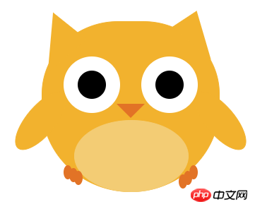
The content of this article is about using CSS to draw a bird. The content is very detailed. Friends in need can refer to it. I hope it can help you.
It’s not difficult either. Just write out the body parts step by step and then position them. Here is a rendering, and I added animation to the two later, which is a little ugly. I will slowly modify it later
 ##
##
<!DOCTYPE html>
<html>
<head>
    <title></title>
</head>
<style type="text/css">
    body{
        font-size: 0;
        text-align: center;
    }
    .wrap{
        position: relative;
        width: 500px;
        margin: 0 auto;
    }
    .a{
        display: inline-block;
        margin-top: 30px;
        width: 250px;
        height: 240px;
        background-color:#f2b22e;
        border: 1px solid #f2b22e;
        border-radius: 60% 60% 70% 70%;
    }

    .b{
        display: inline-block;
        width: 0;
        height: 0;
        border-bottom:40px solid #f2b22e;
        border-right: 60px solid transparent;
        border-left: 12px solid transparent;
        transform: rotate(40deg);
        position: absolute;
        top: 26px;
        right: 115px;
    }
    .c{
        display: inline-block;
        width: 0;
        height: 0;
        border-top:60px solid #f2b22e;
        border-right: 60px solid transparent;
        border-left: 12px solid transparent;
        transform: rotate(140deg);
        position: absolute;
        top: 26px;
        left: 105px;
    }
    .d{
        width: 100px;
        height: 40px;
        border-radius: 50%;
        border:1px solid #f2b22e;
        background-color:  #f2b22e;
        transform: rotate(0deg);
        position: absolute;
        top: 150px;
        right: 72px;
        animation: bird_right 0.5s linear infinite;
    }
    .e{
        width: 100px;
        height: 40px;
        border-radius: 50%;
        border:1px solid #f2b22e;
        background-color:  #f2b22e;
        transform: rotate(0deg);
        position: absolute;
        top: 150px;
        left: 72px;
        animation: bird_left 0.5s linear infinite;
    }
    .f{
        width: 40px;
        height: 40px;
        border: 20px solid #fff;
        border-radius: 50%;
        background-color: #000;
        position: absolute;
        top: 80px;
        left: 155px;
    }
    .g{
        width: 40px;
        height: 40px;
        border: 20px solid #fff;
        border-radius: 50%;
        background-color: #000;
        position: absolute;
        top: 80px;
        right: 155px;
    }
    .h{
        width: 0;
        height: 0;
        border-top:20px solid #e27326;
        border-left:20px solid transparent;
        border-right:20px solid transparent;
        position: absolute;
        top: 147px;
        left: 230px;
    }
    .i{
        width: 160px;
        height: 100px;
        border:1px solid #f3cc74;
        background-color: #f3cc74;
        border-radius: 50%;
        position: absolute;
        bottom: 0px;
        left: 170px;
    }
    .j{
        width: 12px;
        border-bottom:20px solid #e27326;
        border-radius: 50%;
        position: absolute;
    }
    .j_{
        bottom: 14px;
        left: 163px;
    }
    .k{
        left: 155px;
        bottom: 18px;
    }
    .l{
        left: 170px;
        bottom: 10px;
    }
    .n{
        bottom: 10px;
        right: 163px;
    }
    .m{
        bottom: 18px;
        right: 155px;
    }
    .o{
        bottom: 5px;
        right: 170px;
    }
    @-webkit-keyframes bird_left{
        0% {transform:rotate(0deg)}
        10% {transform:rotate(-10deg)}
       20% {transform:rotate(-20deg)}
       40% {transform:rotate(-30deg)}
       60% {transform:rotate(-40deg)}
       80% {transform:rotate(-50deg)}
      100% {transform:rotate(-60deg)}
    }
    @-webkit-keyframes bird_right{
        0% {transform:rotate(0deg)}
        10% {transform:rotate(10deg)}
       20% {transform:rotate(20deg)}
       40% {transform:rotate(30deg)}
       60% {transform:rotate(40deg)}
       80% {transform:rotate(50deg)}
      100% {transform:rotate(60deg)}
    }

    @-moz-keyframes bird_right{
        0% {transform:rotate(0deg)}
        10% {transform:rotate(10deg)}
       20% {transform:rotate(20deg)}
       40% {transform:rotate(30deg)}
       60% {transform:rotate(40deg)}
       80% {transform:rotate(50deg)}
      100% {transform:rotate(60deg)}
    }
    @-moz-keyframes bird_left{
        0% {transform:rotate(0deg)}
        10% {transform:rotate(-10deg)}
       20% {transform:rotate(-20deg)}
       40% {transform:rotate(-30deg)}
       60% {transform:rotate(-40deg)}
       80% {transform:rotate(-50deg)}
      100% {transform:rotate(-60deg)}
    }

    @-o-keyframes bird_left{
        0% {transform:rotate(0deg)}
        10% {transform:rotate(-10deg)}
       20% {transform:rotate(-20deg)}
       40% {transform:rotate(-30deg)}
       60% {transform:rotate(-40deg)}
       80% {transform:rotate(-50deg)}
      100% {transform:rotate(-60deg)}
    }
    @-o-keyframes bird_right{
        0% {transform:rotate(0deg)}
        10% {transform:rotate(10deg)}
       20% {transform:rotate(20deg)}
       40% {transform:rotate(30deg)}
       60% {transform:rotate(40deg)}
       80% {transform:rotate(50deg)}
      100% {transform:rotate(60deg)}
    }
</style>
<body>
    <p class="wrap">
        <p class="a"></p>
        <p class="b"></p>
        <p class="c"></p>
        <p class="d"></p>
        <p class="e"></p>
        <p class="f"></p>
        <p class="g"></p>
        <p class="h"></p>
        <p class="i"></p>
        <p class="j j_"></p>
        <p class="j k"></p>
        <p class="j l"></p>
        <p class="j n"></p>
        <p class="j m"></p>
        <p class="j o"></p>
    </p>
</body>
</html>How to use pure CSS to achieve the effect of a cartoon parrot
How to use pure CSS to achieve the effect of a coffee machine
The above is the detailed content of How to draw a bird using css (code). For more information, please follow other related articles on the PHP Chinese website!
 Minimum configuration requirements for win10 system
 The difference between console cable and network cable
 How to implement color fonts in css
 Rename the apk software
 Windows cannot configure this wireless connection
 Introduction to the difference between javascript and java
 Top ten digital currency exchanges
 What does win11 activation status activity mean?


![[Web front-end] Node.js quick start](https://img.php.cn/upload/course/000/000/067/662b5d34ba7c0227.png)


