


This article mainly introduces an example sharing of using CSS to create graphic deformation pop-up effects. The size of the pop-up window can be modified using jQuery. Friends who need it can refer to it.
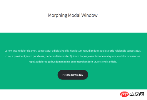
Pop-up forms are commonly used on web pages. Interaction design, in this era that focuses on interactive animation experience, web pop-ups can also come up with some fresh ideas, such as the CSS deformation Modal Window shared today. 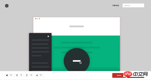
When the user clicks the button, the button will turn into a full-screen screen and then display the content. The entire display process is smooth and friendly. Maybe you can try it on your new project.
Demo page: http://codyhouse.co/gem/morphing-modal-window/
After clicking the "Fire Modal Window" button, the button will be slow Slowly increases the size until it reaches the entire screen. Here is a GIF demonstration: 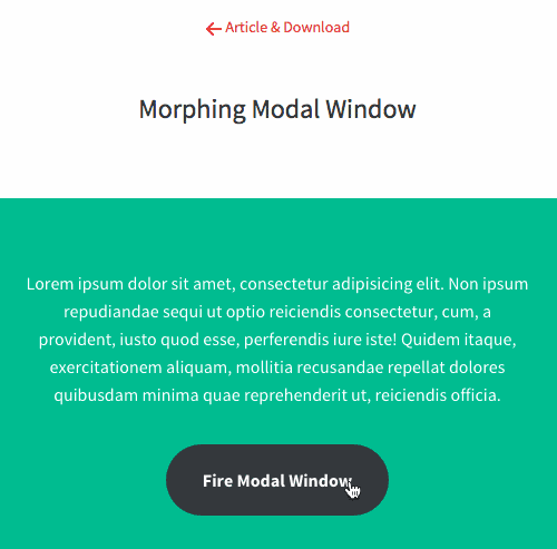
Usage Tutorial
This code is compatible with Chrome, Firefox, Safari, Opera, and IE requires version 9.0 or above (IE9)
STEP 1: Create HTML layout
<section class="cd-section">
<!-- section content here -->
<p class="cd-modal-action">
<a href="#0" class="btn" data-type="modal-trigger">Fire Modal Window</a> <!— 这是窗体按钮 -->
<span class="cd-modal-bg"></span>
</p>
<p class="cd-modal">
<p class="cd-modal-content">
<!— 这是窗体内容区域 -->
</p>
</p>
<a href="#0" class="cd-modal-close">Close</a> <!— 这是关闭按钮 -->
</section>
STEP 2: Add CSS style
.cd-modal-action {
position: relative;
}
.cd-modal-action .btn {
width: 12.5em;
height: 4em;
background-color: #123758;
border-radius: 5em;
transition: color 0.2s 0.3s, width 0.3s 0s;
}
.cd-modal-action .btn.to-circle {
width: 4em;
color: transparent;
transition: color 0.2s 0s, width 0.3s 0.2s;
}
.cd-modal-action .cd-modal-bg {
position: absolute;
top: 0;
left: 50%;
transform: translateX(-2em);
width: 4em;
height: 4em;
background-color: #123758;
border-radius: 50%;
opacity: 0;
visibility: hidden;
transition: visibility 0s 0.5s;
}
.cd-modal-action .cd-modal-bg.is-visible {
opacity: 1;
visibility: visible;
}STEP 3: Add jQuery
This code uses jQuery. You can modify the window size through the following code.
var btnRadius = $('.cd-modal-bg').width()/2,
left = $('.cd-modal-bg').offset().left + btnRadius,
top = $('.cd-modal-bg').offset().top + btnRadius - $(window).scrollTop(),
scale = scaleValue(top, left, btnRadius, $(window).height(), $(window).width());
function scaleValue( topValue, leftValue, radiusValue, windowW, windowH) {
var maxDistHor = ( leftValue > windowW/2) ? leftValue : (windowW - leftValue),
maxDistVert = ( topValue > windowH/2) ? topValue : (windowH - topValue);
return Math.ceil(Math.sqrt( Math.pow(maxDistHor, 2) + Math.pow(maxDistVert, 2) )/radiusValue);
}The above is the entire content of this article. I hope it will be helpful to everyone's study. For more related content, please pay attention to the PHP Chinese website!
Related recommendations:
CSS to achieve the effect of text surrounding images
How to use css3 to implement a circular progress bar
Use CSS3 to write grayscale filters to create black and white photo effects
The above is the detailed content of Create graphic deformation pop-up effect with CSS. For more information, please follow other related articles on the PHP Chinese website!


![[Web front-end] Node.js quick start](https://img.php.cn/upload/course/000/000/067/662b5d34ba7c0227.png)


