


This article will share with you the css3 code to implement the mouse hover to display the content to be expanded. When the space is too crowded and you need to hide part of the content, it is better to use this function. The editor below has brought the specific implementation code, let’s take a look
When we are making navigation tags, sometimes the space is too crowded and some content needs to be hidden, so here I wrote an effect of displaying expanded content on mouse hover, as shown in the figure below.
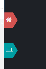
Generally speaking, the effect is relatively easy to achieve, but what is more troublesome is that the triangle part uses the pseudo element::after, and sets over- on the parent element. When flow:hidden is used, pseudo-elements will also be hidden. The final solution is to wrap the text and icons with a and then set the over-flow attribute on them.
HTML code:
<p id="nav">
<a id="nav-main"><span><i class="icon-home"></i> 主界面</span></a>
<a id="nav-sum"><span><i class="icon-laptop"></i> 统计界面</span></a>
</p>
CSS代码:
/*******************************************************************************/
/*********************************** nav **************************************/
/*******************************************************************************/
#nav{
box-sizing:border-box;
width:200px;
height:100%;
position:fixed;
padding-top:80px;
}
#nav a{
display:block;
width:30px;
height:52px;
position:relative;
margin-top:50px;
}
#nav a span{
display:inline-block;
width:46px;
height:50px;
font-size:1em;
font-weight:600;
color:rgba(255,255,255,0.9);
text-indent:3px;
line-height:52px;
cursor:pointer;
overflow:hidden;
}
#nav a span i{
font-size:1.3em;
}
#nav a::after{
content:'';
display:block;
width:0;
height:0;
position:absolute;
rightright:-32px;
bottombottom:0;
border-top:26px solid transparent;
border-right:16px solid transparent;
border-bottom:26px solid transparent;
}
#nav-main{
background-color:rgb(211,83,80);
}
#nav-sum{
background-color:rgb(0,158,163);
}
#nav-main::after{
border-left:16px solid rgb(211,83,80);
}
#nav-sum::after{
border-left:16px solid rgb(0,158,163);
}
#nav a:hover{
-webkit-animation:extend-a 0.5s;
-moz-animation:extend-a 0.5s;
animation:extend-a 0.5s;
width:100px;
}
#nav a span:hover{
-webkit-animation:extend-span 0.5s;
-moz-animation:extend-span 0.5s;
animation:extend-span 0.5s;
width:116px;
}
/******************* a扩展效果 ******************/
@-webkit-keyframes extend-a{
0% {
width:30px;
}
100% {
width:100px;
}
}
@-moz-keyframes extend-a{
0% {
width:30px;
}
100% {
width:100px;
}
}
@keyframes extend-a{
0% {
width:30px;
}
100% {
width:100px;
}
}
/******************* span扩展效果 ******************/
@-webkit-keyframes extend-span{
0% {
width:46px;
}
100% {
width:116px;
}
}
@-moz-keyframes extend-span{
0% {
width:46px;
}
100% {
width:116px;
}
}
@keyframes extend-span{
0% {
width:46px;
}
100% {
width:116px;
}
}The icon uses the API provided by font-awesome. Just import its css file when using it.
The above is the entire content of this article. I hope it will be helpful to everyone's study. For more related content, please pay attention to the PHP Chinese website!
Related recommendations:
CSS to create graphics deformation pop-up effects
CSS3 and jQuery implement Hover effects that follow the mouse direction
CSS to implement adaptive width menu button effect
The above is the detailed content of CSS3 implements mouse hover to display expanded content. For more information, please follow other related articles on the PHP Chinese website!


![[Web front-end] Node.js quick start](https://img.php.cn/upload/course/000/000/067/662b5d34ba7c0227.png)


