


This article mainly introduces CSS3 animation to achieve frame-by-frame animation effect, which has certain reference value. Interested friends can refer to it
The animation attribute in css3 is very powerful, but you can use it yourself Relatively few, I just happened to be asked about it in an interview recently. I will make a short summary of animation while I have time now. At the same time, a demo of frame-by-frame animation is implemented as an exercise
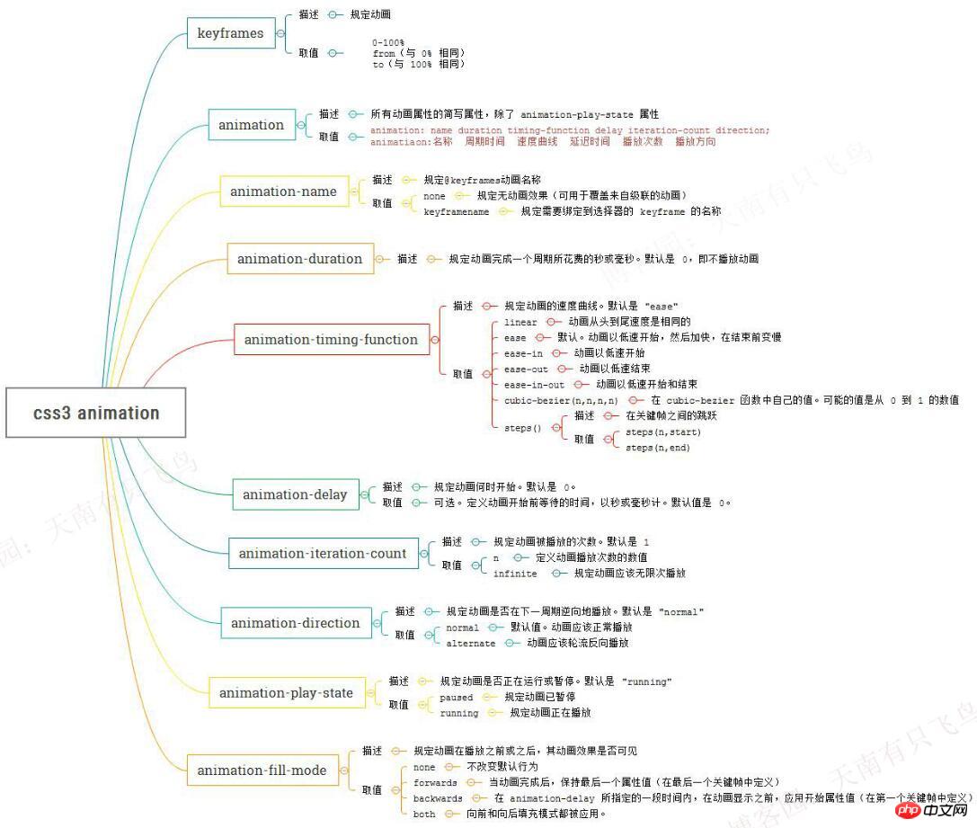
List of animation attributes
Because there are many animation attributes, it is a bit painful to see it in w3c, so I just did it. A map, if you want to check it later, it will be clear at a glance
Use animation to achieve frame-by-frame animation
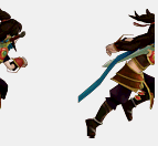
Be familiar with the properties of animation After that, I have to find a simple small project to implement. Frame-by-frame animation is so interesting. Let’s run one to satisfy myself first. The idea is very simple, which is to give the element a sprite background, and then add the frame animation to change the background-position. Key code:
@keyframes run{ from{ background-position: 0 0; } to{ background-position: -1540px 0 ; } } p{ width:140px; height:140px; background: url(run.png) ; animation-name:run; animation-duration:1s; animation-iteration-count:infinite; }
It turns out that animation transitions in ease mode by default, which inserts tweening animation between each key frame, so the animation effect is consistent
It’s easy to solve if you know the reason. The solution is:
@keyframes run{ 0%, 8%{ /*动作一*/ } 9.2%, 17.2%{ /*动作二*/ } ... }
step2: Transition between actions for 1.2 frames, set action two at 9.2%, action two Ended at 17.2%
css3逐帧动画
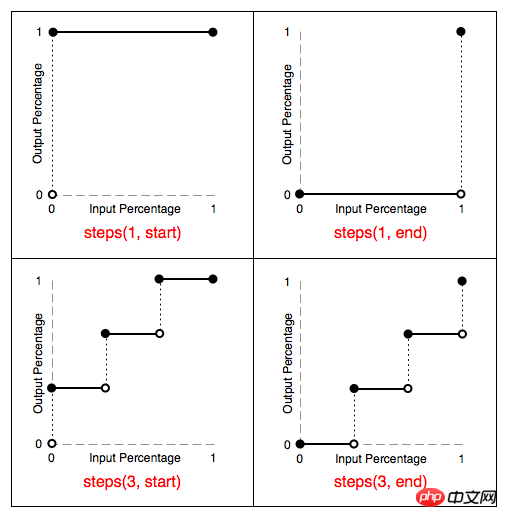
steps(1,end): Maintain the 0% style until the end of this frame (not the entire cycle)
The step-start effect is equivalent to steps(1,start), and the step-end effect is equivalent to steps(1,end)
css3逐帧动画
How to use CSS3 box-reflect to create a reflection effect
About the animation attribute in CSS Instructions
The above is the detailed content of About CSS3 animation to achieve frame-by-frame animation effect. For more information, please follow other related articles on the PHP Chinese website!


![[Web front-end] Node.js quick start](https://img.php.cn/upload/course/000/000/067/662b5d34ba7c0227.png)


