


This article mainly introduces the use examples of animation attribute of CSS. It is the basic knowledge for introductory learning of CSS. Friends who need it can refer to it
1. The syntax of animation
1. @keyframes——Insert key frames
(1)FormTo form:
@keyframes demo { from { Properties:Properties value; } Percentage { Properties:Properties value; } to { Properties:Properties value; } }
(2)Percent form:
@keyframes demo { 0% { Properties:Properties value; } Percentage { Properties:Properties value; } 100% { Properties:Properties value; } }
2. animation-name——Define the name of the animation
animation-name: none | "The name of the animation";
(1)The name of the animation is the animation created by Keyframes The name must be consistent with the name of the created animation. If they are inconsistent, no animation effect will be achieved
(2) none is the default value. When the value is none, there will be no animation effect
3. animation-duration
animation- duration: time (s)
animation-duration is the duration for the specified element to play animation. The value is a numerical value, the unit is seconds (s), and its default value is "0".
4. animation-timing-function
animation-timing-function:ease (buffer) || ease-in (acceleration) || ease-out (deceleration) || ease-in -out (accelerate first and then decelerate) || linear (constant speed) || cubic-bezier (customize a time curve)
animation-timing-function is used to specify the playback method of animation, with the following six transformation methods: ease (buffer); ease-in (acceleration); ease-out (deceleration); ease-in-out (accelerate first and then decelerate); linear (constant speed); cubic-bezier (customize a time curve).
5. animation-delay
animation-delay: time(s)
animation-delay: is used to specify the start time of element animation. The value is a numerical value, the unit is seconds (s), and its default value is "0". This attribute is used in the same way as animation-duration.
6, animation-iteration-count
animation-iteration-count:infinite || number
animation-iteration-count is the number of cycles for the specified element to play animation, and its value is Number, the default value is "1" or infinite (infinite number of loops).
7, animation-direction
animation-direction: normal || alternate
animation-direction specifies the direction of the element animation playback. If it is normal, then each cycle of the animation will It plays forward; if it is alternate, then the animation plays forward in the even-numbered times and in the reverse direction in the odd-numbered times.
8. animation-play-state
animation-play-state:running || paused
animation-play-state is mainly used to control element animation play status. It mainly has two values, running and paused, of which running is the default value. This attribute is currently rarely supported by the kernel, so it is only mentioned briefly.
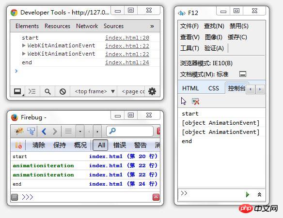
2. Animation event interface
In fact, there are currently only three basic events: start, iteration, and end. You know what the beginning and the end mean. As for this iteration, since there is an iteration-count attribute in animation, which can define the number of times the animation is repeated, the animation will start and end many times. But the real "start" and "end" events are about the entire animation, they will only trigger once, and the "end and start next" event caused by the repeated animation in the middle will trigger the entire "iteration" event.
The standard names of these three events are:
Start: animationstart
Iteration: animationiteration
End: animationend
However, the current version of Chrome needs to add the webkit prefix, and pay attention to the case.
Start: webkitAnimationStart
Iteration: webkitAnimationIteration
End: webkitAnimationEnd
Finally, the example code and screenshots
The above is the summary of this article All content, I hope it will be helpful to everyone's learning. For more related content, please pay attention to the PHP Chinese website!
Related recommendations:
About CSS How to use background
About the compatibility of Hack in CSS under different browsers
How to use CSS3 pseudo The element implements a gradually glowing square border
The above is the detailed content of How to use the animation attribute in CSS. For more information, please follow other related articles on the PHP Chinese website!


![[Web front-end] Node.js quick start](https://img.php.cn/upload/course/000/000/067/662b5d34ba7c0227.png)


