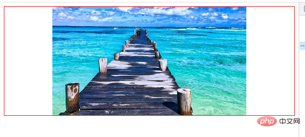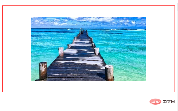
3 methods: 1. Use the text-align attribute to set "text-align: center;" to the parent element containing img. 2. Use the flexible box layout and set "display: flex;justify-content: center;" to the parent element. 3. Use grid layout and set "display:grid;align-items:center;justify-items:center;" to the parent element.

The operating environment of this tutorial: Windows 7 system, CSS3&&HTML5 version, Dell G3 computer.
Method 1: Use the text alignment attribute text-align
text-align to control the alignment of text lines in the element. You can set a parent div for img, so that img can be the text of the div, and then use text-align to modify the div attributes. (Add attributes to the parent element)
Note: The child element must be inline or inline-block; if the child element is also a div, you need to set display: inline/inline-block for the child element. Here the child element img is inline so omit this step. This method is suitable for inline elements, such as the centering of img
<!DOCTYPE html>
<html>
	<head>
		<meta charset="utf-8">
		<style>
			#pic {
				border: 1px solid red;
			    text-align: center;   /*表示div的子元素居中*/
			}
		</style>
	</head>

	<body>

		 <div id="pic">
		        <img  src="img/2.jpg" class="logo" alt="Img in css does not know the width and height, how to achieve centering" >
		 </div>

	</body>
</html>Method 2: Use flexible box layout
css
#pic {
    display: flex;
    justify-content: center;
}
Flexible box layout can achieve almost any layout using a few lines of css. And the most amazing thing is that even the top two rows of n pictures can be centered, without having to consider the picture layout and position.
Method 3: Using grid layout
Flexible boxes are most commonly used in navigation bars. In contrast, grid layout is a universal layout system.
#pic {
    display: grid;
    align-items: center;     /*块级方向(纵向)上的全部栅格元素居中对齐*/
    justify-items: center;  /*行内方向(横向)所有的元素中线对齐*/
}
#So it is very convenient to deal with the problem of aligning multiple pictures.
(Learning video sharing: web front-end)
The above is the detailed content of Img in css does not know the width and height, how to achieve centering. For more information, please follow other related articles on the PHP Chinese website!