Two methods: 1. Use background-clip, the syntax is "text element {background-image: linear-gradient(..); background-clip: text; color: transparent;}". 2. Use mask, the syntax is "text element {color: color value 1;} text element: before {mask: linear-gradient(..); color: color value 2;}".

The operating environment of this tutorial: Windows 7 system, CSS3&&HTML5 version, Dell G3 computer.
In CSS, you can achieve different colors of text by adding gradient effects to text elements. The following introduces two ways to achieve text gradient effects.
Method 1: linear-gradient() background-clip
There is no direct property to set in CSS Text gradient, usually text can only be solid color. However, you can use background clipping to make the background color appear in the text area, which looks like the text has a gradient.
Rendering

##Code
<!DOCTYPE html>
<html>

<head>
    <meta charset="utf-8">
    <style>

    .text {
        background-image: linear-gradient(to right, red, blue);
        background-clip: text;
        -webkit-background-clip: text;
        color: transparent; /*需要文字透明*/
    }
    </style>
</head>

<body>
       <h1 class="text">为你定制 发现精彩</h1>
</body>
</html>background: linear-gradient(to right, red, blue); This line sets the background to a gradient color. Please note that this is an abbreviation. In fact, background-image is set to a gradient color, not background-color, but the background image is set to a gradient color.
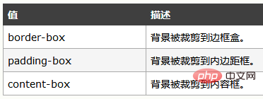
-webkit-background-clip: text; This line will talk about the background-clip attribute:
Syntax
background-clip: border-box|padding-box|content-box;
 ##The above does not mention the value of text. Seeing the previous prefix, you should also think that it has compatibility issues and is not currently supported by all browsers.
The value of text means that the text in the block is used as the cropping area to be cropped outward. The background of the text is the background of the block, and the area outside the text will be cropped.
So, we finally write
color: transparent; to make the text transparent, which means that the background color behind it will be displayed.
Method 2: linear-gradient() mask
 Code
Code
<!doctype html>
<html>
<head>
<meta charset="UTF-8" />

<style type="text/css">
    h1{
        position: relative;
        color: yellow;
    }
    h1:before{
        content: attr(text);
        position: absolute;
        z-index: 10;
        color:pink;
        -webkit-mask:linear-gradient(to left, red, transparent );
    }
</style>
</style>
</head>

<body>
    <h1 text="前端简单说">前端简单说</h1>
</body>

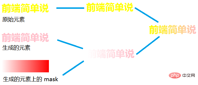
</html>Use the content attribute to specify the content to be inserted.
content value attr is used to get the attribute value, content:attr(attribute name);
content: attr(text);
can get the element text attribute. The text attribute here is a custom attribute. You can also add a tt attribute to the element, like this<h1 tt="Front-end in brief">Front-end in brief </h1>
Then the content attribute is written like this, content: attr(tt); It will also work. Okay, let’s continue talking about the key point of the second method, the mask attribute. You can read the article: //m.sbmmt.com/css-tutorial-494998.html
We can understand the principle of the second method by looking at the pictureSimply put, the mask attribute allows a certain part of the element to be displayed or hidden.
(Learning video sharing:  Getting started with web front-end
The above is the detailed content of How to achieve different colors of text in css. For more information, please follow other related articles on the PHP Chinese website!