Method: 1. Use the "element {animation: name time infinite}" statement to bind animation to the element; 2. Use the "@keyframes name {100%{transform:rotate(rotation angle)}}" statement Set the rotation action of animation to achieve the effect of constant rotation of elements.

The operating environment of this tutorial: Windows 10 system, CSS3&&HTML5 version, Dell G3 computer.
How to achieve a rotating animation effect in css
In css, you can use the animation attribute to bind animation to an element, and the animation attribute can be controlled The animation duration and times, the syntax is:
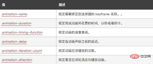
animation: name duration timing-function delay iteration-count direction;
where:

When the value of the attribute is set to "infinite", it specifies that the animation can be played infinitely. When we bind a rotation animation to an element, it can keep rotating.
Then set the rotation action of the animation through @keyframes rules.
The example is as follows:
<!DOCTYPE html>
<html lang="en">
<head>
    <meta charset="UTF-8">
    <meta name="viewport" content="width=device-width, initial-scale=1.0">
    <meta http-equiv="X-UA-Compatible" content="ie=edge">
    <title>Document</title>
    <style>
        div{
            width:100px;
            height:100px;
            background-color:pink;
            animation:fadenum 5s infinite;
        }
        @keyframes fadenum{
   100%{transform:rotate(360deg);}
}
    </style>
</head>
<body>
    <div></div>
</body>
</html>Output result:

(Learning video sharing: css video tutorial)
The above is the detailed content of How to achieve a rotating animation effect in css. For more information, please follow other related articles on the PHP Chinese website!