This article will introduce you to the web page layout grid system in Bootstrap, and understand the working principle, cell width setting and responsive layout method of the Bootstrap grid system. I hope it will be helpful to everyone. !

1.1 Twelve grid system
Grid is grid, English Grid, the reason why some places are grids and some places are rasters is just that the translation habits are different. The twelve grid system means that the entire screen is divided into twelve equal parts according to the width, and one equal part represents one-twelfth of the screen width. Why is it divided into twelve equal parts, rather than ten equal parts or other equal parts? As for parts, this is because 12 is the least common multiple of 1, 2, 3, 4, and 6. According to experience, this division is the most beautiful and practical. Of course, I have also seen 36-grid and 10-grid systems. From the perspective of use, they are indeed not as convenient as 12-grid systems. [Related recommendation: "bootstrap Tutorial"]
In the twelve-grid system, if I want to divide the screen into left and right sides, the left side takes up one-third and the right side takes up three-thirds Second, you can set the left width to 4 grids and the right width to 8 grids. If I need half of the left and right sides, I just need to set each to 6 grids. If I only need to set one page to fill the screen, I can directly set it to 12 grids. Look, isn’t it very convenient?
1.2 Bootstrap grid system tags
Bootstrap grid system design has three tags, namely container, row, col:
The following is a sample code that divides the screen into three equal-width units. There is no need to delve into the specific code writing method. You only need to briefly understand the structure of the grid system. We will cover it later. Detailed description.
<div class="container">
    <div class="row">
        <div class="col">
            第一个单元
        </div>
        <div class="col">
            第二个单元
        </div>
        <div class="col">
            第三个单元
        </div>
    </div>
</div>1.3 Bootstrap Grid System Rules
Use rows to create horizontal groups of columns.
There can be multiple rows in one page.
Rows must be placed inside a container to obtain proper alignment and padding.
Content should be placed within a column (col), and only columns can be direct child elements of rows.
Rows can also be nested within a column. Rows within a column do not need a container because the column itself is a container.
You can directly use predefined grid classes, such as col-screen size-number of grids, to quickly create grid layouts.
In the predefined class, the screen size has 5 values, mainly used for responsive design, see 3.1. The grid number is a number from 1 to 12, which represents the width of the screen.
2.1 Default equal-width layout
If we do not set the width of each column, the default number of columns will be evenly distributed, but if there are more than 12 columns in a row, unpredictable phenomena will occur ( I did a few tests for research. You don’t need to test this. If you want to layout more than 12, you can use a table). I will give a piece of code below. I will continue to use this code with some minor changes, so I won’t give it again.
When using col, col-grid number to set the width, please set the window width to the maximum for the preview effect, otherwise it may cause effect deviation. In addition, we do not recommend this setting in actual applications. Please use responsive Grid layout, even if you don't want to be responsive.
<!doctype html>
<html>
  <head>
    <meta charset="utf-8">
    <meta name="viewport" content="width=device-width, initial-scale=1">
    <meta name="keywords" content="">
    <meta name="description" content="">
    <link href="bootstrap5/bootstrap.min.css" rel="stylesheet">

    <title>网格系统演示</title>
  </head>
  <body>

    <div>
        <div>
            <div>
                <h1>Bootstrap是什么?</h1>
                <p>
                    我们在开发前端页面的时候,如果每一个按钮、样式、处理浏览器兼容性的代码都要自己从零
                    开始去写,那就太浪费时间了。所以我们需要一个框架,帮我们实现一个页面的基础部分和解
                    决一些繁琐的细节,只要在它的基础上进行个性化定制就可以了。Bootstrap 就是这样一个简
                    洁、直观、强悍的前端开发框架,只要学习并遵守它的标准,即使是没有学过网页设计的开发
                    者,也能做出很专业、美观的页面,极大地提高了工作效率。
                </p>
            </div>
            <div>
                <h1>Bootstrap是什么?</h1>
                <p>
                    我们在开发前端页面的时候,如果每一个按钮、样式、处理浏览器兼容性的代码都要自己从零
                    开始去写,那就太浪费时间了。所以我们需要一个框架,帮我们实现一个页面的基础部分和解
                    决一些繁琐的细节,只要在它的基础上进行个性化定制就可以了。Bootstrap 就是这样一个简
                    洁、直观、强悍的前端开发框架,只要学习并遵守它的标准,即使是没有学过网页设计的开发
                    者,也能做出很专业、美观的页面,极大地提高了工作效率。
                </p>
            </div>
            <div>
                <h1>Bootstrap是什么?</h1>
                <p>
                    我们在开发前端页面的时候,如果每一个按钮、样式、处理浏览器兼容性的代码都要自己从零
                    开始去写,那就太浪费时间了。所以我们需要一个框架,帮我们实现一个页面的基础部分和解
                    决一些繁琐的细节,只要在它的基础上进行个性化定制就可以了。Bootstrap 就是这样一个简
                    洁、直观、强悍的前端开发框架,只要学习并遵守它的标准,即使是没有学过网页设计的开发
                    者,也能做出很专业、美观的页面,极大地提高了工作效率。
                </p>
            </div>
            <div>
                <h1>Bootstrap是什么?</h1>
                <p>
                    我们在开发前端页面的时候,如果每一个按钮、样式、处理浏览器兼容性的代码都要自己从零
                    开始去写,那就太浪费时间了。所以我们需要一个框架,帮我们实现一个页面的基础部分和解
                    决一些繁琐的细节,只要在它的基础上进行个性化定制就可以了。Bootstrap 就是这样一个简
                    洁、直观、强悍的前端开发框架,只要学习并遵守它的标准,即使是没有学过网页设计的开发
                    者,也能做出很专业、美观的页面,极大地提高了工作效率。
                </p>
            </div>

        </div>
    </div>

     <script src="bootstrap5/bootstrap.bundle.min.js" ></script>
  </body>
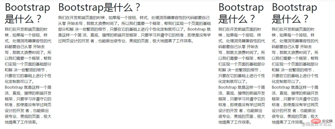
</html>The effect of this code is shown in the picture above. You can copy a few more cells below to see the effect.
              <div class="col">
                <h1>Bootstrap是什么?</h1>
                <p>
                    我们在开发前端页面的时候,如果每一个按钮、样式、处理浏览器兼容性的代码都要自己从零
                    开始去写,那就太浪费时间了。所以我们需要一个框架,帮我们实现一个页面的基础部分和解
                    决一些繁琐的细节,只要在它的基础上进行个性化定制就可以了。Bootstrap 就是这样一个简
                    洁、直观、强悍的前端开发框架,只要学习并遵守它的标准,即使是没有学过网页设计的开发
                    者,也能做出很专业、美观的页面,极大地提高了工作效率。
                </p>
</div>2.2 Set the width of each column
Try to add three is replaced with col-3, col-6, col-3 or other values. In short, the sum of the three numbers is 12. Of course, you can also delete or add one or several cells, as long as the sum of one row is 12.
Through such a simple setting, the width of the cell can be modified very conveniently.
The picture below shows the display effect after setting col to col-2, col-2, col-4, col-4 respectively
2.3 Variable-width columns
If you set the cell value, if there are three cells and only one is set, the remaining The two cells below will divide the remaining space equally, making it easy to set up variable-width columns. As a reminder, the cell where the fixed value is set does not need to be in front. For example, in the 2.1 code, you can set the second cell to occupy the entire screen (col-6), and the other cells are evenly distributed.

2.4 Automatically wrap columns
When each cell has a width value set, when In a row, when the remaining space no longer accommodates a cell, it will automatically wrap.
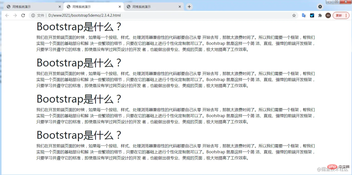
In the example of 2.1, replace the col in the four <div class="col"> with col-6 to see the effect. <p><img src="https://img.php.cn/upload/image/569/508/978/1631529707575018.png" title="1631529707575018.png" alt="An in-depth analysis of the grid system in Bootstrap"></p>
<ul style="list-style-type: disc;"><li>## Take the example of 2.1 and replace the four <p></p>
<div class="col">## Change the col in # to col-12 to see the effect. <code>

Regarding responsive layout, simply speaking, it means that the page layout displayed is different when the screen size is different. For example, when viewing on a mobile phone, there is only one cell in a row, when viewing on a tablet, there are two cells in a row, and when viewing on a computer, there are three. Bootstrap can easily implement this function.
3.2 Screen size division of Bootstrap grid system
Look at the table below. Is it familiar? It is exactly the same as the breakpoint regulations. It’s just an extra xs. In fact, the default is xs, so it can be omitted directly. As you can see, Bootstrap divides the screen into 6 size types through 5 breakpoints.
|
≥576px | md
≥768px | lg
≥992px | xl
≥1200px | xxl
≥1400px |
Container container |
None (auto) | 540px
|---|---|---|---|---|---|---|
| 960px | 1140px | 1320px | Screen size class prefix | .col- | ||
| .col-sm- |
|
|
|
|
|
The above is the detailed content of An in-depth analysis of the grid system in Bootstrap. For more information, please follow other related articles on the PHP Chinese website!