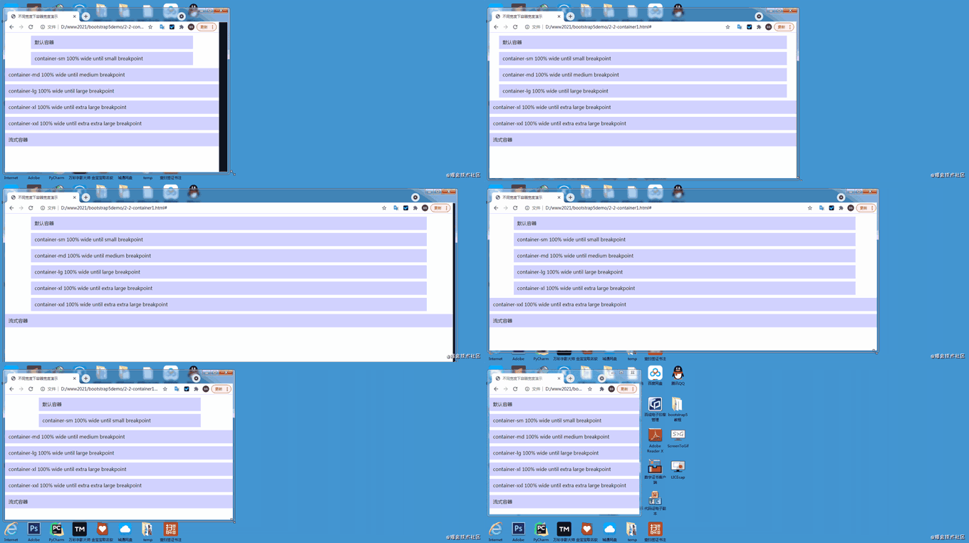
This article will take you through the breakpoints and containers in Bootstrap5. I hope it will be helpful to you!

1.1 Mobile first
Speaking of mobile first, we must first mention responsive design. Responsive interface is to design a page that can adapt to different devices. Responsive design uses media query and other technologies to achieve style adaptation under different devices/windows. It also That is to say, it will display different page layouts to users according to the different devices you use. [Related recommendation: "bootstrap tutorial"]
This is implemented by having a media query technology based on HTML5, which can obtain the screen width, and then use css to use different values under different widths Just css effect.
Mobile first is to first develop an interface suitable for mobile clients, and then adapt the corresponding style according to the situation of the PC. On the contrary, the design idea is to give priority to PC. Which one to choose? The method should be considered based on your habits and which users account for a large proportion. Mobile first is now generally advocated.
1.2 Bootstrap breakpoints
The so-called breakpoint refers to the critical point. This table and its content must be remembered. In addition, especially the class infix, it is often used. This will be demonstrated in detail in the layout of the next section. You only need to read it a few times. It doesn't matter if you can't remember it. You can check it out when the time comes.
| Breakpoint type | Class infix | Resolution | ||||
|---|---|---|---|---|---|---|
| Small, tablet or old laptop) | sm | ≥576px | ||||
| Medium (medium, narrow screen computer) | md |
≥768px | ||||
lg | ≥992px||||||
| xl |
|
|||||
| xxl |
|
|
≥576px | Medium
≥768px | Large
≥992px | X- Large
≥1200px | XX-Large
≥1400px |
||
|---|---|---|---|---|---|---|
.container | 100%540px | 720px | 960px | 1140px | 1320px | |
.container-sm | 100%540px | 720px | 960px | 1140px | 1320px | |
.container-md | 100%100% | 720px | 960px | 1140px | 1320px | |
.container- lg | 100%100% | 100% | 960px | 1140px | 1320px | |
.container-xl | 100%100% | 100% | 100% | 1140px | 1320px | |
.container-xxl | 100%100% | 100% | 100% | 100% | 1320px | |
.container-fluid | 100%100% | 100% | 100% | 100% | 100% |
2.3 Container parsing changes with browser width
2.3.1 Simple examples
Some friends may not understand the table in 2.2. I will give you a few examples:Take container-md as an example. When the screen When the width is less than 768px, the container width accounts for 100% of the screen width. When the screen width is greater than 768px and less than 992px, the container width is always 720px; and when the screen width is greater than 992px and less than 1200px, the container width is always 960px, and so on, the same is true for other breakpoint containers and the default container.2.3.2 Several characteristics of Bootstrap containers (excluding flow containers)
2.4 Demo code for container changes with browser width
The following is the demo code under different browser widths, as well as GIF If you don’t understand the rendering, you can download the code and study it yourself. The style part is written by me to set the background color of the container and the interval of each container to facilitate distinction and viewing. It has nothing to do with the container itself.2.4.1 Demonstration animation

<!doctype html>
<html>
  <head>
    <meta charset="utf-8">
    <meta name="viewport" content="width=device-width, initial-scale=1">
    <meta name="keywords" content="">
    <meta name="description" content="">
    <link href="bootstrap5/bootstrap.min.css" rel="stylesheet">

    <title>不同宽度下容器宽度演示</title>
    <style>
      div{background-color: rgba(0, 0, 255, 0.178);padding: 10px;margin: 10px;}
    </style>
  </head>
  <body>
    <div>    默认容器  </div>
    <div>container-sm 100% wide until small breakpoint</div>
    <div>container-md 100% wide until medium breakpoint</div>
    <div>container-lg 100% wide until large breakpoint</div>
    <div>container-xl 100% wide until extra large breakpoint</div>
    <div>container-xxl 100% wide until extra extra large breakpoint</div>
    <div> 流式容器 </div>

     <script src="bootstrap5/bootstrap.bundle.min.js" ></script>
  </body>
</html>
The above is the detailed content of Let's talk about breakpoints and containers in Bootstrap5. For more information, please follow other related articles on the PHP Chinese website!