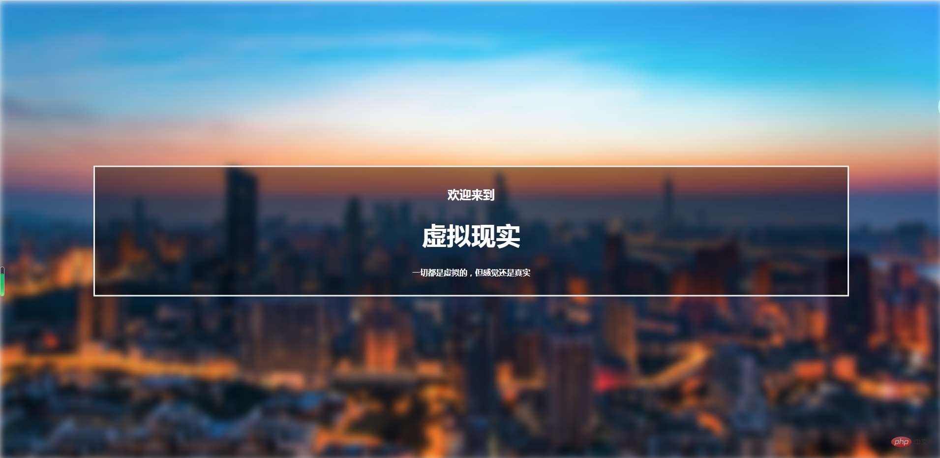
Do you want your web page to look high-end? Want to increase the number of reading visits to your web page? Do you want your users to be attracted to your page at first glance? Then don’t miss this article! After all, anyone can learn how to create a high-end blurry background image simply and quickly!
Without further ado, let’s start with the main text!
As the title says, what we are going to introduce today is to create a blurred background image through CSS, which is suitable for your personal blog page and website background.
I will directly add the code below:
<!DOCTYPE html>
<html>
<head>
    <meta charset=utf-8 />
    <title></title>
<style>
    body, html {
        height: 100%;
        margin: 0;
        font-family: Arial, Helvetica, sans-serif;
    }
    * {
        box-sizing: border-box;
    }
    .bg-image {
        /* 所使用的图像 */
        background-image: url("001.jpg");

        /* 添加模糊效果 */
        filter: blur(8px);
        -webkit-filter: blur(8px);

        /* 完整的高度 */
        height: 100%;

        /* 中心和缩放图像*/
        background-position: center;
        background-repeat: no-repeat;
        background-size: cover;
    }
    /* 将文本放置在页面/图像的中间 */
    .bg-text {
        background-color: rgb(0,0,0);
        background-color: rgba(0,0,0, 0.4);
        color: white;
        font-weight: bold;
        border: 3px solid #f1f1f1;
        position: absolute;
        top: 50%;
        left: 50%;
        transform: translate(-50%, -50%);
        z-index: 2;
        width: 80%;
        padding: 20px;
        text-align: center;
    }
</style>

</head>
<body>
<div class="bg-image"></div>
<div class="bg-text">
    <h2>欢迎来到</h2>
    <h1 style="font-size:50px">虚拟现实</h1>
    <p>一切都是虚拟的,但感觉还是真实</p>
</div>
</body>
</html>The effect is as shown below:

( The background image comes from the Internet, sorry for the infringement)
How about it! Isn’t the effect great!
So in the above code, I will introduce you to several key css attributes:
filter The attribute defines the visibility of the element (usually ) Effects (e.g. blur and saturation).
Note: The non-standard "filter" attribute supported by older versions of Internet Explorer (4.0 to 8.0) has been deprecated. IE8 and lower browsers usually use the opacity attribute.
transformThe property applies a 2D or 3D transformation to the element. This property allows us to rotate, scale, move or tilt the element.
borderShorthand property sets all border properties in one declaration.
border-width:规定边框的宽度。
border-style:规定边框的样式。
border-color:规定边框的颜色。
inherit:规定应该从父元素继承 border 属性的设置。
backgroundShorthand property sets all background properties in one declaration.
background-color:规定要使用的背景颜色。
background-position:规定背景图像的位置。
background-size:规定背景图片的尺寸。
background-repeat:规定如何重复背景图像。
background-origin:规定背景图片的定位区域。
background-clip:规定背景的绘制区域。
background-attachment:规定背景图像是否固定或者随着页面的其余部分滚动。
background-image:规定要使用的背景图像。
inherit:规定应该从父元素继承 background 属性的设置。
PHP Chinese website platform has a lot of video teaching resources. Welcome everyone to learn "css Video Tutorial"!
The above is the detailed content of Quickly create advanced blurry background images with CSS. For more information, please follow other related articles on the PHP Chinese website!