
In CSS, you can use the border-top attribute to set the top border. You only need to set the "boder-top:width style color" style to the element; this attribute can be set in order: border-top-width, border-top-style and border-top-color.

The operating environment of this tutorial: Windows 7 system, CSS3&&HTML5 version, Dell G3 computer.


Custom border Width cannot be defined as a percentage.
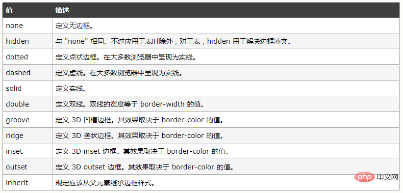
The above attributes can be set with one, two, three, or four attribute values. When setting a value, four This attribute value is applied to all borders. When two are set, the first attribute value is used for up and down, and the second attribute value is used for left and right. When three values are set, the first value is applied to the top border, and the second one is used for the left and right sides. Apply to the left and right borders, and the third attribute value is applied to the bottom border. When four attribute values are set, apply them one at a time in a clockwise direction. In most cases, groove, ridge, inset, and outset can use two-color borders, but when the border-color attribute is set to black, both colors will be displayed as black.
2. Apply a border style to a side
boder-top/bottom/right/left-width/style/color is used to set the style of a border, and can be combined with general properties In conjunction with. You can also use border-bottom/top/left/right to set one border at a time.
<!DOCTYPE html>
<html>
<head>
    <meta charset="UTF-8">
    <title>Document</title>
    <style type="text/css">
        div{
         width: 100px;
         height:200px;
         border-width: 10px;
         border-style: ridge;
         border-color: red;
         border-top-style: double;
        }
    </style>
</head>
<body>
    <div>

    </div>
</body>
</html> 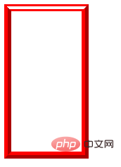
3. Use the border abbreviation attribute
You can use it once to set the width, style, and color of the border. Separate the three attribute values with spaces. . The order among the three attributes can be disrupted.
<!DOCTYPE html>
<html>
    <head>
        <meta charset="UTF-8">
        <title>Document</title>
        <style type="text/css">
            div{
            width: 100px;
            height:200px;
            border:solid 2px red ;
            }
        </style>
    </head>
    <body>
        <div>

        </div>
    </body>
</html> 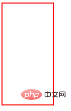
4. Create a rounded border
border-top/bottom-left/right-radius
Set a rounded corner, A pair of length values or percentages relative to the width and height of the border box. The first value is the horizontal radius of the ellipse's border, and the second value is the vertical radius of the ellipse. If only one value is the radius of a circle, separate the two values with a space.
Border -radius
Set the four rounded corners of the border at one time, one pair, two pairs, three pairs, four pairs of length values or percentages, and the horizontal radius and vertical radius are separated by / .
<!DOCTYPE html>
<html>
    <head>
        <meta charset="UTF-8">
        <title>Document</title>
        <style type="text/css">
            div{
            width: 100px;
            height:200px;
            border:solid 2px red;
            border-top-left-radius: 20px 10px
            }
        </style>
    </head>
    <body>
        <div>

        </div>
    </body>
</html> 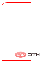
<!DOCTYPE html>
<html>
    <head>
        <meta charset="UTF-8">
        <title>Document</title>
        <style type="text/css">
            div{
            width: 100px;
            height:200px;
            border:solid 2px red;
            border-radius: 20px/10px
            }
        </style>
    </head>
    <body>
        <div>

        </div>
    </body>
</html> 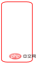
When there is a pair or one attribute value, the four rounded corners are the same, and when there are two attribute values, the first one The attribute value corresponds to the upper left and lower right, the second corresponds to the upper right and lower left, and the three attribute values correspond to the upper left, (upper right, lower left), and lower right. The four attribute values are in clockwise direction.
The browser compatibility of the image border is not good. In many cases, it is necessary to add the browser manufacturer prefix in front of the attribute. In order to provide better compatibility, it is recommended to use it as follows.

You must use the url function to specify the image source.
This attribute specifies the inward offset of the upper, right, lower, and left edges of the image. It is divided into nine areas: four corners, four sides and a middle area. Unless the fill keyword is used, the middle portion of the image is discarded. If the fourth value/percentage is omitted, it is the same as the second value. If the third value is omitted, it is the same as the first value. If the second value is omitted, it is the same as the first value. 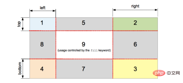
 <!DOCTYPE html>
<html>
    <head>
        <meta charset="UTF-8">
        <title>Document</title>
        <style type="text/css">
            div{
                width: 500px;
                height: 400px;
                background: red;
                 /*border-image-source:url(1.png);
                 border-image-slice:89;
                 border-image-width: 89px;
                 border-image-repeat: stretch;
                 border-image-outset: 10px;*/
                 border-image:url(1.png) 89 30 89 30 fill/89px repeat
            }
        </style>
    </head>
    <body>
        <div>

        </div>
    </body>
</html> Cutting picture: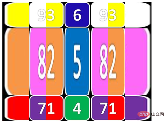
When this attribute is not set, the border will occupy the content area. When you need to set it, you can add "/" after the width of the border to set the attribute value.
d、border-repeat

e、border-image
You can set the above properties at once. border-image:souce slice/width/outset repeat
Recommended learning: css video tutorial
The above is the detailed content of How to set the top border in css. For more information, please follow other related articles on the PHP Chinese website!