
In CSS, you can use the box-shadow attribute to achieve the shadow effect. You only need to set the "box-shadow: horizontal shadow position, vertical shadow position, blur distance, shadow size, color inset;" style to the element. This property adds one or more shadows to the box, a comma-separated list of shadows.

The operating environment of this tutorial: Windows 7 system, CSS3&&HTML5 version, Dell G3 computer.
I have rarely used it before and have not understood this aspect carefully, so I just implemented some simple requirements for shadows and animations. So while this project needs to be combined with practice, let’s summarize this aspect.
Shadow effect in css3:
box-shadow in css3 Please see the properties of box-shadow (the introduction is taken from w3c content)
box-shadow: h-shadow v-shadow blur spread color inset;
box-shadow to Add one or more shadows to the box. This property is a comma-separated list of shadows, each specified by 2-4 length values, an optional color value, and the optional inset keyword. The value for omitted length is 0.
Value Description
h-shadow Required. The position of the horizontal shadow. Negative values are allowed. (Positive values are on the right, negative values are on the left)
v-shadow Required. The position of the vertical shadow. Negative values are allowed. (Positive values are at the bottom, negative values are at the top)
blur Optional. Fuzzy distance. (Area covered by shadow)
spread Optional. The size of the shadow. (size of shadow)
color Optional. The color of the shadow. See CSS color values. (Color of shadow)
inset Optional. Change the outer shadow (outset) to an inner shadow. (The default is the setting of outer, inner shadow and outer shadow)
The next step is to implement different shadow effects one by one:
<!DOCTYPE html>
<html>
<head>
    <meta charset="UTF-8">
    <title>box-shadow</title>
    <style>
        .demo{
            width:200px;
            height:200px;
            border: 1px solid #999;
            margin: 50px auto;
            box-shadow: 10px 10px 5px #9521de;
        }
    </style>
</head>
<body>
<div></div>
</body>
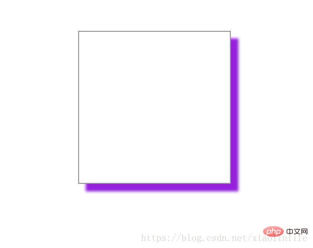
</html>box-shadow: 10px 10px 5px #9521de; (horizontal and The vertical direction is a positive value)
Rendering:
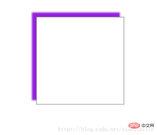
box-shadow: -10px -10px 5px #9521de; (The horizontal and vertical directions are In the case of negative values)
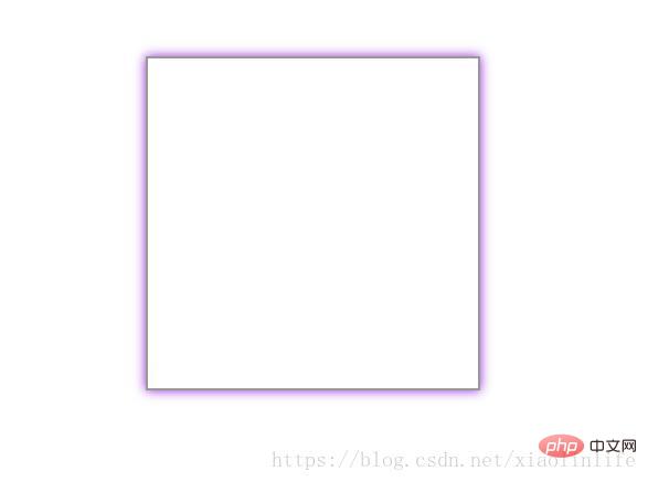
box-shadow: 0px 0px 10px #9521de; (When the horizontal and vertical directions are 0, there will be shadows all around. In this case Also commonly used)
box-shadow: 0px 0px 10px 10px #9521de; (When the horizontal and vertical directions are 0, there will be shadows all around. The three values are the blur distance (the coverage area of the shadow) and the fourth value is the size of the shadow (this is rarely used))
f27fd8cdd93fc3a3a5309aa413725c5-3.jpg" alt="Write a picture description here "/>
**box-shadow: 0px 0px 10px #9521de inset;** When the horizontal and vertical directions are 0, there will be shadows all around. The third value is the blur distance (shadow The coverage area) is set to the inner shadow)
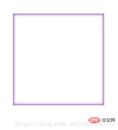
**box-shadow: 5px 5px 10px #9521de inset;** When the horizontal and vertical directions are positive values, in Upper left, the third value is the blur distance (the area covered by the shadow) set so that the inner shadow is exactly opposite to the outer shadow)
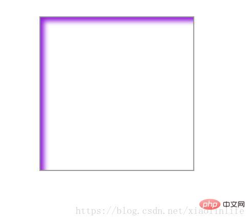
**box-shadow: -5px - 5px 10px #9521de inset;** When the horizontal and vertical directions are negative values, in the lower right, the third value is the blur distance (the coverage area of the shadow) set to the inner shadow exactly opposite to the outer shadow)
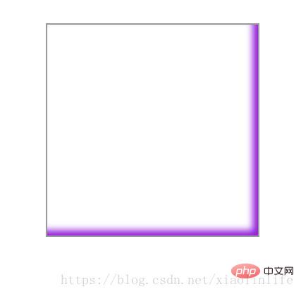
The above is just a simple experiment on the effect and position of the shadow. In fact, judging from the effect used in the project, it is still **box-shadow: 0px 0px 10px #9521de;**and* *box-shadow: 10px 10px 5px #9521de;**In fact, it is mainly through familiarity with various effects to freely combine them, and familiarity with the meaning of each value.
The spread attribute is rarely used, this is for expansion Shadow radius.
For example: box-shadow: -5px -5px 10px 10px #9521de inset;
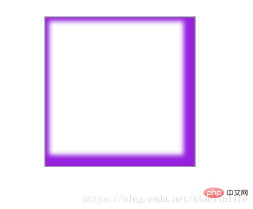
You can also set the shadow individually for each side Effect:
box-shadow:5px 5px 5px #000,5px -5px 5px #000,-5px 5px 5px #000,-5px -5px 5px #000;
In a word: use as you learn.
Recommended learning: css video tutorial
The above is the detailed content of How to achieve shadow effect in css3. For more information, please follow other related articles on the PHP Chinese website!