In Bootstrap, there are some components used for prompt information, such as labels, badges, giant screens and headers. This article will introduce you to the prompt information in Bootstrap. It has certain reference value. Friends in need can refer to it. I hope it will be helpful to everyone.

Related recommendations: "bootstrap tutorial"
In some Web pages, a Tags are used to tell the user some additional information. For example, if a new navigation item is added to the navigation, a "new" tag may be added to tell the user
This effect is deliberately used in the Bootstrap framework Extract it and become a label component, and use the ".label" style to achieve highlighting
The method of use is very simple, you can use an inline label like span
<h3>Example heading <span>New</span>
</h3>
[Auto-hide]
When there is no content, automatically hide
.label:empty {
    display: none;
}<h3>Example heading <span></span> </h3>
[Color Settings]
and buttons The element button is similar, and the label style also provides a variety of colors:
☑ label-default: default label, dark gray
☑ label-primary: main label, dark blue
☑ label-success: success label, green
☑ label-info: information label, light blue
☑ label-warning: warning label, orange
☑ label -danger: error label, red
Mainly use these class names to modify the background color and text color
<span>Default</span>
<span>Primary</span>
<span>Success</span>
<span>Info</span>
<span>Warning</span>
<span>Danger</span>
In a sense, the badge effect is very similar to the label effect introduced earlier. It is also used to make some prompt messages. What often appears is the information sent by some systems, such as the system prompts how many messages are unread
In the Bootstrap framework, this effect is called the badge effect, and the "badge" style is used to achieve it
You can use span tags to make them like tags, and then add the badge class
<a>Inbox <span>42</span></a>
【Auto-hide】
If not New or unread information entries, that is, they do not contain any content, and the badge component can be automatically hidden (implemented through the CSS :empty selector)
.badge:empty {
    display: none;
}<a>Inbox <span></span></a>
[Button Badge]
The badge has a similar style in the button element button and capsule navigation nav-pills, but the colors are different
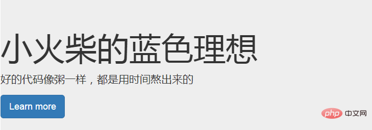
This is a lightweight, flexible component that can extend to the entire browser viewport to display key content on the website
<div>
  <h1>小火柴的蓝色理想</h1>
  <p>好的代码像粥一样,都是用时间熬出来的</p>
  <p><a>Learn more</a></p>
</div>

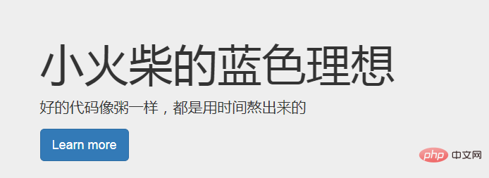
If Add rounded corners to the giant screen component and place this component inside the .container element
<div>
    <div>
        <h1>小火柴的蓝色理想</h1>
        <p>好的代码像粥一样,都是用时间熬出来的</p>
        <p><a>Learn more</a></p>
    </div>
</div>

The header component can add appropriate space to the h1 tag and form a certain separation from other parts of the page. It supports the default effect of small elements embedded in h1 tags, and also supports most other components (need to add some additional styles)
.page-header {
    padding-bottom: 9px;
    margin: 40px 0 20px;
    border-bottom: 1px solid #eee;
}<div> <h1>Example page header <small>Subtext for header</small> </h1> </div>
For more programming-related knowledge, please visit: Programming Video! !
The above is the detailed content of Detailed explanation of labels, badges, giant screens and headers in Bootstrap. For more information, please follow other related articles on the PHP Chinese website!