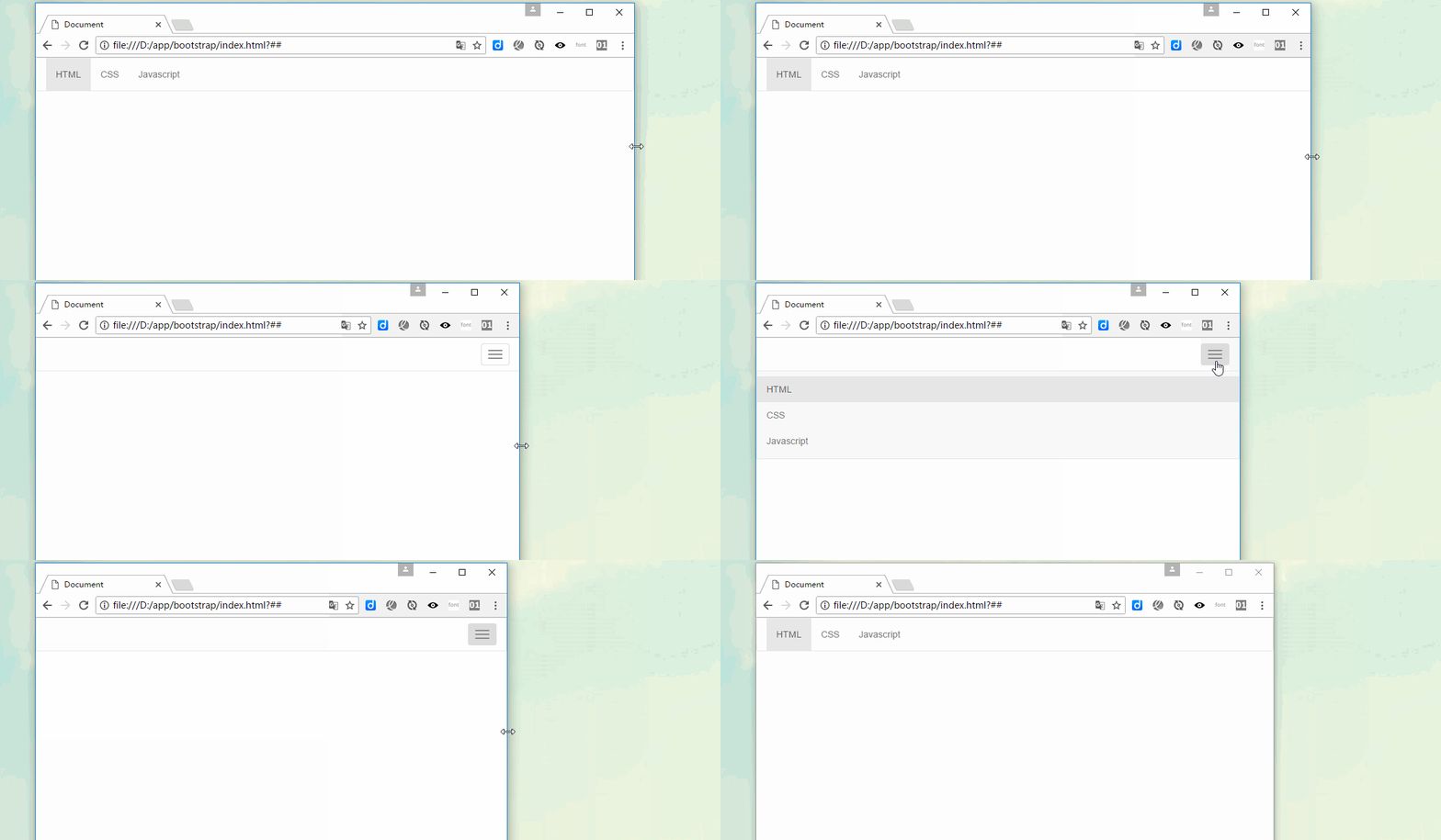

The navigation bar (navbar) and the navigation (nav) differ by one word, with an additional word "bar". In fact, they are still obviously different in the Bootstrap framework. There is a background color in the navigation bar (navbar), and the navigation bar can be a pure link (similar to navigation), a form, or a combination of form and navigation. This article will introduce theBootstrapnavigation bar in detail.
Basic navigation bar
In the Bootstrap framework, the navigation bar and navigation are not much different in appearance, but in actual use, navigation Bars are much more complex than navigation.
The navigation bar is a responsive basic component used as the navigation header in an application or website. They can be folded (and opened or closed) on mobile devices, and gradually change to horizontal expansion mode when the width of the viewport (viewport) increases
When making a basic navigation bar, there are mainly the following steps: :
1. First, add the class name “navbar-nav” on the basis of making the navigation list (
2. Add a new one outside the list Container (p), and use the class names "navbar" and "navbar-default"
[Principle Analysis]
The main function of the ".navbar" style is to set left and right padding and rounded corners, etc. effect, but its color-related style has not been set in any way
.navbar { position: relative; min-height: 50px; margin-bottom: 20px; border: 1px solid transparent; }
The color of the navigation bar is controlled through ".navbar-default"
.navbar-default { background-color: #f8f8f8; border-color: #e7e7e7; }
The navbar-nav style is in The floating and inner and outer margins of menu items have been re-adjusted based on navigation.nav. It also does not include color and other style settings, and color and other styles are implemented together with the parent container "navbar-default"
[Note] It is best to use theelement , if you are using the genericelement, be sure to set therole="navigation"attribute for the navigation bar, so that users using assistive devices know clearly that this is A navigation area
bootstrap tutorial"
Navigation bar component
[Title]
In Web page production, there is often a title in front of the menu (the text size is slightly larger than other text). In fact, This aspect has also been considered in the Bootstrap framework, which is implemented through "navbar-header" and "navbar-brand"[Brand Icon]
Replace the place where the brand logo is placed in the navigation bar with theelement to display your own brand icon. Since.navbar-brandhas been set with padding and height, you need to add some CSS code according to your own situation to override the default settings
 [Second-level menu]
【Part Arrangement】
By adding .navbar-left and .navbar-right tool classes, you can create navigation links, forms, buttons or Text alignment. Both classes will set the float style in a specific direction through CSS. For example, to align navigation links, place them in separate. navbar-rightclass. To allow for proper space between content, the last.navbar-rightelement uses a negative margin. If there are multiple elements using this class, their margins will not be displayed normally as expected
[Form]
Some navigation bars will have There is a search form. The Bootstrap framework provides a "navbar-form". The method of use is very simple. Just place a form with the navbar-form class name in the navbar container. navbar-left implements left floating , navbar-right implements right floating【按钮】
对于不包含在中的元素,加上.navbar-btn后,可以让它在导航条里垂直居中。有一些对于为辅助设备提供可识别标签的方法,例如,aria-label、aria-labelledby或者title属性。如果这些方法都没有,屏幕阅读器将使用placeholder属性(如果这个属性存在的话),但是请注意,使用placeholder代替其他识别标签的方式是不推荐的
[注意]就像标准的 按钮类 一样,.navbar-btn可以被用在和元素上。然而,在.navbar-nav内,.navbar-btn和标准的按钮类都不应该被用在元素上。

把文本包裹在.navbar-text中时,为了有正确的行距和颜色,通常使用标签
Signed in as huochai
【非导航链接】
可以在标准的导航组件之外添加标准链接,使用.navbar-link类可以让链接有正确的默认颜色和反色设置
Signed in as huochai
导航条位置
很多情况下,设计师希望导航条固定在浏览器顶部或底部,这种固定式导航条的应用在移动端开发中更为常见。Bootstrap框架提供了g两种固定导航条的方式:
☑ .navbar-fixed-top:导航条固定在浏览器窗口顶部
☑ .navbar-fixed-bottom:导航条固定在浏览器窗口底部
使用方法很简单,只需要在制作导航条最外部容器navbar上追加对应的类名即可
这个固定的导航条会遮住页面上的其它内容,除非给元素底部设置了padding。提示:导航条的默认高度是 50px
body { padding-top: 70px; } body { padding-bottom: 70px; }
测试内容
测试内容
测试内容
测试内容
测试内容
测试内容
测试内容
【静止在顶部】
通过添加.navbar-static-top类即可创建一个与页面等宽度的导航条,它会随着页面向下滚动而消失
测试内容
测试内容
测试内容
测试内容
测试内容
测试内容
测试内容
响应式导航条
Bootstrap的响应式导航条实现如下:
1、保证在窄屏时需要折叠的内容必须包裹在带一个p内,并且为这个p加入collapse、navbar-collapse两个类名。最后为这个p添加一个class类名或者id名
或者
2、保证在窄屏时要显示的图标样式(固定写法):
3、并为button添加data-target=".类名/#id名",究竞是类名还是id名呢?由需要折叠的p来决定。如
或者,对应class="example"

反色导航条
反色导航条其实是Bootstrap框架提供的第二种风格的导航条,与默认的导航条相比,使用方法并无区别,只是将navbar-deafult类名换成navbar-inverse。其变化只是导航条的背景色和文本做了修改
更多编程相关知识,请访问:编程视频!!
The above is the detailed content of Let's talk about the navigation bar in Bootstrap. For more information, please follow other related articles on the PHP Chinese website!
 The difference between PD fast charging and general fast charging
 unicode encoding conversion
 How to start oracle data monitoring
 location.hash
 Win11 My Computer Added to Desktop Tutorial
 How to use the groupby function
 Can Douyin sparks be lit again if they have been off for more than three days?
 What is a dump file?