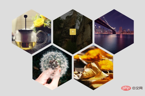
How to set a hexagonal image in css: first create an HTML sample file; then introduce the image into the body; finally implement the image through css styles such as "transform: rotate(120deg);overflow: hidden;" Just be hexagonal.

The operating environment of this tutorial: Windows7 system, HTML5&&CSS3 version, Dell G3 computer.
CSS3 to achieve hexagonal Div image display effect
1. Effect picture

##2. Principle explanation
The main knowledge points used for this effect:
1. transform: rotate(120deg); Image rotation
2. overflow: hidden; Beyond hiding
3. visibility: hidden; is also hidden, similar to display:none;, but the difference is that although it is hidden, it will still occupy a position in the web page
We need to use 3 layers of p. Rotate to get this effect (note: the size of the 3 layers of p is the same). The outermost layer p (boxF) is rotated 120 degrees, the second layer (boxS) is rotated -60 degrees, and the third layer (boxT) is rotated another -60 degrees, which is just back to normal. Our image is placed in the p background of layer 3. Because there is nothing in the first two layers p, they are purely used to rotate to obtain a hexagon, so set visibility: hidden for the 1st and 2nd layers p; and the third layer p is for pictures and needs to be displayed, so set visibility: visible; (Note: If you do not set visibility: visible; on the third layer p, it will inherit the visibility: hidden; of the second layer p(boxS) by default). There will definitely be excess parts after rotation, so set overflow:hidden;
for all three ps. After rotation and hiding the excess parts, we can get the hexagon we want. Another thing to note is that the width-to-height ratio of p must meet 4:5, otherwise the result will not be a hexagon. In the effect picture above. We also placed a p (overlay) in the third layer (boxT). This p is used for masking. When the mouse moves over the 6-sided shape, there will be a masking effect. There is an a tag inside p(overlay), which is a number. Clicking the a tag will pop up the layer and display the large image (note: this js effect has not been written yet).
3. The DEMO code of the above renderings [Recommended: "
css Video Tutorial"]
CSS3 实现六边形图片展示效果
+
+
+
+
+
Copy after login
-- If you want to see the effect, just copy the DEMO code directly. Of course, you have to add the picture yourself, and versions below IE9 do not support it.
The above is the detailed content of How to set the image to hexagon in css. For more information, please follow other related articles on the PHP Chinese website!


