
Foreword:
This article shares with you how to draw a circular progress bar using pure CSS. When using the method in this article, it is recommended to first understand the central angle, Knowledge of radian system, trigonometric functions, etc.
We have worked hard to achieve the following effects:

Of course you can embrace Svg... Here we share how to create a ring progress bar with pure Css, which only takes three steps step!

This item is 2 1 sandwich biscuits, the blue and green part is jam. It is obvious that the biscuits are two divs cut into circles. We focus on demonstrating how to make jam:

As shown in the picture, the large fan shape is composed of 6 small fans. , each small fan-shaped occupies 1/15 of the entire round cake, and the large fan-shaped occupies 6/15 of the entire round cake. We only need to construct a sector unit, copy it into 6 copies, rotate them at corresponding angles and connect them together.
How to construct a sector? Use triangles to disguise...

#How to calculate the width and height of a triangle? Assume the circle radius $radius is 100px and the fraction $count is 15. Then the central angle of the small sector is 360deg / 15, the height of the triangle is 100px, and the width is 2 * 100px * tan(360deg / 15 / 2). Among them, 360deg / 15 / 2 is converted into radians as PI / 15 (PI == 360deg / 2).
span {
    width: 0;
    height: 0;
    border: $radius solid transparent;
    $borderWidth: tan(pi() / $count) * $radius;
    border-left-width: $borderWidth;
    border-right-width: $borderWidth;
}Students who are not good at mathematics, please educate yourself...
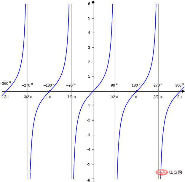
Special handling is required when $count is 1 or 2, because tan(PI) and tan(PI / 2) are Infinite value. If you don’t understand, please study the tangent function image:

Related code (where $diameter = 2 * $radius is the diameter of the circle):
span {
    @if $count == 1 {
        width: $diameter;
        height: $diameter;
    } @else if $count == 2 {
        width: $diameter;
        height: $radius;
    } @else {
        width: 0;
        height: 0;
        border: $radius solid transparent;
        $borderWidth: tan(pi() / $count) * $radius;
        border-left-width: $borderWidth;
        border-right-width: $borderWidth;
    }
}Finally, copy and rotate the fan-shaped units one by one:
@for $index from 0 to $count {
    span:nth-child(#{$index + 1}) {
        $transform: translate(-50%, 0) rotate(360deg / $count / 2 + 360deg * $index / $count);
        $origin: if($count == 2, bottom, center);
        -webkit-transform: $transform;
                transform: $transform;
        -webkit-transform-origin: $origin;
                transform-origin: $origin;
    }
}The jam is made, please add other embellishments by yourself... The complete code of this example is here .
Continued on 2017/11/14
Since this example introduces mathematical operations such as trigonometric functions, use Sass to precompile. Students who have not installed Sass can download the compiled source code and open sector.html to view the effect.
To install Sass, please refer to the installation tutorial at the end of the article sunmengyuan.github.io/garden/2017….
Debugging method for this example:
cd sector
sass --watch style.scss:style.css --debug-info
Author: Dailianxiaomiao
My back garden: sunmengyuan.github.io/garden/
My github: github.com/sunmengyuan
Original link: sunmengyuan.github.io/garden/2017…
Related recommendations: css tutorial
The above is the detailed content of CSS draws fan-shaped progress bar. For more information, please follow other related articles on the PHP Chinese website!