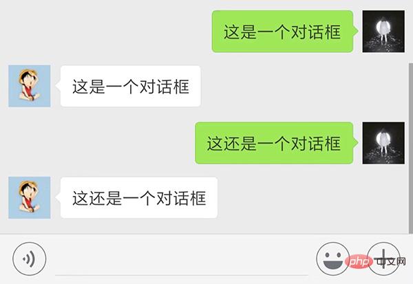
Pure CSS method to achieve the voice chat bubble box effect: first create an HTML sample file; then create a div in the body; and finally implement it by setting css attributes such as "-moz-border-radius" to the div Just use the voice chat bubble box effect.

The operating environment of this article: Windows7 system, HTML5&&CSS3 version, Dell G3 computer.
This article mainly introduces how to use pure css to achieve the voice chat bubble box effect.
The voice chat bubble box effect is a very common and popular dialog box effect in our daily life or on social networking sites.
For example, the chat dialog interface of WeChat and QQ.

#So for novices, it may be difficult to achieve this effect. In fact, there are many ways to achieve this speech bubble effect, but we can use the simplest css method to achieve it.
Now we will introduce to you a simple method to achieve the speech bubble effect using pure CSS.
css code example is as follows:
<!DOCTYPE>
<html>
<meta charset="utf-8">
<head>
    <title>css实现语音气泡示例</title>
    <style type="text/css">
        #speech-bubble {
            width: 120px;
            height: 80px;
            background: #5ac4ed;
            position: absolute;
            left:100px;
            -moz-border-radius: 10px;
            -webkit-border-radius: 10px;
            border-radius: 10px;
        }
        #speech-bubble:before {
            content:"";
            position: absolute;
            width: 0;
            height: 0;
            border-top: 13px solid transparent;
            border-right: 26px solid #5ac4ed;
            border-bottom: 13px solid transparent;
            margin: 13px 0 0 -25px;
        }

    </style>
</head>
<body>
<div id="speech-bubble"></div>
</body>
</html>The effect is as shown below:

In the above code, everyone needs to pay attention is the realization of the triangle shape in front of the border. The principle of triangle implementation is also very simple. Just set the width and height of the element to 0 pixels, and then set the border to the element. Here we set the upper and lower borders to 13 pixels and display them transparently, the right border to 26 pixels, and the color to be the same as the color of the div on the right.
In this way, the triangle effect can be achieved, and the same complete speech bubble can be achieved. The color and size can be set according to your own preferences.
Related attribute introduction:
border attribute allows you to specify the style, width and color of the element border.
:before The selector inserts content before the content of the selected element.
Recommended reference tutorial: "CSS Tutorial"
This article is about using pure css to implement the effect of the voice chat bubble box, also It's very easy to understand, I hope it will be helpful to friends who need it!
The above is the detailed content of How to use pure CSS to achieve voice chat bubble box effect. For more information, please follow other related articles on the PHP Chinese website!