We often use button effects. This article will share with you the implementation of a beautiful button effect. Let’s use CSS to achieve a glowing button effect.
Without further ado, let’s look directly at the code
The following code is the basic code for all subsequent button styles:
HTML
<a class="button" href="#">Button</a>
CSS
.button {
width:80px;
height:20px;
  display: block;
  padding: 1em 3.2em;
  border-radius: 1.6em;
  color: #fff;
  font-size: 18px;
  font-family: 'Lato', sans-serif;
  font-weight: 700;
  text-align: center;
  text-decoration: none;
}The basic color is changed from button1 to button4 below, and the color transmittance of the button body is also adjusted by box-shadow to describe the shadow used for each button. Start designing buttons with gradient effects starting from button5. Let's look at the specific code implementation.
button1:
.button {
  background-color: rgba(252, 28, 143, 1);
  box-shadow: 0 5px 20px rgba(252, 28, 143, .5);
}The effect is as follows:

button2:
.button{
background-color: rgba(251, 152, 11, 1);
box-shadow: 0 5px 20px rgba(251, 152, 11, .5);
}The effect is as follows:

button3:
.button {
  background-color: rgba(241, 196, 15, 1);
  box-shadow: 0 5px 20px rgba(241, 196, 15, .5);
}The effect is as follows:

button4:
.button {
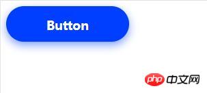
  background-color: rgba(0, 63, 255, 1);
  box-shadow: 0 5px 20px rgba(0, 63, 255, .5);
}The effect As follows:

button5:
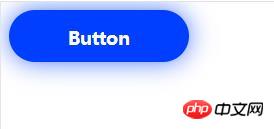
The basic appearance is "button4", box-shadow changes the position of the shadow attached below by setting the shadow .
.button {
  background-color: rgba(0, 63, 255, 1);
  box-shadow: 0 0 40px rgba(0, 63, 255, .7);
}The effect is as follows:

button6:
This is the box-shadow we added to the "button4" position specified by inset.
.button {
  background-color: rgba(0, 63, 255, 1);
  box-shadow: 0 5px 20px rgba(0, 63, 255, .5), 0 0 40px rgba(255, 255, 255, .5) inset;
}The effect is as follows:

button7:
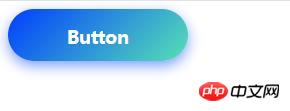
Use the gradient type button to combine different colors and adjust the angle .
.button {
  background: linear-gradient(-45deg, rgba(87, 225, 181, 1) 0%, rgba(0, 63, 255, 1) 100%);
  box-shadow: 0 5px 20px rgba(0, 63, 255, .5);
}The effect is as follows:

#The above is the entire content of this article. For more other exciting content, please refer to the video tutorial on the php Chinese website The CSS video tutorial and CSS3 video tutorial columns in the column! ! !
The above is the detailed content of CSS to achieve glowing button effect (code example). For more information, please follow other related articles on the PHP Chinese website!