This article introduces the style of CSS active controls. Let’s take a look at the specific content.
Let’s take a look at the syntax format first:
:focus{
  (样式描述)
}Describe it by specifying the element, class and ID, as follows:
When setting a specific tag
(标签名):focus{
  (样式描述)
}When setting a specific class
.(class名):focus{
  (样式描述)
}When setting a specific ID
#(id名):focus{
  (样式描述)
}Code example:
Write the following code.
FocusSelector.css
input {
  background-color:#D0D0D0;
}
input:focus {
  background-color:#FFD0D0;
}Note:
Since "input" is described, the style of the INPUT tag is defined and the background color is specified as gray ( #D0D0D0). The definition of a normal INPUT is a style definition that
input { background-color:#D0D0D0;}receives and activates focus, and the background color is specified to be pink (#FFD0D0).
input:focus { background-color:#FFD0D0;}FocusSelector.html
<!DOCTYPE html>
<html>
<head>
<meta http-equiv="Content-Type" content="text/html; charset=utf-8"/>
    <title></title>
    <link rel="stylesheet" type="text/css" href="ForcusSelector.css" />
</head>
<body>
    输入1 : <input type="text" /><br />
    输入2 : <input type="text" /><br />
    输入3 : <input type="text" /><br />
    输入4 : <input type="text" /><br />
    输入5 : <input type="text" /><br />
    </body>
</html>Execution results:
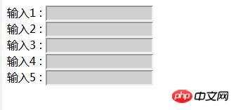
Use a web browser to display the above HTML. The effect shown below will be displayed.

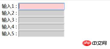
#Click the text box and enter the input state, the background color of the text box changes to pink.

The above is the detailed content of CSS sets the style of active controls (implementation of focus pseudo-class). For more information, please follow other related articles on the PHP Chinese website!