This article will share with you the method of implementing triangle mark in CSS. The content is very detailed. Friends in need can refer to it.
Without further ado, let’s take a look at the code first~
The code is as follows:
CssMark.html
CssMark .css
.TriMarkPre0 { position: static; width: 100px; height: 100px; border: 10px solid transparent; border-color: #0058e2; } .TriMarkPre1 { position: static; width: 100px; height: 100px; border: 10px solid transparent; border-left-color: #0058e2; } .TriMarkPre2 { position: static; width: 0px; height: 0px; border: 10px solid transparent; border-left-color: #0058e2; } .TriMark { position: static; width: 0px; height: 0px; border: 5px solid transparent; border-left-color: #0058e2; }
Detailed code explanation
Creation process 1:
The following code is the code to draw the outer frame of a 100 x 100 pixel area. This is the general code.
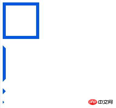
The box at the top of the execution result image corresponds to this code.
.TriMarkPre0 { position: static; width: 100px; height: 100px; border: 10px solid transparent; border-color: #0058e2; }
Creation process 2:
Use the code below to draw only the left side of the area frame. If you draw the left side, you can see that the corner part is cut diagonally. (When drawing 4 sides, only draw half so that each line does not overlap.)
This code corresponds to the code that will execute the second trapezoid of the resulting image sideways.
.TriMarkPre1 { position: static; width: 100px; height: 100px; border: 10px solid transparent; border-left-color: #0058e2; }
Complete:
Triangular markers can be drawn using the following code.
By reducing the height of the code to the left of the previous line, the section between the lines will disappear and it will appear as a triangle mark.
The third image of the execution result image corresponds to this code.
.TriMarkPre2 { position: static; width: 0px; height: 0px; border: 10px solid transparent; border-left-color: #0058e2; }
You can change the size of the triangle marker by reducing the border width of the line.
The fourth image of the execution result image corresponds to this code.
.TriMark { position: static; width: 0px; height: 0px; border: 5px solid transparent; border-left-color: #0058e2; }
Execution results:
When the HTML file is displayed, the following image will be displayed.

Added:
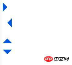
You can change the orientation of the triangle by changing the position of the border you want to draw.
The code is as follows:
CssMark2.html
CssMark.css
.TriMarkRight { position: static; width: 0px; height: 0px; border: 15px solid transparent; border-left-color: #0058e2; } .TriMarkLeft { position: static; width: 0px; height: 0px; border: 15px solid transparent; border-right-color: #0058e2; } .TriMarkTop { position: static; width: 0px; height: 0px; border: 15px solid transparent; border-bottom-color: #0058e2; } .TriMarkBotom { position: static; width: 0px; height: 0px; border: 15px solid transparent; border-top-color: #0058e2; }
The effect is as follows:

The above is the detailed content of Introduction to the method of implementing triangle mark in CSS. For more information, please follow other related articles on the PHP Chinese website!