This article will introduce to you how to achieve the animation effect of fireworks blooming through the transforms attribute and keyframes attribute of js css3. It has certain reference value. Friends in need can refer to it. I hope it will be helpful to you.
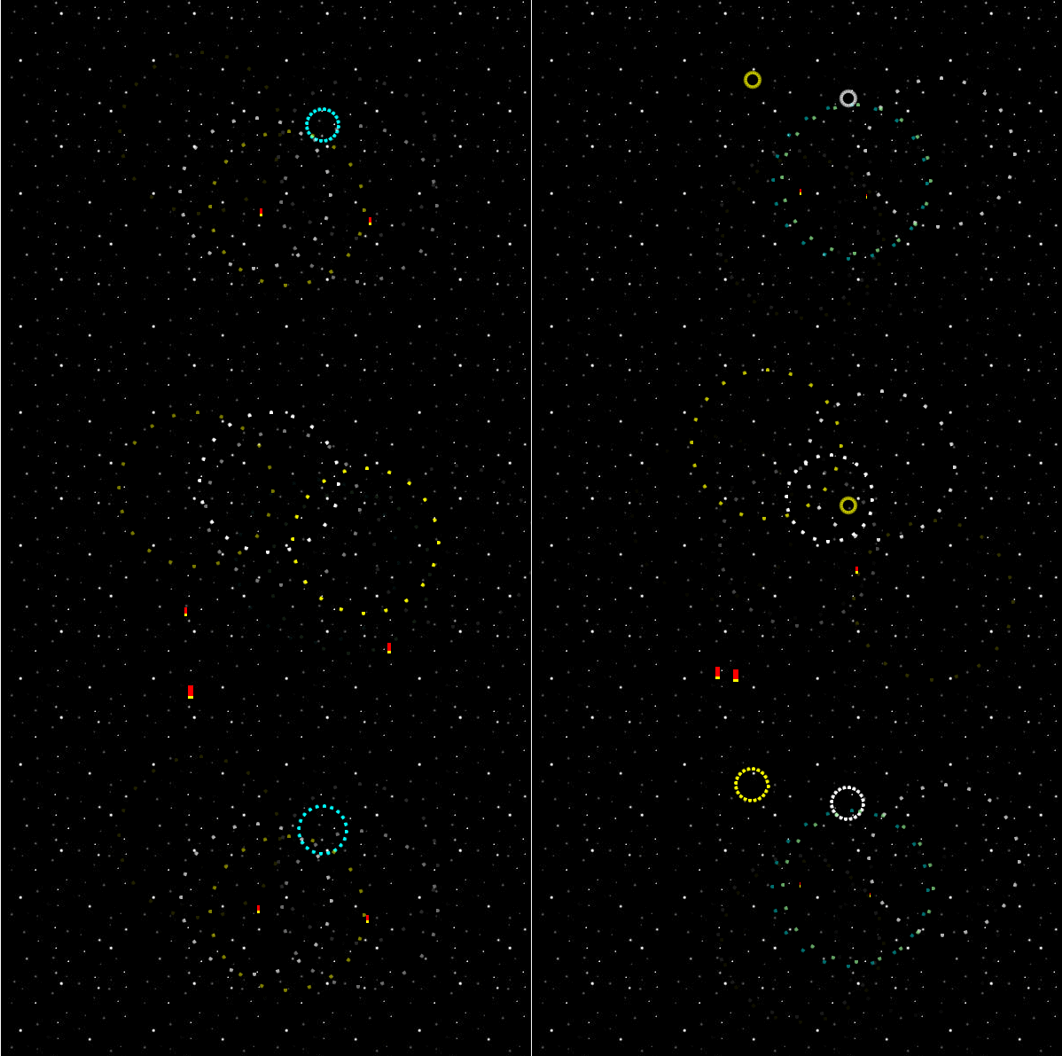
First let’s take a look at the effect:

The implementation principle of animation:
Usage of animation Two keyframes are created:
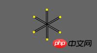
One is the rising trajectory of the fireworks tube, and the other is the spark fragments in the fireworks. Here you can see the basic sketch in progress:

Each firework tube is assigned a random one along the line at the bottom of the field starting point. It also assigns a random target within the marked area. As the firework tube approaches its target point, it shrinks to invisible (0x0 pixels).
At this point, the flare becomes visible. These are actually a series of DIVs pointing outward in a radial fashion, with a color at the outward tip - like a matchstick. To simulate an explosion, they simply increased the length and moved the lights outward.
JavaScript is used for:
1. Add all required elements to the page (DOM);
2. For each Create and assign keyframes to the fireworks tube; and
3. Specify colors and rotate each light spot to the correct position.
Code example:
html code:
css code (css-fireworks.css)
@-webkit-keyframes explosion { from { width: 0; opacity: 0; } 33% { width: 0; opacity: 0; } 34% { width: 10px; opacity: 1.0; } 40% { width: 80px; opacity: 1.0; } to { width: 90px; opacity: 0; } } @-moz-keyframes explosion { from { width: 0; opacity: 0; } 33% { width: 0; opacity: 0; } 34% { width: 10px; opacity: 1.0; } 40% { width: 80px; opacity: 1.0; } to { width: 90px; opacity: 0; } } #stage { position: relative; width: 600px; height: 400px; margin: 100px auto; background: #000 url(img/outerspace.jpg); } .launcher { position: absolute; -webkit-animation-duration: 4s; -webkit-animation-iteration-count: infinite; -moz-animation-duration: 4s; -moz-animation-iteration-count: infinite; background: red; border-bottom: 3px solid yellow; } .launcher div { position: absolute; opacity: 0; -webkit-animation-name: explosion; -webkit-animation-duration: 4s; -webkit-animation-iteration-count: infinite; -moz-animation-name: explosion; -moz-animation-duration: 4s; -moz-animation-iteration-count: infinite; left: 3px; top: 3px; width: 10px; height: 4px; border-right: 4px solid yellow; border-radius: 2px; -webkit-transform-origin: 0 0; -moz-transform-origin: 0 0; }
js code (css-fireworks.js)
document.addEventListener("DOMContentLoaded", function() { var num_launchers = 12; var num_flares = 20; var flare_colours = ['red', 'aqua', 'violet', 'yellow', 'lightgreen', 'white', 'blue']; var cssIdx = document.styleSheets.length - 1; function myRandom(from, to) { return from + Math.floor(Math.random() * (to-from)); } var keyframes_template = "from { left: LEFTFROM%; top: 380px; width: 6px; height: 12px; }\n" + "33% { left: LEFTTOP%; top: TOPTOPpx; width: 0; height: 0; }\n" + " to { left: LEFTEND%; top: BOTBOTpx; width: 0; height: 0; }"; for(var i=0; i < num_launchers; i++) { leftfrom = myRandom(15, 85); lefttop = myRandom(30, 70); toptop = myRandom(20, 200); leftend = lefttop + (lefttop-leftfrom)/2; botbot = toptop + 100; csscode = keyframes_template; csscode = csscode.replace(/LEFTFROM/, leftfrom); csscode = csscode.replace(/LEFTTOP/, lefttop); csscode = csscode.replace(/TOPTOP/, toptop); csscode = csscode.replace(/LEFTEND/, leftend); csscode = csscode.replace(/BOTBOT/, botbot); try { // WebKit browsers csscode2 = "@-webkit-keyframes flight_" + i + " {\n" + csscode + "\n}"; document.styleSheets[cssIdx].insertRule(csscode2, 0); } catch(e) { } try { // Mozilla browsers csscode2 = "@-moz-keyframes flight_" + i + " {\n" + csscode + "\n}"; document.styleSheets[cssIdx].insertRule(csscode2, 0); } catch(e) { } } for(var i=0; i < num_launchers; i++) { var rand = myRandom(0, flare_colours.length - 1); var rand_colour = flare_colours[rand]; var launch_delay = myRandom(0,100) / 10; csscode = ".launcher:nth-child(" + num_launchers + "n+" + i + ") {\n" + " -webkit-animation-name: flight_" + i + ";\n" + " -webkit-animation-delay: " + launch_delay + "s;\n" + " -moz-animation-name: flight_" + i + ";\n" + " -moz-animation-delay: " + launch_delay + "s;\n" + "}"; document.styleSheets[cssIdx].insertRule(csscode, 0); csscode = ".launcher:nth-child(" + num_launchers + "n+" + i + ") div {" + " border-color: " + rand_colour + ";\n" + " -webkit-animation-delay: " + launch_delay + "s;\n" + " -moz-animation-delay: " + launch_delay + "s;\n" + "}"; document.styleSheets[cssIdx].insertRule(csscode, 0); } for(var i=0; i < num_flares; i++) { csscode = ".launcher div:nth-child(" + num_flares + "n+" + i + ") {\n" + " -webkit-transform: rotate(" + (i * 360/num_flares) + "deg);\n" + " -moz-transform: rotate(" + (i * 360/num_flares) + "deg);\n" + "}"; document.styleSheets[cssIdx].insertRule(csscode, 0); } for(var i=0; i < num_launchers; i++) { var newdiv = document.createElement("div"); newdiv.className = "launcher"; for(var j=0; j < num_flares; j++) { newdiv.appendChild(document.createElement("div")); } document.getElementById("stage").appendChild(newdiv); } }, false);
Summary: The above is the entire content of this article. You can try it yourself to deepen your understanding. I hope it will be helpful to everyone's learning. I recommend video learning:css3 tutorial!
The above is the detailed content of CSS3+js realizes the animation effect of fireworks blooming (code example). For more information, please follow other related articles on the PHP Chinese website!