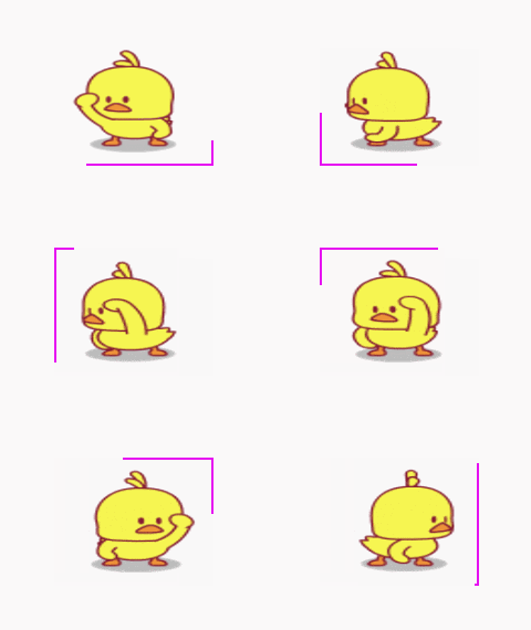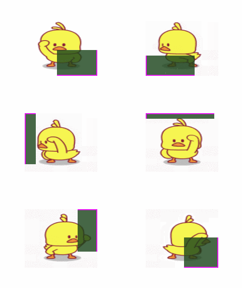
Look at the effect first

##The clip property clips absolutely positioned elements.
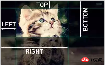
What happens when an image is larger than the element that contains it? The "clip" attribute allows you to specify the visible dimensions of an element so that it will be clipped and appear in this shape.clip: rect(<top>, <right>, <bottom>, <left>);</left></bottom></right></top>

nbsp;html>
<meta>
<title></title>
<style>
.box {
margin: 100px;
display: inline-block;
padding: 8px;
position: relative;
background-color: rgba(255,255,255,0.8);
}
.box::before {
content: '';
position: absolute;
left: 0;
top: 0;
right: 0;
bottom: 0;
border: 2px solid #E611F1;
animation: borderAround 5s infinite linear;
background-color: rgba(25,66,25,0.8);
}
@keyframes borderAround {
0%,
100% {
clip: rect(0 148px 2px 0);
}
25% {
clip: rect(0 148px 116px 146px);
}
50% {
clip: rect(116px 148px 116px 0);
}
75% {
clip: rect(0 2px 116px 0);
}
}
</style>
<div>
<img alt="How to apply clip attribute in css (with code)" >
</div>

The above is the detailed content of How to apply clip attribute in css (with code). For more information, please follow other related articles on the PHP Chinese website!