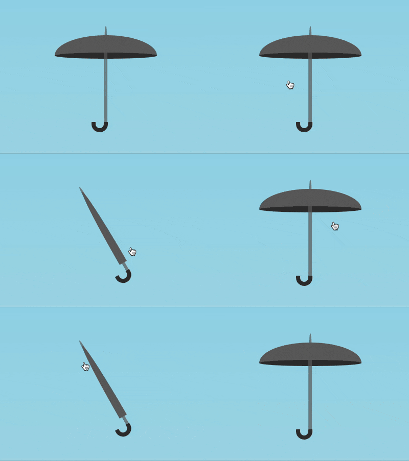
The content of this article is about how to use pure CSS to realize the animation effect of opening and closing an umbrella (source code attached). It has certain reference value. Friends in need can refer to it. I hope It will help you.

https://github.com/comehope/front- end-daily-challenges
Define dom, the container .umbralla contains 2 elements, .canopy represents the umbrella cover,.shaft Umbrella handle:
<figure>
    <div></div>
    <div></div>
</figure>
Centered display:
body {
    margin: 0;
    height: 100vh;
    display: flex;
    align-items: center;
    justify-content: center;
    background: linear-gradient(skyblue, lightblue);
}Set the common attributes of the pseudo-element:
.umbrella *::before,
.umbrella *::after {
    content: '';
    position: absolute;
} First draw the open appearance of the umbrella.
Set the container size. The attribute value of font-size will be used later, so a variable is defined:
:root {
    --font-size: 10px;
}

.umbrella {
    position: relative;
    width: 25em;
    height: 26em;
    font-size: var(--font-size);
}Define the size of the umbrella cover:
.umbrella .canopy {
    position: absolute;
    width: inherit;
    height: 5.5em;
    top: 2.5em;
}Use ::before pseudo-element to draw the upper part of the umbrella cover. First draw a semicircle and then compress it in the vertical direction:
.umbrella .canopy::before {
    width: inherit;
    height: 12.5em;
    background: rgb(100, 100, 100);
    border-radius: 12.5em 12.5em 0 0;
    transform: scaleY(0.4);
    top: -4em;
}Use :: after Use pseudo elements to draw the lower part of the umbrella cover:
.umbrella .canopy::after {
    width: inherit;
    height: 1.5em;
    background-color: #333;
    top: 4em;
    border-radius: 50%;
}Draw the long pole of the umbrella handle:
.umbrella .shaft {
    position: absolute;
    width: 0.8em;
    height: 18em;
    background-color: rgba(100, 100, 100, 0.7);
    top: 5.5em;
    left: calc((100% - 0.8em) / 2);
}Use pseudo elements to draw the top of the umbrella pole exposing the tip of the umbrella cover For the head, the method is similar to that of drawing the upper part of the umbrella cover. First draw a semicircle, and then compress it in the horizontal direction:
.umbrella .shaft::before {
    width: 6em;
    height: 3em;
    background-color: rgba(100, 100, 100, 0.7);
    left: calc((100% - 6em) / 2);
    top: -5.5em;
    border-radius: 6em 6em 0 0;
    transform: scaleX(0.1);
}Draw the hook-shaped handle of the umbrella:
.umbrella .shaft::after {
    box-sizing: border-box;
    width: 4em;
    height: 2.5em;
    border: 1em solid #333;
    top: 100%;
    left: calc(50% - 4em + 1em / 2);
    border-radius: 0 0 2.5em 2.5em;
    border-top: none;
} At this point, complete Draw the open look of the umbrella, and then use deformation to draw the closed look of the umbrella.
Close the umbrella cover first by compressing it in the horizontal direction and stretching it in the vertical direction:
.umbrella .canopy {
    transform-origin: top;
    transform: scale(0.08, 4);
}Hide the lower part of the umbrella cover:
.umbrella .canopy::after {
    transform: scaleY(0);
}Let the umbrella Tilt, because the vertical umbrella is a bit dull, so add a little change:
.umbrella {
    transform: rotate(-30deg);
} At this point, the umbrella looks like when it is closed, and next it needs to be turned into a toggle control.
Add a checkbox control in the dom:
<input>
<figure>
    <!-- 略 -->
</figure>
Set the control to be as large as the umbrella and place it on the upper layer of the umbrella layer:
.toggle {
    position: absolute;
    filter: opacity(0);
    width: 25em;
    height: 26em;
    font-size: var(--font-size);
    cursor: pointer;
    z-index: 2;
} checkbox The unselected state of the control corresponds to the appearance of the umbrella when it is closed, which is the current appearance of the umbrella, so you only need to specify the appearance of the umbrella that corresponds to the selected state of the control when it is opened. Because closing the umbrella is obtained by deforming several elements, switching to the open state of the umbrella cancels the deformation.
First, let the umbrella come over:
.toggle:checked ~ .umbrella {
    transform: rotate(0deg);
}Then open the umbrella cover:
.toggle:checked ~ .umbrella .canopy {
    transform: scale(1, 1);
}Then display the lower part of the umbrella cover:
.toggle:checked ~ .umbrella .canopy::after {
    transform: scaleY(1);
}Finally, set the above Easing effects of several elements:
.umbrella,
.umbrella .canopy,
.umbrella .canopy::after {
    transition: 0.3s cubic-bezier(0.5, -0.25, 0.5, 1.25);
}Done!
The above is the detailed content of How to use pure CSS to achieve the animation effect of opening and closing an umbrella (source code attached). For more information, please follow other related articles on the PHP Chinese website!