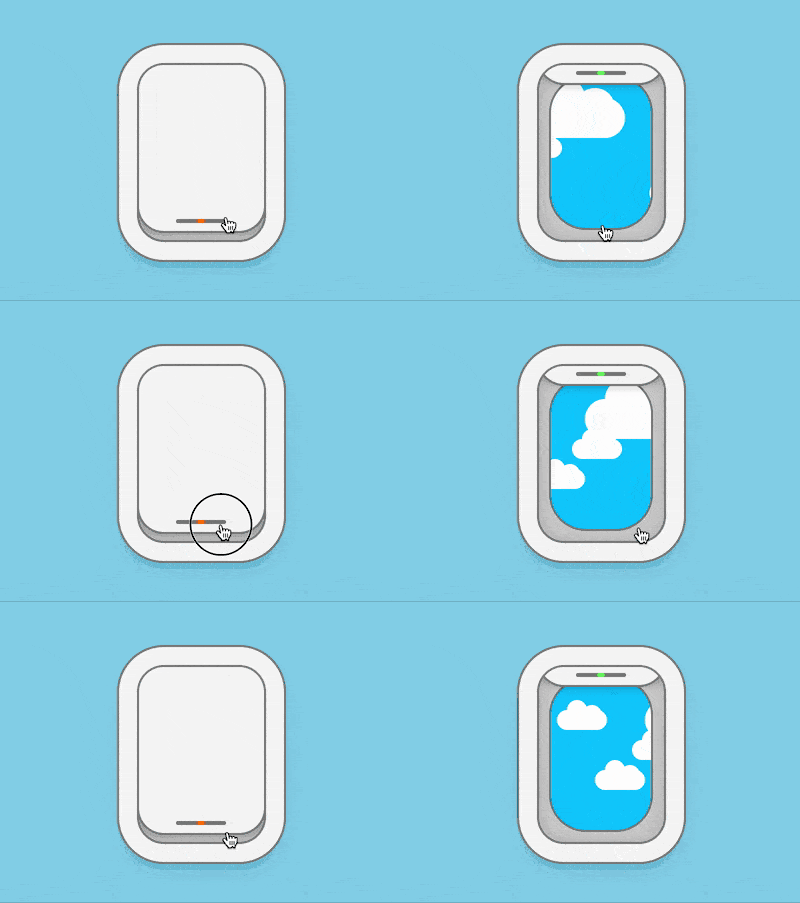
The content of this article is about how to use pure CSS to implement the aircraft porthole style toggle control. It has certain reference value. Friends in need can refer to it. I hope it will be helpful to you.

https://github.com/comehope/front- end-daily-challenges
Define dom, .windows container represents the porthole, and its child element .curtain represents the curtain:
<figure>
    <div></div>
</figure>
Centered display:
body {
    margin: 0;
    height: 100vh;
    display: flex;
    align-items: center;
    justify-content: center;
    background-color: skyblue;
}Set the size of the portholes. Because the font size will be used later, the font size is defined with variables:
:root {
    --font-size: 10px;
}

.window {
    position: relative;
    box-sizing: border-box;
    width: 25em;
    height: 35em;
    font-size: var(--font-size);
    background-color: #d9d9d9;
}Use shadow to draw a thick window frame:
.window {
    border-radius: 5em;
    box-shadow:
        inset 0 0 8em rgba(0, 0, 0, 0.2),
        0 0 0 0.4em #808080,
        0 0 0 4em whitesmoke,
        0 0 0 4.4em #808080,
        0 2em 4em 4em rgba(0, 0, 0, 0.1);
}Set the curtain style to the same size as the window, but do not pull it all the way:
.window .curtain {
    position: absolute;
    width: inherit;
    height: inherit;
    border-radius: 5em;
    box-shadow:
        0 0 0 0.5em #808080,
        0 0 3em rgba(0, 0, 0, 0.4);
    background-color: whitesmoke;
    left: 0;
    top: -5%;
}Use pseudo elements to draw indicator lights on the curtains, which will light up red when the curtains are closed:
.window .curtain::before {
    content: '';
    position: absolute;
    width: 40%;
    height: 0.8em;
    background-color: #808080;
    left: 30%;
    bottom: 1.6em;
    border-radius: 0.4em;
}

.window .curtain::after {
    content: '';
    position: absolute;
    width: 1.6em;
    height: 0.8em;
    background-image: radial-gradient(orange, orangered);
    bottom: 1.6em;
    border-radius: 0.4em;
    left: calc((100% - 1.6em) / 2);
}The above is what the porthole looks like when it is closed. Next, draw the effect when the porthole window is open.
First add a checkbox in the dom. When it is checked, it means the porthole is opened:
<figure>
    <div></div>
</figure>
Hidecheckbox, Use opacity(0) to make the element interactive even when it is invisible. Set its size to be as big as the porthole, and the layer is above the porthole. The effect will be the actual effect when clicking on the porthole. is clicked checkbox:
.toggle {
    position: absolute;
    filter: opacity(0);
    width: 25em;
    height: 35em;
    font-size: var(--font-size);
    cursor: pointer;
    z-index: 2;
} When the porthole is open, .curtain wants to move upward, and the indicator light lights green:
.window .curtain {
    transition: 0.5s ease-in-out;
}

.toggle:checked ~ .window .curtain {
    top: -90%;
}

.toggle:checked ~ .window .curtain::after {
    background-image: radial-gradient(lightgreen, limegreen);
}Hide beyond Part of the window:
.window {
    overflow: hidden;
} Next, draw the scenery outside the porthole.
Add the .clouds element that represents clouds in the dom, and the five <span></span> sub-elements represent one white cloud respectively:
<input>
<figure>
    <div></div>
    <div>
        <span></span>
        <span></span>
        <span></span>
        <span></span>
        <span></span>
    </div>
</figure>
Use The cloud container draws the blue sky outside the window:
.window .clouds {
    position: relative;
    width: 20em;
    height: 30em;
    background-color: deepskyblue;
    box-shadow: 0 0 0 0.4em #808080;
    left: calc((100% - 20em) / 2);
    top: calc((100% - 30em) / 2);
    border-radius: 7em;
}Each cloud is composed of 3 parts. Draw the largest part first:
.clouds span {
    position: absolute;
    width: 10em;
    height: 4em;
    background-color: white;
    top: 20%;
    border-radius: 4em;
}Then use pseudo elements to draw 2 protruding arcs:
.clouds span::before,
.clouds span::after {
    content: '';
    position: absolute;
    width: 4em;
    height: 4em;
    background-color: white;
    border-radius: 50%;
}

.clouds span::before {
    top: -2em;
    left: 2em;
}

.clouds span::after {
    top: -1em;
    right: 1em;
}Increase the animation effect of floating clouds:
.clouds span {
    animation: move 4s linear infinite;
}

@keyframes move {
    from {
        left: -150%;
    }

    to {
        left: 150%;
    }
}Make some changes in the size and position of each cloud:
.clouds span:nth-child(2) {
    top: 40%;
    animation-delay: -1s;
}

.clouds span:nth-child(3) {
    top: 60%;
    animation-delay: -0.5s;
}

.clouds span:nth-child(4) {
    top: 20%;
    transform: scale(2);
    animation-delay: -1.5s;
}

.clouds span:nth-child(5) {
    top: 70%;
    transform: scale(1.5);
    animation-delay: -3s;
}Finally, hide the content outside the container:
.window .clouds {
    overflow: hidden;
}Done!
The above is the detailed content of How to use pure CSS to implement an aircraft porthole style toggle control. For more information, please follow other related articles on the PHP Chinese website!