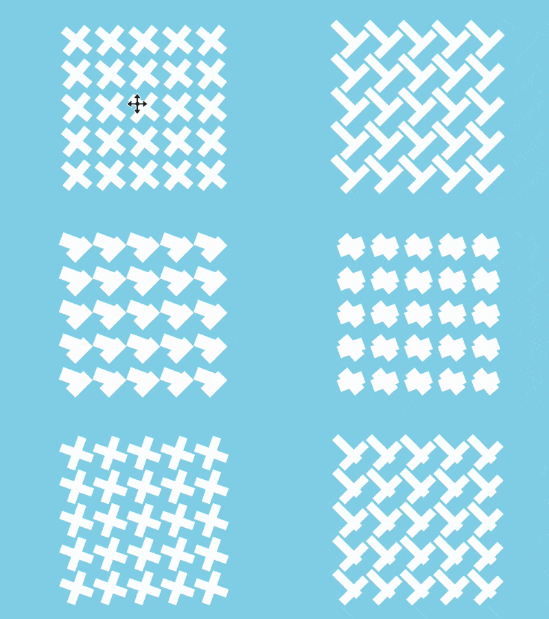
The content of this article is about how to use D3 and GSAP to achieve a dancing effect (source code attached). It has certain reference value. Friends in need can refer to it. I hope it will be useful to you. helped.

https://github.com/comehope/front-end-daily -challenges
Define dom, the container contains 2 sub-containers, .horizontal represents horizontal line segments, .vertical represents vertical Line segment, each sub-container contains 4 sub-elements:
<div>
    <div>
        <span></span>
        <span></span>
        <span></span>
        <span></span>
    </div>
    <div>
        <span></span>
        <span></span>
        <span></span>
        <span></span>
    </div>
</div>
Centered display:
body {
    margin: 0;
    height: 100vh;
    display: flex;
    align-items: center;
    justify-content: center;
    background-color: skyblue;
}Set the container size, where --side-length is each side of the square matrix Number of elements:
.container {
    --side-length: 2;
    position: relative;
    width: calc(40px * calc(var(--side-length)));
    height: calc(40px * calc(var(--side-length)));
}Use grid layout to arrange sub-elements, 4 elements are arranged into a 2 * 2 square matrix:
.container .horizontal,
.container .vertical {
    position: absolute;
    top: 0;
    left: 0;
    display: grid;
    grid-template-columns: repeat(var(--side-length), 1fr);
}Set the style of sub-elements, .horizontal## The child elements within # are horizontal bars, and the child elements within .vertical are vertical bars:
.container .horizontal span {
    width: 40px;
    height: 10px;
    background: #fff;
    margin: 15px 0;
}

.container .vertical span {
    width: 10px;
    height: 40px;
    background: #fff;
    margin: 0 15px;
}Introduce d3 library:
<script></script>
Define the number of elements on each side of the square matrix, and assign this value to the css variable:
const SIDE_LENGTH = 2;

let container = d3.select('.container')
.style('--side-length', SIDE_LENGTH);span sub-elements, adding horizontal and vertical ones respectively. Child element:
function appendSpan(selector) {
    container.select(selector)
    .selectAll('span')
    .data(d3.range(SIDE_LENGTH * SIDE_LENGTH))
    .enter()
    .append('span');
}

appendSpan('.horizontal');
appendSpan('.vertical');SIDE_LENGTH. For example, the following statement will create a 5 * 5 Square matrix:
const SIDE_LENGTH = 5;
Introducing the GSAP library:
<script></script>
animation, declare variables representing dom elements $horizontalSpan and $verticalSpan:
let animation = new TimelineMax({repeat: -1});
let $horizontalSpan = '.container .horizontal span';
let $verticalSpan = '.container .vertical span'; statement is the name of the step: <div class="code" style="position:relative; padding:0px; margin:0px;"><pre class="brush:php;toolbar:false">animation.to($horizontalSpan, 1, {rotation: 45}, 'step1')
.to($horizontalSpan, 1, {x: '-10px', y: '-10px'}, 'step2')
.to($horizontalSpan, 1, {rotation: 0, x: '0', y: '0', scaleY: 2, scaleX: 0.5}, 'step3')
.to($horizontalSpan, 1, {rotation: 90, scaleY: 1, scaleX: 1}, 'step4')</pre><div class="contentsignin">Copy after login</div></div>Create the animation of the vertical bar again,
The step name of the statement is the same as the step name of the horizontal bar, so as to match The horizontal bars keep the animation synchronized: <div class="code" style="position:relative; padding:0px; margin:0px;"><pre class="brush:php;toolbar:false">animation.to($verticalSpan, 1, {rotation: 45}, 'step1')
.to($verticalSpan, 1, {x: '10px', y: '10px'}, 'step2')
.to($verticalSpan, 1, {x: '0', y: '0', scaleX: 2, scaleY: 0.5}, 'step3')
.to($verticalSpan, 1, {rotation: 90, scaleX: 1, scaleY: 1}, 'step4');</pre><div class="contentsignin">Copy after login</div></div> Use the time scale scaling function at the end of the animation to double the animation playback speed:
animation.timeScale(2);
Finally, change the side length of the square matrix to 10, square The bigger the formation, the more powerful it will be:
const SIDE_LENGTH = 10;
Done!
The above is the detailed content of How to use D3 and GSAP to achieve a dancing effect (source code attached). For more information, please follow other related articles on the PHP Chinese website!