The properties in CSS are very magical and can create many unexpected graphics. This article mainly wants to share with you how to make a triangle using CSS. Friends who are interested can refer to it. I hope it will be helpful to you.
First we create a new 100x100 square div, and set a background color for our convenience.
css code is as follows:
width: 100px;
height: 100px;
background-color: #333;
Then add two borders to this div,
width: 100px;
height: 100px;
background-color: #333;
border-left:50px solid red;
border-bottom: 50px solid blue;
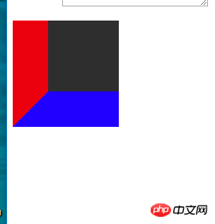
The effect picture is as follows:

Doesn’t it feel amazing? Why is this happening? Above, we added a 50-pixel left border and a bottom border of 50 pixels to the div. The browser intelligently divides the two colors in the lower left corner of the div. The top is the red of the left border, and the bottom is the blue of the bottom border. You may be confused when you see this, don't you want to implement a triangle? How do I set the border? Don't worry, we will add the top and right borders next.
   width: 100px;
   height: 100px;
   background-color: #333;
   border-left:50px solid red;
   border-bottom: 50px solid blue;
   border-right:50px solid green;
   border-top:50px solid yellow;
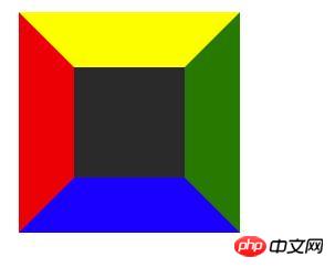
Effect:

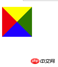
Do you already understand this, let’s set the width and height of this div to 0px , look at the effect

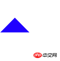
Haha, four triangles come out, which one you want, just set the border color of the other three to transparent That's it. For example, if I want the blue triangle below, the css code is as follows:
  width: 0px;
  height: 0px;
  border-left:50px solid transparent;
  border-bottom: 50px solid blue;
  border-right:50px solid transparent;
  border-top:50px solid transparent;
Finally, the triangle we want will come out.

The above is the detailed content of How to make a triangle with CSS (with code). For more information, please follow other related articles on the PHP Chinese website!