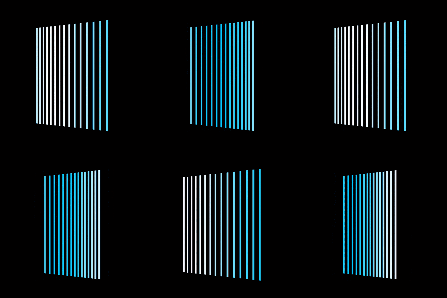
The content of this article is about how to use pure CSS to achieve a flag-waving animation effect (source code attached). It has certain reference value. Friends in need can refer to it. I hope it will be useful to you. Helps.

https://github.com/comehope/front- end-daily-challenges
Define dom, the container contains 15 elements:
<div>
    <span></span>
    <span></span>
    <span></span>
    <span></span>
    <span></span>
    <span></span>
    <span></span>
    <span></span>
    <span></span>
    <span></span>
    <span></span>
    <span></span>
    <span></span>
    <span></span>
    <span></span>
</div>
Centered display:
body {
    margin: 0;
    height: 100vh;
    display: flex;
    align-items: center;
    justify-content: center;
    background-color: black;
}Define container size:
.flag {
    width: 10em;
    height: 15em;
    font-size: 20px;
}Set the line style:
.flag span {
    width: 0.25em;
    height: inherit;
    background-color: deepskyblue;
}Make the lines tiled:
.flag {
    display: flex;
    justify-content: space-between;
}Add 3d perspective effect:
.flag {
    transform: perspective(500px) rotateY(-20deg);
}Define the animation effect of left and right movement:
.flag span {
    animation: wave 1.5s ease-in-out infinite alternate;
}

@keyframes wave {
    to {
        transform: translateX(2em);
    }
}Set the element variable value:
.flag span:nth-child(1) {
    --n: 1;
}

.flag span:nth-child(2) {
    --n: 2;
}

/* 共 15 个元素,每元素的 --n 变量值等于它的序号。 */
/* 中间代码略 …… */

.flag span:nth-child(14) {
    --n: 14;
}

.flag span:nth-child(15) {
    --n: 15;
}Let each line start the animation with a delay to form the effect of flying flags:
.flag span {
    animation-delay: calc(var(--n) * -0.1s);
}Finally, add the light and shadow effect:
.flag span {
    background-color: ghostwhite;
}

@keyframes wave {
    to {
        transform: translateX(2em);
        background-color: deepskyblue;
    }
}Done!
Related recommendations:
How to Using CSS and D3 to realize interactive animation of small fish swimming (with code)
The above is the detailed content of How to use pure CSS to achieve a flag-waving animation effect (source code attached). For more information, please follow other related articles on the PHP Chinese website!