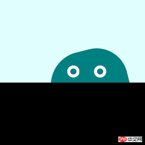
The content of this article is about how to use pure CSS to realize the wandering jelly monster. It has certain reference value. Friends in need can refer to it. I hope it will be helpful to you.

https://github.com/comehope/front-end-daily-challenges
Define dom, the container contains 2 elements, representing the monster's body and eyes respectively:
<p>
    <span></span>
    <span></span>
</p>
Set the background color:
body {
    margin: 0;
    height: 100vh;
    background-color: black;
}Settings Foreground color:
.monster {
    width: 100vw;
    height: 50vh;
    background-color: lightcyan;
}Draw the monster’s body:
.monster {
    position: relative;
}

.body {
    position: absolute;
    width: 32vmin;
    height: 32vmin;
    background-color: teal;
    border-radius: 43% 40% 43% 40%;
    bottom: calc(-1 * 32vmin / 2 - 4vmin);
}Define the container where the monster’s eyes are:
.eyes {
    width: 24vmin;
    height: 5vmin;
    position: absolute;
    bottom: 2vmin;
    left: calc(32vmin - 24vmin - 2vmin);
}Draw the monster’s eyes using pseudo elements:
.eyes::before,
.eyes::after {
    content: '';
    position: absolute;
    width: 5vmin;
    height: 5vmin;
    border: 1.25vmin solid white;
    box-sizing: border-box;
    border-radius: 50%;
}

.eyes::before {
    left: 4vmin;
}

.eyes::after {
    right: 4vmin;
}Define a gentle jumping animation for the monster, and combine it with the following animation effects to make it have the elasticity of jelly:
.body {
    animation:
        bounce 1s infinite alternate;
}

@keyframes bounce {
    to {
        bottom: calc(-1 * 32vmin / 2 - 2vmin);
    }
}Let the monster's body rotate:
@keyframes wave {
    to {
        transform: rotate(360deg);
    }
}Let the monster wander Walking:
.monster {
    overflow: hidden;
}

.body {
    left: -2vmin;
    animation:
        wander 5s linear infinite alternate,
        wave 3s linear infinite,
        bounce 1s infinite alternate;
}

.eyes {
    animation: wander 5s linear infinite alternate;
}

@keyframes wander {
    to {
        left: calc(100% - 32vmin + 2vmin);
    }
}Finally, let the monster’s eyes blink:
.eyes::before,
.eyes::after {
    animation: blink 3s infinite linear;
}

@keyframes blink {
    4%, 10%, 34%, 40% {
        transform: scaleY(1);
    }

    7%, 37% {
        transform: scaleY(0);
    }
}Done!
Related recommendations:
How to use pure CSS to achieve the animation effect of a person walking alone (source code attached)
How to use pure CSS Implement a paper crane (with source code)
The above is the detailed content of How to use pure CSS to implement a wandering jelly monster (source code attached). For more information, please follow other related articles on the PHP Chinese website!