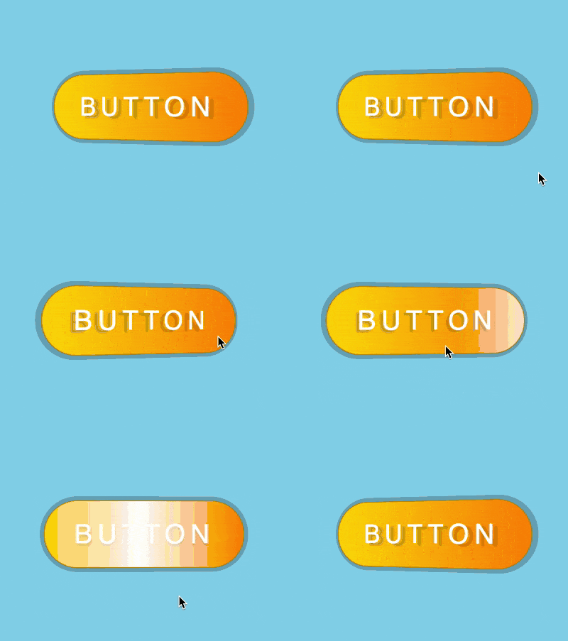
The content of this article is about how to use pure CSS to realize the animation effect of three-dimensional buttons with metallic luster (source code attached). It has certain reference value. Friends in need can refer to it. I hope it will be helpful to you. You helped.

https://github.com/comehope/front-end-daily-challenges/ tree/master/004-metallic-glossy-3d-button-effects
Define a container in the dom:
<div class="box">BUTTON</div>
Container is displayed in the center:
html, body {
    height: 100%;
    display: flex;
    align-items: center;
    justify-content: center;
    background-color: skyblue;
}Set the 2D style of the button. In order to facilitate the adjustment of the button size, variables are used:
.box {
    background: linear-gradient(to right, gold, darkorange);
    color: white;
    --width: 250px;
    --height: calc(var(--width) / 3);
    width: var(--width);
    height: var(--height);
    text-align: center;
    line-height: var(--height);
    font-size: calc(var(--height) / 2.5);
    font-family: sans-serif;
    letter-spacing: 0.2em;
    border: 1px solid darkgoldenrod;
    border-radius: 2em;
}Set the 3D style of the button:
.box {
    transform: perspective(500px) rotateY(-15deg);
    text-shadow: 6px 3px 2px rgba(0, 0, 0, 0.2);
    box-shadow: 2px 0 0 5px rgba(0, 0, 0, 0.2);
}Define the mouse-over animation effect of the button:
.box:hover {
    transform: perspective(500px) rotateY(15deg);
    text-shadow: -6px 3px 2px rgba(0, 0, 0, 0.2);
    box-shadow: -2px 0 0 5px rgba(0, 0, 0, 0.2);
}

.box {
    transition: 0.5s;
}Add gloss with pseudo elements:
.box {
    position: relative;
}

.box::before {
    content: '';
    position: absolute;
    width: 100%;
    height: 100%;
    background: linear-gradient(to right, transparent, white, transparent);
    left: 0;
}Define the gloss animation effect:
.box::before {
    left: -100%;
    transition: 0.5s;
}

.box:hover::before {
    left: 100%;
}Finally, hide the content outside the container:
.box {
    overflow: hidden;
}You’re done!
Related recommendations:
How to use pure CSS to achieve the animation effect of text disconnection (source code attached)
How to use CSS to achieve gradient animation borders The effect (with code)How to use CSS and color mixing mode to achieve loader animation effect (with code)
The above is the detailed content of How to use pure CSS to achieve the animation effect of a three-dimensional button with metallic luster (source code attached). For more information, please follow other related articles on the PHP Chinese website!