This article introduces you to the combination of 2D and 3D in HTML and CSS3 to achieve animation effects. It has certain reference value. Friends in need can refer to it. I hope it will be helpful to you.
Although we are working on the front end, we generally do not use 2D and 3D animation effects. We basically use JS or jQ to complete these animation effects, but the most basic ones Have you forgotten it?
I reviewed these things yesterday and wrote two small examples
First define a div in HTML,
<div class="heart"></div>
Only one p is needed, I use pseudo elements to draw it;
  <style>
        /* 基于父级定位 */
    .heart{
     position: relative;
    }
    /* 使用伪元素画出两个图像,使用图形拼接来造出一个心 */
    .heart::after,
    .heart::before{
        content: "";
        position: absolute;
        top: 100px;
        left: 0;
        right: 0;
        margin: auto;
        width: 50px;
        height: 80px;
        background: red;
        /* borde-radius 有四个值 分别对应四个角,分别对应 左上 右上 右下 左下 */
        border-radius: 50px 50px 0 0;

        /* 旋转元素,两个一起旋转。等下只需要调动一个即可 */
        transform: rotate(-45deg);
        transform-origin: 0 100%;
    }
    /* 旋转元素 使它和before伪元素 拼接成一个心 */
    .heart::after{
        left: -100px;
        transform: rotate(45deg);
        transform-origin: 100% 100%;
    }
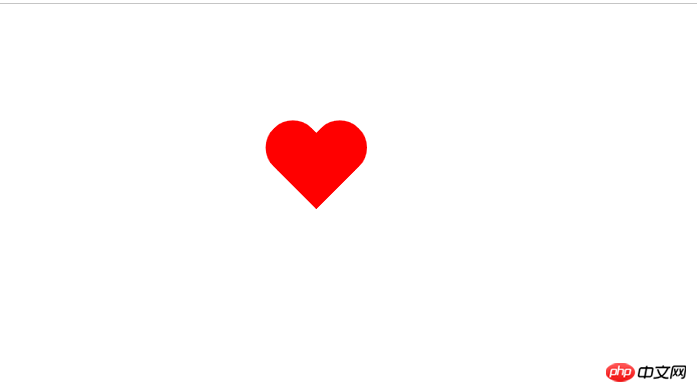
</style>Through the above code, we get a prosperous heart

Like the heart shape above, I still use pseudo elements to write it
First define a div and name it taiji
<div id="taiji"></div>
Then use pseudo elements and see how I create it. Without further ado, just add the code
<style type="text/css">
        #taiji {
            position: relative;
            width: 200px;
            height: 100px;
            background: white;
            border-color: black;
            border-style: solid;
            border-width: 4px 4px 100px 4px;
                  /*变成圆形*/
            border-radius: 50%;

            margin: 100px auto;
               /* 定义动画 名称 时长  匀速 无限循环播放 */
            animation: myfirst 4s linear infinite;

        }

        #taiji::before,
        #taiji::after {
            content: " ";
            position: absolute;
            top: 50%;
            left: 0;
            width: 25px;
            height: 25px;
            background: white;
            border: 38px solid black;

            border-radius: 50%;
        }

        #taiji::after {
            left: 50%;
            background: black;
            border-color: white;
        }

        /* 定义动画 */

        @keyframes myfirst {
            0% {

                transform: rotate(0deg);
            }
            100% {

                transform: rotate(360deg);
            }

        }
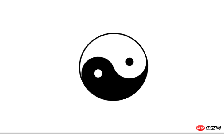
</style>and the effect is as follows:

Recommended related articles:
How to use pure CSS to achieve the effect of a green pig
How to enlarge images with css? (Example of cool special effects)
The above is the detailed content of Combining 2D and 3D in HTML and CSS3 to achieve animation effects. For more information, please follow other related articles on the PHP Chinese website!


