This article introduces to you an introduction to the Holy Grail layout and the double flying wing layout in CSS (with code). It has certain reference value. Friends in need can refer to it. I hope it will be helpful to you.

<div>#header</div>

  <div>
    <div>#center</div>
    <div>#left</div>
    <div>#right</div>
  </div>

  <div>#footer</div>
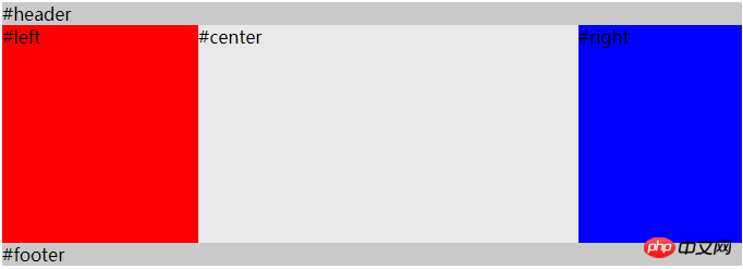
The effect achieved is mainly in the container, left and rgith have fixed widths, center is rendered first, and automatically Adapt to width.
    body {
      min-width: 500px;
    }
    #container {
      overflow: auto;        /* BFC */
      padding-left: 180px;
      padding-right: 150px;
    }
    #container .column {
      height: 200px;
      position: relative;
      float: left;
    }
    #center {
      background-color: #e9e9e9;
      width: 100%;
    }
    #left {
      background-color: red;
      width: 180px;
      right: 180px;
      margin-left: -100%
    }
    #right {
      background-color: blue;
      width: 150px;
      margin-right: -150px;
    }

    #header,
    #footer {
      background-color: #c9c9c9;
}Several points to pay attention to in this solution:
The center element is located before left and right, so center can be rendered first and the user can see the main content of the page first.
container (width: 100%) wraps the three columns of content and makes space for the left and right columns through padding-left and padding-right.
center, left, and right all set a left float (float:left), so there is a floating stream inside the container.
By setting margin-left: -100% to the left element, the left element moves to the upper left corner of the container, and position: relative; right : 180px, moved to the padding-left position of the container.
Set margin-right: -150px to the right element so that it moves to the position of the padding-right of the container.
ps: margin-left and margin-right take advantage of the characteristics of floating flow, so that the first row can accommodate the three elements of center, left, and right at the same time.
 ##
##
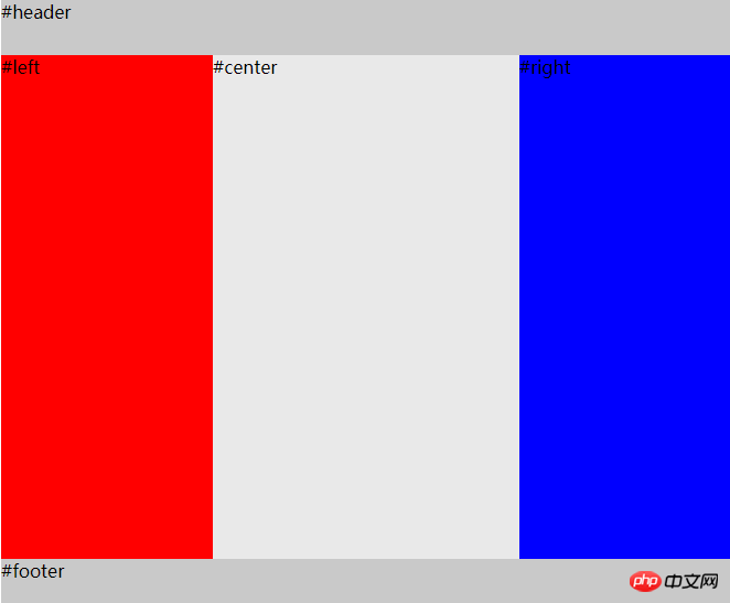
<div>#header</div> <div> <div>#center</div> <div>#left</div> <div>#right</div> </div> <div>#footer</div>If you do not consider browsers ie10 and below, you can use flex to implement it Holy grail layout. And the Holy Grail layout can make the footer achieve a sticky effect by letting the container fill the height.body { min-width: 550px; } #HolyGrail { display: flex; min-height: 100vh; flex-direction: column; } #container { display: flex; flex: 1; } #center { background-color: #e9e9e9; flex: 1; } #left { background-color: red; order: -1; width: 150px; } #right { background-color: blue; width: 150px; } #header, #footer { height: 50px; background-color: #c9c9c9; }Copy after loginflex compatibility
Double flying wing layoutThe difference lies in
##The Holy Grail layout and the double flying wing layout solve the same problem, that is A three-column layout with fixed width on both sides and adaptive middle column. The middle column should be placed in front of the document flow for priority rendering. The solution to the problem of the Holy Grail layout and the double-wing layout is the same in the first half, that is, all three columns are float, but the left and right columns are added with negative margins to make them side by side with the middle column p to form a three-column layout.
The idea of solving the middle p content from being blocked.
The holy grail layout is to wrap the element in order to prevent the middle content from being modified.
How to implement floating element line wrapping in cssGrid layout in CSS Summary of usage (with code)- padding-left
The solution to the double-wing layout is to add a p inside the middle element to place the content, and then use the left and right marginsand
padding-rightto place the content p in the middle, and then use relative positioningposition:relative, and use the right or left attributes to make the left and right columns uneven. When the middle content.- margin-left
The double flying wing layout has one more p tag and 4 less css attributes. Less padding-left and padding-right are used. The left and right p's use relative layout position: relative and the corresponding right and left, and margin-left and margin-right are used more.and
margin-rightLeave space for the left and right columns.- Recommended related articles:
<div>#header</div> <div> <div> <div>#center</div> </div> <div>#left</div> <div>#right</div> </div> <div>#footer</div>Copy after loginbody { min-width: 500px; } #container { overflow: auto; /* BFC */ } #container .column { height: 200px; float: left; } #center { background-color: #e9e9e9; width: 100%; } #center-content { margin-left: 180px; margin-right: 150px; } #left { width: 180px; background-color: red; margin-left: -100%; } #right { background-color: blue; width: 150px; margin-left: -150px; } #header, #footer { background-color: #c9c9c9; }Copy after login
The above is the detailed content of Introduction to Holy Grail Layout and Double Flying Wing Layout in CSS (with code). For more information, please follow other related articles on the PHP Chinese website!


