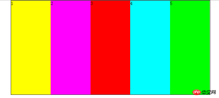
The content shared with you in this article is about the flexible layout in HTML. Friends in need can refer to it. I hope it can help everyone.
Flex is the abbreviation of Flexible Box, which means "flexible layout" and is used to provide maximum flexibility for box-shaped models.
Any container can be designated as Flex layout.
Elements that adopt Flex layout are called Flex containers (flex containers), or "containers" for short. All its child elements automatically become container members, called Flex items (flex items), referred to as "items".
flex-direction
flex-wrap
flex-flow
justify-content
align-items
<html lang="en">
<head>
    <meta charset="UTF-8">
    <meta name="viewport" content="width=device-width, initial-scale=1.0">
    <meta http-equiv="X-UA-Compatible" content="ie=edge">
    <title>弹性布局</title>
    <style>
     body{
         margin: 0;
         padding: 0;
     }
     #main
{
    width:50vw;
    height:50vh;
    border:1px solid black;
    display:flex;
    margin: 0 auto;

}

     #main p
        {
    flex:1;

    }


    </style>
</head>
<body>
    <p>
        <p id="main">
            <p style="background:#ff0">1</p>
            <p style="background:#f0f">2</p>
            <p style="background:#f00">3</p>
            <p style="background:#0ff">4</p>
            <p style="background:#0f0">5</p>
        </p>
    </p>
</body>
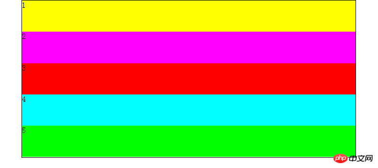
</html> ## Tips: Add flex-direction to the css style :column; will become another layout effect. As shown below:

Recommended related articles:
The above is the detailed content of Introduction to flexible layout (Flex) in HTML (with code). For more information, please follow other related articles on the PHP Chinese website!


