The following article brings you a comprehensive understanding of CSS gradient color, omitted tags, embedded fonts, and text shadows. The content is quite good, so I will share it with you now and give it as a reference.
1. Gradient color
CSS3 Gradient is divided into linear gradient(linear)and Radial gradient(radial). Since different rendering engines have different syntax for implementing gradients, here we only analyze its usage based on the W3C standard syntax of linear gradients. You can refer to relevant information for the rest. W3C syntax has been supported by browsers such as IE10, Firefox19.0, Chrome26.0 and Opera12.1.
In this section, let’s talk about Linear gradient:

## Parameters:
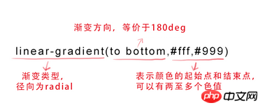
The first parameter:Specify the gradient direction, which can be represented by the keyword "angle" or "English":

represents the starting point and end point of the color, which can have multiple color values.
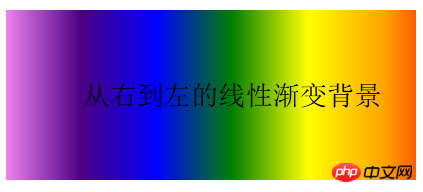
background-image:linear-gradient(to left, red, orange,yellow,green,blue,indigo,violet);
Rendering:

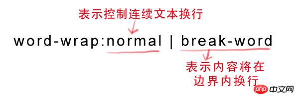
2, text-overflow and word-wrap
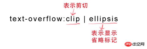
text-overflow is used to set whether to use an omission mark (...) to mark the overflow of text within the object. Grammar:
text-overflow:ellipsis; overflow:hidden; white-space:nowrap;
Syntax:

3. Embed font @font-face
@font-face can load the server-side font file so that the browser can display the user There are no fonts installed on the computer.Syntax:
@font-face { font-family: font name;
src: relative or absolute path to the font file on the server ;
}
For example:
p {
    font-size :12px;
    font-family : "My Font";
    /*必须项,设置@font-face中font-family同样的值*/
}4. Text-shadow
text-shadow can Used to set the shadow effect of text.Syntax:
text-shadow: X-Offset Y-Offset blur color;X-Offset: represents the horizontal offset distance of the shadow, its value is positive When the shadow is offset to the right, otherwise it is offset to the left; Y-Offset: refers to the vertical offset distance of the shadow. If its value is positive, the shadow is offset downward, otherwise it is offset upward ;Blur: refers to the blurring degree of the shadow, and its value cannot be a negative value. The larger the value, the blurr the shadow, and conversely the clearer the shadow. If the shadow blur is not needed, the Blur value can be set to 0; Color: refers to the color of the shadow, which can use rgba color. For example, we can use the following code to set the shadow effect.text-shadow: 0 1px 1px #fff
Two commonly used functions of CSS3 rounded corners and gradients
CSS3 realizes background transparency and text opaqueness Effect
Implementation of linear color gradient in CSS3
The above is the detailed content of Comprehensive introduction to css gradient colors, omission tags, embedded fonts, and text shadows. For more information, please follow other related articles on the PHP Chinese website!
 Convert text to numeric value
 Windows cannot access the specified device path or file solution
 mysql backup data method
 What are the disk cleanup commands?
 securefx cannot connect
 How to calculate the refund handling fee for Railway 12306
 How to use plot function in Python
 How to clean up your computer's C drive when it's full


