


This article mainly introduces a wave of examples of triangular and round small buttons made with CSS, all of which adopt the common gray button style design. Friends in need can refer to it
Refer to Tmall and Wechat The approach of websites such as Bo is implemented with pure HTML and CSS, and the effect is still good.
The following are the results, compatible with mainstream browsers, including ie6. 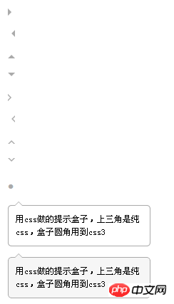
<!DOCTYPE html PUBLIC "-//W3C//DTD XHTML 1.0 Strict//EN"             "http://www.w3.org/TR/xhtml1/DTD/xhtml1-strict.dtd">
<html xmlns="http://www.w3.org/1999/xhtml">
<head>
<meta http-equiv="Content-Type" content="text/html; charset=utf-8" />
<meta http-equiv="Content-Language" content="zh-CN" />
<meta name="Keywords" content="" />
<meta name="Description" content="" />
<title></title>
</head>
<style type="text/css">
*{margin:0; padding:0; list-style:none; font:normal 12px/150% 宋体; }
body{ padding:20px; }
.arrow{ margin-bottom:20px;  }
/* css三角形 */
.arrow,.arrow s { position:relative;  display:block; font-size: 0; line-            height: 0; width: 0; height: 0; border-color:transparent; border-style:dashed; border-width:5px; }
.arrowR,.arrowR s{ border-left-color:#aaa; border-left-style:solid; }
.arrowR s{ border-left-color:#fff; position:absolute; left:-7px; top:-5px; }
.arrowR:hover{ border-left-color:#f60;  }
.arrowL,.arrowL s{ border-right-color:#aaa; border-right-style:solid; }
.arrowL s{ border-right-color:#fff; position:absolute; rightright:-7px; top:-5px; }
.arrowL:hover{ border-right-color:#f60;  }
.arrowT,.arrowT s{ border-bottom-color:#aaa; border-bottom-style:solid; }
.arrowT s{ border-bottom-color:#fff; position:absolute; left:-5px; top:-3px; }
.arrowT:hover{ border-bottom-color:#f60;  }
.arrowB,.arrowB s{ border-top-color:#aaa; border-top-style:solid; }
.arrowB s{ border-top-color:#fff; position:absolute; left:-5px; bottombottom:-3px; }
.arrowB:hover{ border-top-color:#f60;  }
/* css圆形 */
.circle{ line-height:100%; overflow:hidden;  font-    family:Tahoma,Helvetica; font-size:18px; color:#aaa;  }
.circle:hover{ color:#f60;  }
/* 提示盒子 */
.tipBox{ width:200px; margin-top:10px;   }
.tipBox .hd{ height:5px;  position:relative;  }
.tipBox .hd .arrow{ position:absolute; top:-5px; left:10px; }
.tipBox .hd .arrow s{ top:-4px; }
.tipBox .bd{ border:1px solid #aaa; padding:10px;  -webkit-border-    radius:5px; -moz-border-radius:5px; border-radius:5px;  }
.tipBoxA .arrow s{ border-bottom-color:#f6f6f6;  }
.tipBoxA .bd{ background:#f6f6f6;  }
</style>
<body>
<a class="arrow arrowR"></a>
<a class="arrow arrowL"></a>
<a class="arrow arrowT"></a>
<a class="arrow arrowB"></a>
<a class="arrow arrowR"><s></s></a>
<a class="arrow arrowL"><s></s></a>
<a class="arrow arrowT"><s></s></a>
<a class="arrow arrowB"><s></s></a>
<a class="circle">?</a>
<p class="tipBox">
<p class="hd">
<s class="arrow arrowT"><s></s></s>
</p>
<p class="bd">
用css做的提示盒子,上三角是纯css,盒子圆角用到css3
</p>
</p>
<p class="tipBox tipBoxA">
<p class="hd">
<s class="arrow arrowT"><s></s></s>
</p>
<p class="bd">
用css做的提示盒子,上三角是纯css,盒子圆角用到css3
</p>
</p>
</body>
</html>The above is the entire content of this article. I hope it will be helpful to everyone's study. For more related content, please pay attention to the PHP Chinese website!
Related recommendations:
How to implement CSS pop-up window centering
The above is the detailed content of Code for small triangle and round buttons made with CSS. For more information, please follow other related articles on the PHP Chinese website!


![[Web front-end] Node.js quick start](https://img.php.cn/upload/course/000/000/067/662b5d34ba7c0227.png)


